

chaos
/ˈkeɪɒs/
See definitions in:
All
Physics
Mythology
noun
-
complete disorder and confusion.
"snow caused chaos in the region"
BACKSTORY
Rosanna Jones is a photographer and mixed media image maker based in London, she graduated from Falmouth University with a degree in fashion photography. Rosanna Jones was born in 1994, however her direct date of birth is unknown. (She is now around the age of 28) Her profession specializes 'in an experimental blend of art and photography'. She is known for defacing her photos; burning, ripping and painting over her images 'to create tactile portraits that defy the flat images they once were.' Rosanna Jones's tactile work is of a personal nature and is aimed at examining visual identity and notions of embodiment. Embodiment or incarnation is defined as the giving of human form to a spirit. When you talk about embodiment, you're talking about giving a form to ideas that are usually not physical: like love, hate, fear, justice, etc. Her ripped up portraiture reflects on her own life, this can be seen in series such as Destroy. In her photos Rosanna Jones reflects the same havoc and craziness in her own life in her photos making them more personal and self related.


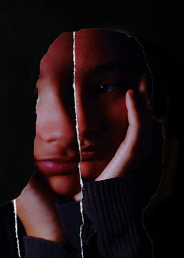
The image on the left is one of Rosanna Jones's best pieces in my opinion for the overlaid ripped paper gives the effect of shattered glass, this fits in with her whole theme of humans being broken. In my opinion the main way she creates that shattered glass aspect it through making the ripped pieces of the image in triangular shapes for when glass breaks it tend to break into triangles. One more thing I've realized that Rosanna Jones does is arrange the torn pieces so they are not very far from their original places so the image does not look weird, disconnected or odd. This image represents how humans are cracked (as in broken) inside and that to be beautiful you do not have to be perfect. The color scheme of this image is very important to register; the skin has an orangey sheen over it this contrasts nicely with the red of the lips and the blue of the girl's eyes.
One more thing that I have realized is that to make the blue eyes more noticeable Rosanna Jones overlaid them on the image 3 the more times while with nose (for example she only overlaid it once) she uses this tactic to define the facial elements that she wants to make more obvious and vice versa.
COLOR SCHEME
Above is the color scheme of the image, I think this is useful for it allows us to look in depth at the image and identify the amount of contrast. The first color is the average skin color, the second is the shadows, the third is the color of the eyebrows/hair, the fourth is the lips and the last is the eyes (however, I have realized that this color does not show much in the image but it still draws eyes). I think that the color most shown is the first one and I think that this contrasts nicely with the color of the lips and eyes. I have discovered and although I do not know if it is intentional the color of the lips and the color of the eyes are on opposing sides of the color wheel making them contrast in a nice way.
PHOTOSHOOT PLAN

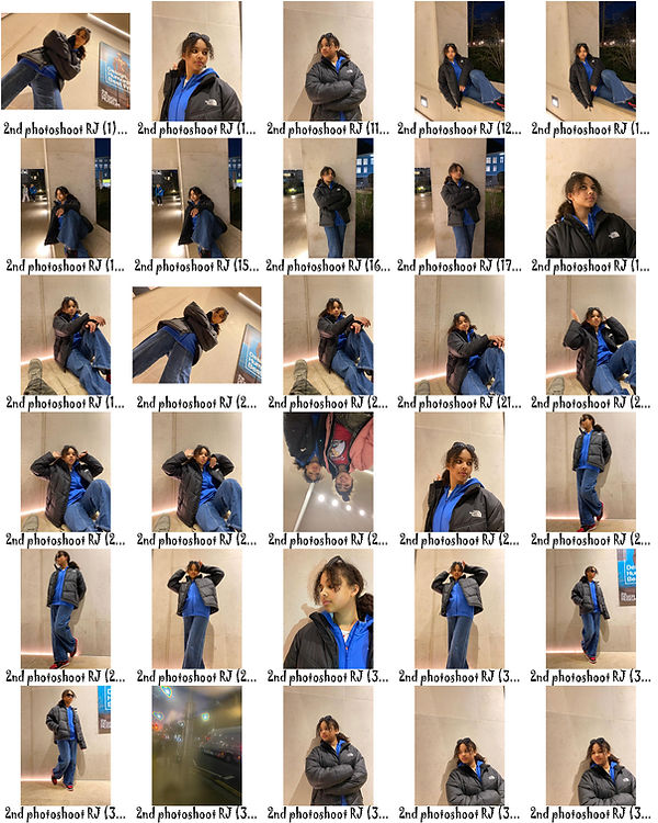
CONTACT SHEETS
In the photoshoot on the right I tried to capture a variety of different styles and poses. I wanted to get a consistent background of the white gravel behind my model. I also wanted to get some closeup portraits of my models facial features to use for collages and double exposure. On top of this I tried to have simple images so my model would be easier to cutout and use the drop shadow technique on photoshop. My main aim was to make my model the priority of every image. I plan to use the dodge tool on photoshop to get rid of the texture of my background or add an alternate texture using the layer style tool (also on photoshop). The photos that I didn't select were the ones that I either had to much of or the ones that I didn't think were to the correct standard or composition. My favorite photo was probably the one of my model looking over the camera and standing directly over it .

EDITS


In the edits above I attempted to give my images a layered effect by adding texture to my pictures. One of my favorite edits is the one on the center of the last row, this is where I used 3 different raw photos to make that hole effect whilst with the other ones I only used 2. One of my favorite textures is the first one on the bottom row for I feel like it gives the image the effect that it will crumble, another one of my favorite textures is used on the first image, I think it adds a cardboard like texture to the image. I added an inner glow when I overlaid my image for I felt that it added that ripping paper effect that Rosanna Jones uses often. I tried to make these developments more relevant to my current artist then my previous. An example of this is that I used less double exposure and more of the drop shadow effect on photoshop. One way I think that these edits could be more successful is if the rip line in each of the images were more realistic, however, I think I have a way to rectify this; I plan to print these images and rip them up even more to make them look more like Jones's work and give them more texture. I think the least successful photo in the gallery above is the first one for I feel like I made the shadow too thick therefore making the image less realistic compared to the others. If I was going to edit these images again I think that I would play around with color a bit; for example make the inside layer with color and the outside without. I would also try and make more images like the second last one; with more layers to add more depth and to increase the level of craziness and havoc in the image like in Rosanna Jones's work and, as she claims, her life.


TEXTURES
PROCESS LOG
Above are the textures I used in my first set of developments, I found these on photoshop whilst I was using drop shadow, these made the images more contrasted which is a very important aspect of Jones's work. My favorite texture is probably the last one for it is the most detailed and contrasted, on the other hand, the second one is my least favorite for it harder to distinguish and mainly fades into the background. The texture that I think worked best with my images is the first for it added to the ripped effect in each image that I used it on. These textures hopefully achieved something like the 3D element in Rosanna Jones's images.

In the above process log I used drop shadow to give the image I pasted on top of the original a layered quality. Whilst doing this I discovered that the the right drop shadow changed depending on each image for example the first image on the gallery I made the shadow really thick so it links with the cardboard texture. However with others I found that it was best to have a thinner shadow an example of this is the first photo on the last row. As well as using the drop shadow effect I also used the inner shadow, however, I only used this on some of the images for the rip effect was not as realistic as I'd hoped so I did not deem it necessary to add another process looked like someone had drawn on the image in black marker or the shadow was demolished completely taking away the element that made the image 3D. I also found that I could change the angle of the shadow, so I tried to align this with the lighting in the overlaid photo.
PHYSICAL DEVELOPMENTS


In the physical developments above I decided to rip my images to make them look more like Rosanna Jones's, I think this worked out really nicely for the original edits already looked ripped so this just added to that effect. I really liked the first one for it is more contrasted than the others therefor making it darker and more like Rosanna Jones's work. I think that my most successful image is the second one for I like the fact that it's upside down and I think that despite the lack of color, this images looks quite like one of Rosanna Jones's own.
Although the images above turned out quite successful I would have liked to create more of them however, I had limited developments and photos to use. I also would have maybe made them into a collage and stuck them on either black or light grey paper. The least successful image in the gallery is the last one for it is more random than the others for in one of the segments there is no face making the image less chaotic that I'd like it to be.
CONTACT SHEETS

In the contact sheet on the left I took a photoshoot using a black background. In this photoshoot I got my model to do different poses such as the typical damsel in distress pose consisting of my model laying her hand on her forehead and tilts her head slightly to the side and upward. An examples of this are on the first 3 rows of images on my contact sheet. Another pose struck in this photoshoot is the one where my model puts her head in her hands and looks away from the camera. I think that the nicer pose is the distressed one (the one on the first 3 rows). I selected the images that I think are the right composition and lighting. One of my favorite images are the last few on the third row for I think they have really good composition and that the light inflict mysterious shadows on the face.
If I was going to take this photoshoot again I would get a wider variety of poses and maybe try a few brighter backgrounds for example a nice sky blue or a plain white. However, I plan to rip the images so if I chose white the image wouldn't contrast as nice as I want and it would definitely make the rip line less visible.
One reason why these images are successful is the fact that most of the images are candid (taken in action) and although this is not strictly Rosanna Jones's style, I think it adds a sort of deep aesthetic to the images making them feel more emotional in a way.
SCANNED EDITS


In the images above I printed them out and ripped them into strips to place on different photos. I tried to place them in a way that I learnt from Rosanna Jones; accordingly to each image, my most successful attempt at this is the last image in the gallery above for if the rip line (the white line cutting through the image) wasn't there the image would look the same , the only image I didn't do this was the first one on the last row for you can see that the skin tones on the different images contrast nicely. However one thing I did not like about this image is that it did not have that nice white line (the rip line slicing through the picture) which indicates that the image is ripped (like the other images). I realized that the scanner gave my images a reddish sheen and automatically increased the contrast.
One thing that I disliked about some of my images is the lack of coordination for example, some of the pictures are positioned quite randomly, a good example of this is the first one. In my opinion the first image is the weakest for it is the most random, there is no rip line (therefore no contrast), and the pictures aren't taken at the best angle.
EDITING PHYSICAL DEVELOPMENTS


The photos above are further developments of my third photoshoot where I ripped up my images. In these further developments I copied the style of my 2nd photoshoot's developments using drop shadow and inner glow to add to the ripped effect of these photos. Occasionally, I added a texture to just add that finishing touch an example of this is the second image on the first row of the gallery above this image has a discreet texture over laid I did it in this way so you have to almost squint to see it. I really liked the images with color because the vibrancy makes it easier to see the texture of each of the facial parts.
One thing in these images that was not as successful as I'd hoped was the contrast between the image below and the one on top. Due to both the backgrounds being black it is more difficult to distinguish the two images. This occurs in the least successful image in my developments as well, the first one. I do not really like how I cut out and overlaid the hand on the image especially because it was unclear. This image turned out way more random than I'd hoped and a segment of the images was slightly blurred.
CONTACT SHEETS


To take the photos in the contact sheet above I hung a white sheet on the wall of the photography studio and made it ripple by holding up certain areas of the sheet. I found that on this particular day there was plenty of natural sunlight flooding through the windows so I did not need to use an artificial light, however, I found that the whole photoshoot was quite rushed for I wanted to capture all the photos I needed before the sun set. I'm aware that I have not annotated which photos I will use and which I won't, this is for I felt that in this case it would be a slight waste of time for there are 7 contact sheets and I decided that I would only edit the photos that have appealing composition, light and angles. One of my favorite photos is where my model is only half obscured by light and and the other half is shadow.
If I was going to take this photoshoot again I would perhaps bunch up the white fabric across the model's features and take some close up photos. Or I would spread the fabric across the floor and the wall and buy a fish eye lens and take some full body shoots like a fashion shoot. Despite this I feel like I've got a good balance between the two.
One thing that is successful about this photoshoot is the use of light; I really like how the light is reflected on the model's face and I hope to explore this more in my next few artists.
EXPLORING DOUBLE EXPOSURE


In these photos above decided to make a whole series of just doing the glitch effect for I felt that this was what went best with my final photoshoot. Overall I think these edits are successful for the color lookup along with the glitch effect gives my images a nice pastel sheen over the top of the image. The downfall I found whilst I was editing these images was that the white background usually became brighter and less textures when I was going through the editing process (mainly whilst I was double exposing my images). An example of this is the last image on the third row and the one directly beneath it. I also discovered something: when I added the color lookup layer it added a different kind of vibrancy depending on which on I chose for example the color drop I used below (in the process log) made the image look more red whilst in others such as the second last image in the gallery above give the image a blueish tint.
PROCESS LOGS

In the process log above I show how I achieved the glitch effect in the images in the gallery above, what I did was: select the whole image using the marquee tool (the second icon on the left corner), then I pasted it, pressed ctrl t on my keyboard, then I experimented with where I wanted to put the image and finally selecting the position that it is in now, and last I pressed 'normal' to change the double exposure style and I chose screen for it worked best with the image.

In the above process log I show how I added that red sheen over the top of my image: I did this by clicking the color lookup icon on photoshop then I pressed 'Load 3D LUT' and scrolled through a few different color lookup styles (quite like I did with the double exposure beforehand) then a few seconds later I found '3Strip.Look' which I thought went really nicely with the composition and lighting of this image.
FINAL PHOTOSHOOT INSPIRATION

In the photo on the right, Rosanna Jones has captured an image of a man, the background of this photo is a white wall. After capturing this image she printed it out and sprayed a light coat of red spray paint on one side of the image. She did this in way that the line of red is not to sharp or to blurred. After she did this she waited for the paint to dry and then she took something sharp (preferably a compass <used for math>) and drew multiple circles in the center of the image, ripping it. In my opinion this gives the images more depth and takes it from simple to something more. In my variation of this photo I am going to use fabric to create the same effect, I plan to make it so in some of the images the fabric is blurred and in some of the images it is not. Instead of using the compass to create the holes I plan to rip my images much like I did in my last two photoshoots.
FINAL PHOTOSHOOT


In the photoshoot above I put fabric over either the whole image or just a segments to create contrast with my face and the colored fabric and recreate Rosanna Jones's image above. My aim during this photoshoot was to create more definition in the image by using bright colors.
I think, overall that this worked pretty well, however, at the beginning of the photoshoot the images were a bit darker than I'd hoped, but I plan on adjusting this during the editing process, perhaps using the curve and lifting it a bit, or just increasing the brightness slightly. I think that the green color in the images worked really nicely in the image for it contrasted nicely with the shadows.
The color that worked best with the image was the pink for I realized that I could put over the whole image and it could still be seen anyway. This created a really nice textured effect over the image whilst I could still see my face clearly.
Although this photoshoot was successful, if I was going to take it again I would maybe take a full body photo instead of just my face, like Rosanna Jones's original image. I would also take some photos of just the crumpled fabric for double exposure materials.
The least successful images are the ones with the purple cloths for the fabric barely shows however just makes the image a shade darker.
Whilst selecting these images I was looking fo
EDITS


In the edits above, I did not have to do much for the best part of this photoshoot is that the images were remotely simple yet still appealing. I mainly uses the blemish tool on photoshop to touch up the face slightly. I think my most successful photos were the ones with the pink fabric, for it contrasted best with the my skin and in the first image the fabric was blurred this gave an interesting effect to the image and made it look slightly strange like someone had spray painted a green stripe over the image. In my opinion the least successful images were the ones where I used the purple fabric for it was the least visible as well as contrasting the least.
The most successful aspect of these images is how blurred the fabric turned out, I really liked this effect for it allowed me to see my face through it and made it look like someone had double exposed a pink and red gradient over the image. I was slightly disappointed with the outcome of the purple for it was barely visible and all you can see is a purplish blurred line going across the screen.
COLOR SCHEME
The colors above are the colors of the fabric that I used for my last photoshoot, this worked really well in my opinion. I think the color that was the least successful was the purple for it did not contrast as much as I hoped it would. I think the most vibrant color is definitely the pink for it is more neon than the others. Whilst I was adding the color boxes above I made sure to get roughly the same color as the fabric. Whilst doing this I noticed that each of the colors had a bit of dark grey inside, dulling it slightly; the purple has this the most making it the least visible (especially compared to the lighter pink and green).
HIGHLIGHTING SUCCESS
In the photo on the left I took a raw photo from my third photoshoot and cut out the silhouette from it, this made an empty cutout revealing my physical edit underneath. When I scanned the image it gave it an orangey, reddish tint and a slightly grainy quality which I think helped with contrasting overlaid image and the one beneath. One of the downfalls of this image is that the collage has one blurry segment and that kind of makes the image lose some of its sharp effect. Another bad thing about this image is the fact that I forgot to add an inner glow whilst I was using drop shadow to make that ripped paper effect this makes the overlapping images look less contrasting and more similar and it made the image lose some of its collage aspect.