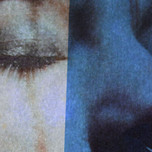
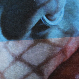
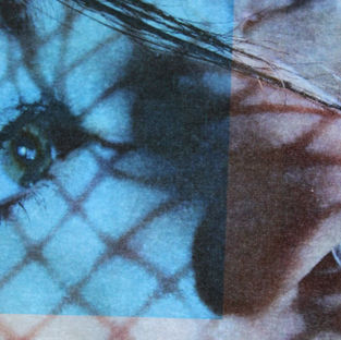
My last final piece idea is to use laser acetate to make tinted shapes over my Andrea Koporova images:

I plan to recreate the same effect as the image on the left however in a different way. In the photo on the there is a girl making various poses in front of the camera such as a gun shape with her hands of leaning on the wall. The artist uses natural light and shapes to make this unique blue and peach effect. These colors are contrasting and match with the model's attire (beige suite, black t-shirt tucked in and black heels). So I feel that the colors that I dye the acetate should be contrasting and match with my model's complexion (for the photos I'm using are zoomed in portraits and do not show the full outfit/body of my model. I've also realized that the shape of the blue shadow is almost and irregular square, although in some of the images the shape looks more triangular, so I will try and incorporate these shapes into my art. Although this image is a collage I am just going to use singular images for I have already done collages in idea 2.


In the contact sheets above, I have put blue laser acetate over my images to make them different shades of blue. Occasionally I decided to put the acetate only partly over the image to give it that geometric effect. I decided not to cut the acetate into triangles for I felt that squares suited the images more and that triangles would look out of place. I selected the images that I thought had good composition and that I think I would like to edit. Sometimes I didn't select an image for I thought that there were too many of the same image. I think one of my favorite images is the 3rd one for I think the image had nice composition and was very interesting.

In the developments above, I have just decided to make the photos slightly more vibrant/saturated to make the blue of the laser acetate more bright. I also decided to blemish (use the band aid tool) to take away the dirt on the image from the lightbox below it. However in the last image this didn't work because the image was too grainy, whilst in images such as the first and 3rd worked better. I also increased the contrast to make the shadows in the image darker. I realized that the images came out slightly grainy, however, I think this gave my images a nice effect. I think that I should have made sure the acetate was straight for example in the last image the acetate isn't straight, its also like this in the middle image in the 2nd line.

In the monochrome edits above, I decided to increase the contrast to make the shadows darker so that that they were more prominent. One thing that disappointed me with these developments was the fact that in some of the images the blue acetate is indistinguishable for example the second image on the 3rd row where you can't see the acetate at all. However, in a way this makes sense because in this photoshoot the main priority was to manipulate color, so by making my images black and white, I have removed my main priority whilst taking these photos.

The images above are my most successful developments for this idea, I like these because they are very contrasted making this the blue more florescent (especially in the last one). Despite this, I still like the second last one because it is unique and although you can barely distinguish the difference between the blue acetate and the actual image, it is still one of my best monochrome photos.


