

looking
/ˈlʊkɪŋ/
adjective
adjective: looking; adjective: -looking
-
having a specified appearance.
"a young-looking American"
Andrea Koporova is a 43 year old photographer born in Slovakia in 1979. Andrea Koporova is a self-taught art photographer based in Austria .She started her career in photography in 2011 and prefers taking photos of people, especially women within their living environment. Her work concentrates mainly on portraits and nude with the main feature being emotions and feelings. The style of her photographs were at first dreamy and light and relaxing to look at, however, her work has gradually become increasingly urban and surreal, mainly through the use of bright colours and modern settings. her main themes have remained the same: isolation, alienation.
In her series Ghost Town, for example, we follow a lone female as she explores an abandoned universe. While we recognize the locations in the images as tennis courts, public swimming pools and stairways, Andrea has stripped them of their original function of accommodating social activities. Instead, a single female figure is positioned in the center of the composition, staring out in the distance, alone. I find that her photos are strange for typically when we think of a ghost town the think of a landscape void of color and life however, she has intentionally increased the saturation. When I think of color I tend to think of life, however when Andrea Koporova uses her saturated colors it somehow makes her images all the more lonesome. Her images tend to be quite simple, the aim of this is to make the girl (the subject/model) the focus.


The images on the right are going to be my inspiration for this photoshoot. The way Andrea Koporova achieves this by slathering vaseline on the models face to get that shiny effect and shining a light through a net. The light gives the image a tropical effect like the model is in the sun and the shadow of the net makes the image more interesting. If the model squints her eyes slightly it helps with this allusion. There is a slight bluish sheen which I think I can get by using the color select tool on photoshop.
PHOTOSHOOT PLAN

CONTACT SHEET

The contact sheet on the right (and below) shows my first photoshoot. I thought it was quite successful for the shadow was reflected perfectly on the models face. Overall I think my favourite images were the ones on the 3rd row for the shadow was reflected nicely and the angles were good. My least favourite was the last photo on the 4th row and the first on the 5th row. I didn't like these because they only showed half the face obscured in shadow. Also on this contact page in most of the photos I didn't use the nose ring, I think the nose ring is a big part of all of Andrea Koporova's photoshoots.
This contact sheet (on the right) had the same amount of successful images as the last one. My thought process whilst I was choosing which images I would bring to the editing stage was that I was relying solely on the on the composition rather than the colours for I figured that I could just change/edit them on photoshop. In this photoshoot I used natural light for before the photoshoot we found that It made a better shadow than using the artificial light (the photos I took with the artificial light were deleted off my camera) . My favourite edits from this contact sheet were on the 4th row for I felt that the shadow was reflected amazingly on my model's face.


In this last contact sheet, there were not many successful images in comparison to the first 2, I think this is because the sunlight was disappearing so the shadows were fainter, especially on the first image. On top of this the angles aren't great and in some of the images my model's face is only half obscured in shadow this makes the other half of the face look bare in comparison.
EDITS


In the editing stage of these photos there wasn't really that much to do. My main aim was to achieve that blue tint on my images (like Andrea Koporova) without making it too obvious. I tried to crop the images so each one was a different angle of composition, for example in some of the images you can only see the nose and the mouth and in others you can only see the eyes. I found that in some of my images the nose and mouth was sharp whilst the eyes were more blurry, you can see an example of this in the 3rd edit in the 2nd row. This is another reason why I cropped my images. I found that there was also a problem with my composition for although I added many thick layers of vaseline my models face is still not shiny enough. Most successful development is the first one on the last line for I think the shadows were very prominent and that the image has really good composition. One think I would like to improve in my next photoshoot is that I'd like to add more makeup to my model's lips for in (especially the last two) images the lip stick is fading a bit. I'd also like to capture more full face photos for in this photoshoot I took a lot of just the eyes, nose or mouth.
PROCESS LOGS

In the process log above I took a screenshot of me adding a channel mixer layer and decreasing the blue to make the model look more pale and add that blueish sheen that is in all of Andrea Koporova's portraits. However once I did this I realized that it slightly dulled the colors of the lips and eyes so that is why I did what is shown in this next process log:

In this last process log I tried to bring the color back into the face; as you can sea in this process log the lips are bright red and the eyes look sharper and more green. The netting also has a reddish tint that matches the lips. I also realized that when I increased the saturation (as shown above) it also had the effect of increasing the contrast making the face look more shiny and bright.


CONTACT
SHEETS
ANALYSIS
In the contact sheets above I took my second photoshoot, in this photoshoot I used different lighting to use a warmer effect, however, I realized that in this photoshoot the shadows show less on my models face than in the last photoshoot. Another thing I discovered with the shadows is that although I was using a net the shadow (most of the time) only showed lines. However as I played around with my light I found that sometimes if I was tilting the lamp to the side the shadow would show better on my model's face. I found that this photoshoot was more relaxed than the other one for with my first photoshoot we (me and my model) were rushing for the sunlight was disappearing rapidly. The main thing I was thinking of when I was snapping these photos on my camera was the angles, I found that if I lowered the camera pointing it slightly up whilst tilting the face slightly to the side it creates a really nice effect making the face look sharper and more edged and the lips more plump and shiny. You can see this if you look at the comparison between my first and second edits; in the first the face was shiny and textured at the same time whilst the second (still a good edit) was not as successful.
DEVELOPMENTS


PROCESS LOGS
In the above edits I tried to highlight the warmth of my images, on the other hand in my first photoshoot I tried to recreate the blue sheen layered on all of Andrea Koporova's images but in this one I found that most of the images were naturally warm even before I edited them and that when I tried to add a channel mixer layer (like I did last time) it just made my pictures look more green than blue. I think my 2 favorite developments is the 1st one and the 1st one on the third row for I think I hit a really good angle and that makes my model' s face look more sharp and defined than most of the other ones. I think that the only bad thing about these images is that you can barely see the shadow however Andrea Koporova has one photo in her human segments series with no shadows at all on the face so I think for one image it is fine.
In the process log above I added a color lookup layer to my image, it was mainly just an experiment however I found that it somehow smoothed out the photo, dulling the colors very, very slightly and adding definition to the face. I decided to leave this color lookup layer on full opacity for I felt that it was only a subtle change in the image and I didn't want it to be any less visible. For this process log I decided to use my most successful image (in my opinion) to give the full extent of my photoshoot.

In this second process log I pulled down the curve to increase the darkness of the shadows and give the face more dark angles by doing this it also made the cheek look more shiny along with the eyeshadow and the edge of the lips and the (fake) nose ring. I was happy with this photo because I thought that the background was black however another thing I liked when I brought down the curve is that it made the background even darker, contrasting it even further with the face.
HIGHTLIGHTING SUCCESS

On the left is my most successful image from this artist. I like this image for I think that it firstly, makes my model's face look completely different; (for the better) , more defined, nose more sharp, and lips more plump and full. In this image the model's face is also very shiny, especially lining the edge of the lips, tip of the nose and inner cheek. Another thing I like about this image is that it is not to bright and saturate particularly in contrast to my first photoshoot for this artist. I'm aware that the shadow is almost non-existent however, I think that this just adds to the clean sharp effect of this image.
COLLAGES
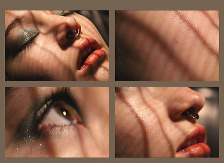


Whilst I was editing these collages I ensured that the warmer images were placed together and the cooler images were also placed together. I had to make sure that the background matches the images tone. For example for the first collage I decided to make the background a warm brown, this image gave me autumn vibes whilst the others are more wintery. I used the same grey blue color for the background of both my cooler images for they were roughly the same tones. My most successful collage is the first one for it is the most put together and reminds me, not only of Andrea Koporova's images but also Rosanna Jones's.