

PETRA COLLINS
emotion
/ɪˈməʊʃ(ə)n/
noun
-
a strong feeling deriving from one's circumstances, mood, or relationships with others.
"she was attempting to control her emotions"
ANALYSIS
<BACKSTORY>
Petra Collins is a Canadian photographer, fashion model and actor, she was born on December 21 1992 and raised in Toronto where she attended Rosedale Heights School of the arts. There, at the age of 15, she started practicing photography. Her father, a former criminal lawyer, is British-Canadian and her mother is a Hungarian refugee. Petra Collins goal 'is to question the current ideology of femininity and recast women in positive/dominant roles' the artist does that through the making of her website The Ardorous, which she created herself on the last year of Rosedale, She 'was getting frustrated with the lack of outlets to share my work. I wanted to see and create work that inspired me and empowered me as a young woman but never experienced that.'
She struggled with mental health issues early on; it’s something she’s openly discussed over the years. In her 2016 portrait series, “24 Hour Psycho,” Collins photographed several women up close while in moments of emotional distress. In her youth Collins suffered from multiple health disorders, for example she was bipolar, strongly dyslexic and developed a mild eating disorder. She is known to spend a lot of her time pondering the mental health of women and the abuse (mental and physical) that they experience and that she herself has personally experienced . She notices the dismissal that is often used when women talk about their disorders and reveals that it was shrugged off like a ‘symptom’ of being female – of her being weak. She makes sure to use her personal identity in her photos she reveals all parts of herself the good and the bad, she does this through other young women currently feeling the same way that she did.
PHOTO ANALYSIS
The photos on the right are part of Petra Collins's series '24 Hour Psycho' she plays around with lighting and color. Her portraits are expressive and capture these young female's emotions perfectly. She takes photos of girls in times of anguish, distress and raw pain, to raise awareness to the fact that women have every right to show emotion and that you can still be strong while showing your feelings. She explores this through her images. It is a common known fact that Collins actually does not edit or retouch her photos, however, I may need to do these things because I do not have all of the resources that she has and I need.
In her photo she uses colors on opposing sides of the color wheel for example, as shown on the right, pink and gree, and blue and orange. This gives the image a contrasting effect. In my opinion the colors in the photographs could mean a lot for example, the color combination for the top image (blue and orange) could possibly symbolise fire and water.
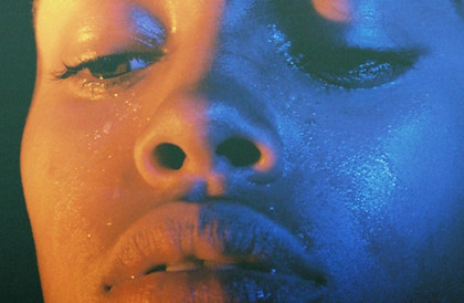

The photographer also plays with the water or tears on these girl's faces, she shines light on them metaphorically and literally. A nice example of this is the top right image, the tears gives us the illusion that the image is sharper, almost as if you are looking at it in real life (not just through a screen).
In her portraits she tends to zoom in quite a lot making sure the faces take up the whole canvas making it the focus of the image in the first image the camera has been tilted slightly downward and the lens pointing moderately up. I have also realized that in her images, Collins never captures the girl looking at the camera, giving the photo a candid feel and making it feel like somehow we are intruding by looking at the photo.
PHOTOSHOOT PLAN

COLOR SCHEME
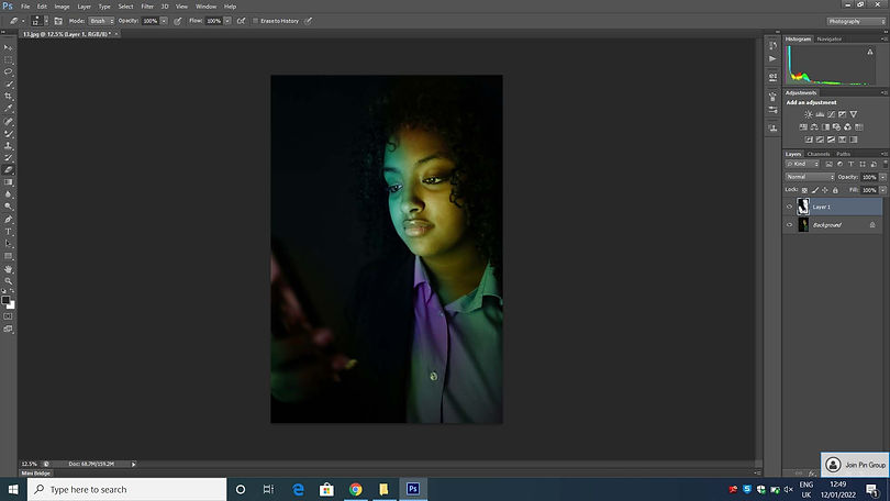
During my photoshoot, I used a laptop to project the colored lights onto my model's face. I don't this worked as effectively as I'd hoped for it didn't make the light vibrant enough. I discovered that in general, the dark blue light did not shine as brightly as the lighter colors such as the pink and green. I found that the closer I held the laptop to my model's face the more the light shone however, I did not want the laptop to get in the way of the camera. I think for my next photoshoot, I would like to incorporate more tears on the model's face. I think that my favourite element of the work was the angles in which I took the photos, I think these were very effective and portrayed the model in a mysterious light, what helped with this was the fact that shadow obscuring half her face.
CONTACT SHEET


The images around this text are contact sheets, these are commonly used by photographers to help depict what images they want to keep and bring to the editing stage, and what images need to be deleted (in some case they just have too much of the same images so they need to delete some, in other cases the images are not to the correct standard) a good example of this for me are the ones where the portrait is too dark or maybe when the photo is blurry. As I am taking photos in Petra Collins style the photos must have clear sharp edges and have relatively bright colors, in some of my images the colors did not stand out enough (however editing/ photoshop helped with this later on in the process). Personally my favorite images were the purple ones (the ones taken from a side angle) on the left. In my opinion these images are sharp and there is a perfect amount of color on the right side of the face. It is also beneficial that the facial features are sharp and precise. My least favorite were the photos on the second row for they were too dark and the color was almost invisible. (I found later on that these were also harder to edit because increasing the contrast/ bringing down the curve made the image grainy and unrecognizable.)
If I was going to take this photoshoot again I would probably try and use more light and tears in the images, I would also capture some close up features, for example, of just the models eyes or lips. I know that this is not strictly Petra Collin's style however, I would like to gain experience from doing more close up photoshoots, maybe even in my final artist.
I think that this photoshoot is very successful and I like how flawless the images turned out. I think that the majority of the images turned out sharp and defined and despite the fact that some colors worked better than others, I think this turned out great.
DEVELOPMENTS


In my opinion the raw images did not need lots and lots of editing, because some of my images already had the color and sharpness needed for these images. However, there were some images where they were ever so slightly blurry, with these all I did was increase the contrast and maybe change the colors a bit (this made the images more interesting). During the editing process, I found that if I edited these portraits too much the image would go all grainy and the colors would become blotchy making the image look more like a poster than the sharp photograph that I needed. On some occasions I used the 'color lookup tool' to give the image a unique quality. I also did this by using the 'channel mixer' which was also great for customizing the colors in my photographs. For example if I had an image that had green lights shining on my models face and I didn't like the color but I thought the composition was good I could change the color of the light with the 'channel mixer tool'. I felt that after I edited some of my images they had a shiny quality that I liked, you will have seen these photos on the third row of my edits.
I thought these edits were quite successful, especially the green one on the first row. I loved the angle of this one and the way that the light reflected so flawlessly onto my model's face. I think that overall the images turned out amazing, and that making the colors more vibrant really helped a lot.
I think for my further developments I'd like to use some double exposure techniques and maybe some mirroring, I'd also like to try to do more color combinations from different sides of the color wheel to give my images some extra contrast.
PROCESS LOGS


In the process logs above, I show some techniques of how I edited my images for example; in the top process log you can see that I have added a photo filter, this made the image pop a bit more, in a way it made the image look like I had increased the contrast (which I actually couldn't do with these images because it added noise and grain to the photograph) so this helped a lot. I also discovered that I could increase/decrease the opacity of the filter so if I thought it was too much I could keep the filter but make it slightly more subtle.
In the second process log, you can see how much I increase or decreased the contrast and the brightness, I found that after I put the photo filter, the photograph was a bit too dark (I was unable to see my models face properly) and I thought the face was a bit too green (the color did not look like light) so I decided to increase the brightness slightly. This also made the green light look more vibrant in all the right places; such as the nose, cheeks and chin.
FURTHER DEVELOPMENTS


Above are my further edits, these are where I gave the images a strange surreal quality, I'm conscious that these edits are not in Petra Collin's style however, I wanted to add a bit of a weird and odd element to my photos for example; the glitch effect. My main aim whilst editing these images was to incorporate 2 (instead of one) color in each image) like in Collin's work. With some of my images I concluded that there was not enough color, with these photos I double exposed a gradient that I found on the internet, this successfully added more color to these images and gave them a peaceful quality while still giving them aspects of Petra Collin's photos. In these further developments I would like to accentuate the colors, therefore I added color to the glitch effect, this also incorporates some qualities of my first artist, Rosanna Jones. You will find that most of the photos I've above that I've edited are glitchy, I find that this style is the one I know most about and enjoy. Occasionally, I attempted to double expose another image over the original, however, I found that this usually did not work and I would end up with an image like the last one on the third row. I found that although this is not the effect I desired, it still amplified the color and also added segments of different colors, supplying us with a variety.
One thing I would do differently, is plan more what I'd do. I feel like this would make the whole process of completing my further developments easier and less stressful. I think that the process of editing was slightly improvised and I'd like to change that when I do my next set of further developments.
One thing that was successful about these developments is the use of color. I think that I paired colors very well whilst I was doing my developments, for example; the blue and purple, purple and orange and blue and yellow, which was my personal favorite.
PROCESS LOGS

I have discovered that if you do not pick the correct double exposure technique the image does not turn out good. This varies and changes for every image, for example for the process log above there were several different styles that worked Linear dodge (add) obviously being one of them, along with screen, hue and saturation. However, overall I decided to go with Linear dodge for I felt that it went best with the image.
PETRA COLLINS <SELFIES>


Above are a few images from Petra Collin's selfie series, here she illustrates a teenage girl's use of a phone. What I see when I look at these photos are the images these girls are trying to make for themselves via technology, the picture shows the youth of this generation trying to make the camera catch only the aspects about them that they like, with angles lighting and positioning of the camera. In my opinion Petra Collins is trying to unleash the fact that these girls are more than just their social statuses. I can't help but realize that from what we can see from these photos none of these young women are smiling, they are merely posing, this makes me think, intentional on Collin's part or just a fluke? One more thing I have realized is that in the photos that capture more than one girl in the frame they are not talking to each other and the only way they are achnologing each other is through the phone in their hands, what does this say about our society and our relationships? The angle in which Petra Collins captured most of these images is on I find particularly interesting for it only shows thes girls through the phone as if they do not exist other than online, I find this extremely worrying and concerning which I think is what Petra Collins wants us to feel.
Now for the physical aspect of these pictures; Petra Collins has purposely blurred the background/atmosphere/setting to make the phone and what is on the phone the priority of the image this is important because it means that instead of technology revolving round the earth the earth revolves round the phone. The background of these images are fairly simple sometimes the image is set in a simple bathroom, sometimes bedroom and in one of the photos the atmosphere is just a plain red/brown brick format. If I had to use one word to describe Petra Collin's color scheme (in only this series of images I find that the others are more bright and vibrant)it would be; subdued for they are dull and lack the vibrance that she uses constantly in her other types of photos.
PHOTOSHOOT PLAN <REDRAFT>
I plan to make my redraft photos more interesting than my older photoshoot, I will do this by adding another aspect to my photos; a phone. I have realized that that this phone is a crucial element of many of Petra Collins's photos so I decided that instead of starting a whole new project on selfies, to merge the to ideas together. My past photoshoot was based on Petra Collins's 24 hour psycho which explored mental health. I have recently discovered Petra Collins's selfie series and by introducing these two genres to each other in this photoshoot the I will be able to venture into the new experience of mental health and technology.
CONTACT SHEET <REDRAFT>


In my opinion, the photoshoot turned out really well, in said photoshoot I can gladly say I merged both mental health and technology successfully. The one thing I would change about this photoshoot would be the visibility of the phone, in some image the phone was positioned so it was clearly in the shot however, in others the phone was nothing but a shadow in the corner of the canvas. For example in the images in the bottom left the phone is not visible at all. On the other hand one of my favourite photo is the one where the pink light reflected on the models face. I felt this made a very good color combination with the models skin. I've noticed that the vast majority of the above images are taken with the purple light I will attempt to roughly even this out in the editing stage. One think that I found important for this shoot is to position the light behind the phone to make it look like it is coming from it. (I did try to do it with just the phone however, the light wasn't bright enough.
DEVELOPMENTS <REDRAFT>


ANALYSIS
While editing my main aim was to make the color pop and to make the phone (the one in the fame) stand out slightly more while doing this I made multiple discoveries; if I increase the contrast too much the image becomes blotchy and unappealing however if I decrease it too much it looks like a film has been placed over the image (I remember doing this with my last photoshoot in my further developments) the second thing I discovered was that the images with the orange/yellow light worked the best with high contrast. I tried to explore more aspects and functions of photoshop, I did this by using the color select tool, saturation and hue. One thing I found out about the function hue is that if you change it too much it makes my model look like an alien, in fact I kept one of these images (the second one all the way at the top of the gallery) , this was originally one of my purple images however I changed the hue of the image so now it is blue, as you can see this image now has a foreign quality for the face has taken on the full blue color and the shirt. One of my favorite images is the one directly above this analysis, the red ones, with these I think the composition is appealing and the phone is clear/visible. During the time I was editing these particular images I decreased the contrast slightly and I found that this made the images more smooth and less blotchy, I really liked this affect.
One thing I would improve about these images is the amount of color; in some of the developments, I find that there is slightly too much color, which, ironically, was the opposite of the problem that I had with my last photoshoot. In some of the developments the images are so brightly colored that the face of the model is almost fully painted in the color.
PROCESS LOGS
%201.jpg)
In the above process log I changed the vibrancy and the saturation to 100. I did this because it created a nice rainbow effect on my model's face, I thought this was really unique and gave the image a strange element, however my favorite effect that this had on the image was that the bright/vibrant colors this adds to the image contrasts with the mood of this photo; part of this task was to make the photo gloomy and dark (moodwise) however adding this color still accomplishes this while making the whole photo more bright.
FURTHER DEVELOPMENTS <REDRAFT>


In the gallery above are my further developments, my aim here was to use a surreal creepy feeling to my original edits to make them more memorable, original and unique. In order to do this I used my previous developments (the redraft ones) and took the editing to another level, I found that the point of doing further developments (well the point for me) was to edit images in a style that I wouldn't have discover if I was editing strictly to the artist's style (however, a well know fact about Petra Collins is that in her series 24 hour psycho she did not edit or even retouch her photos at all! Telling us that Petra Collins in particular does not use editing as much as other photographers may.) I edited the photos above in many different ways, for example the the last photo on the first row (the one with 4 of my models face) I selected the original face in the image and I copied it multiple times, moved each copy around and finally I selected the eraser tool, put it on a light brush (soft brush) and erased/rubbed out the edges of each copy to make it more smooth.
Overall, I think that these images turned out very interestingly, I think that some of the most successful further developments were the ones where I used the mirroring technique.
PROCESS LOGS
Above is a process log of one of my favorite further developments, what I did to achieve this cool style was; copy and paste the background the I changed the hue of the copy making the face blue/green and the shirt a pale magenta color, after this step I erased the parts of the copy that I wanted to look like the original in this case; half the face and the majority of the shirt. I feel like this gives the image a nice layered effect.
HIGHLIGHTING SUCCESS

On the right is what I think is my most successful edit. I think what is especially nice about this edit it the rainbow effect. I achieved this by increasing the saturation and the contrast (only slightly for the contrast). I like this image for although you can't really see the phone the image looks like the phone is still casting this rainbow light on this model's face (and shirt). I think one of the ways that the image has this effect is that the yellow light on the model's face looks the brightest out of the green and blue making it look like the light reflected on the face is coming from the phone.