


In my opinion the edits above turned out really great, although there are some better than others. I think some of my favorites were the second one on the last row, the first one on the third row and the third one on the second row. I liked these because they were the most put together and they reminded me of Rosanna Jones's images. The more random ones, in my opinion are the last one on the third row, the second one on the third row and the first image on the first row. I think the rest of the images are somewhere in the middle. My aim whilst collaging these image was to make the colors opposing (like in the last image) for I think that the cool blue and the warm peach color go really nice together. I realized soon that this could not be achieved in all of the images (like the first one on the third row) for I did not have enough printouts.


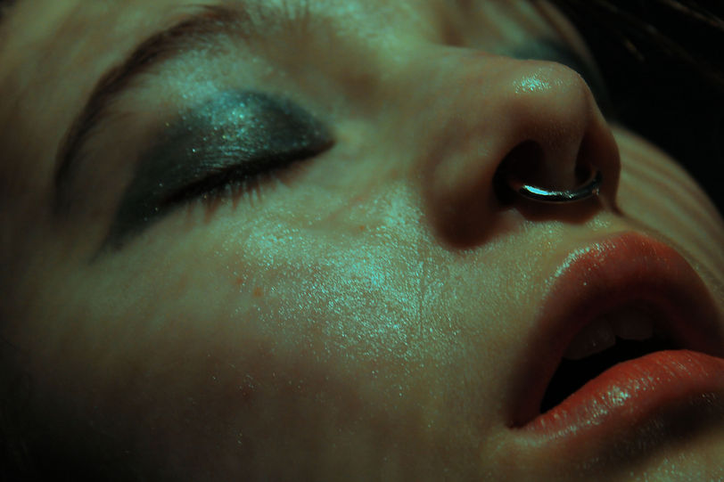
I found editing these images quite challenging for my main aim was to increase the saturation and the contrast, however, if I did any of these things directly the image would immediately posterize itself and turn really grainy. So I found a more effective way to increase the saturation, I did this by dragging the curve down (on photoshop) and then using the brightness and contrast tool to increase the brightness significantly, I found this tactic to be really useful throughout the editing process, for (although it was a slightly longer process than just increasing the saturation) it had a better effect and could be more personalised for each image.