
My second idea for my final piece is to do collages using my most successful photoshoot; Andrea Koporova in the style of Rosanna Jones:


My idea is to use the images above as inspiration for this idea. I've decided that I'm going to use a black background (like the image in the centre) for all my photos to give them a sense of consistency. Although Rosanna Jones uses tape to secure her images to the paper I am going to use a glue stick instead to give my collages more of a clean cut look. My main aim will be to not use two of the same images in a single collage to make them more interesting, although I feel that this will be inevitable for I have a limited supply of images and I need to create a vary of collages.


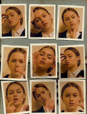
In the contact sheet above I have selected the physical developments that I would like to edit. In the images in my contact sheet I have stuck my printed Andrea Koporova images on a black piece of A3 paper in the style of Rosanna Jones. Although you can not see this in the above images, I tore the black paper out of a notebook and I did not cut off the margin for I thought it added to that casual Rosanna Jones effect and that the images still look sharp anyway.


In the edits above, I decided to mostly leave the image as it was for they were too sensitive for me to do anything but increase the contrast slightly and bring down the curve. Despite this, I think these images turned out great anyway, for each image was already edited on my Andrea Koporova page. The image I found most difficult to edit was probably the last one in the gallery above, for it was already very saturated and bright, however, images more like the second one on the second row were the ones I found easier to edit for they were more dull. My favorite developments are the first one, the second one, and the last one on the second row. This is because they remind me most of Koporova's work.


In the gallery above, I decided to make my edits monochrome. To be honest, I prefer these to my original edits because the paper of the original edits was really shiny, you can see this on the last picture of the third row (the one with the large eye. So I discovered that by making the images black and white (or monochrome) it reduced the shine and made the image look more realistic and less out of place. In my opinion, the best edits are the second one and the 2nd one on the 2nd row. I liked these because they show the shadows on the on the face the most prominently. In my opinion the worst image is the last one (again) for even the image next to it is bad quality and a bit too ambiguous. I also like the second last image because the photos in the collage look smooth and they are not grainy.

In the gallery above, I decided to make my edits monochrome. To be honest, I prefer these to my original edits because the paper of the original edits was really shiny, you can see this on the last picture of the third row (the one with the large eye. So I discovered that by making the images black and white (or monochrome) it reduced the shine and made the image look more realistic and less out of place. In my opinion, the best edits are the second one and the 2nd one on the 2nd row. I liked these because they show the shadows on the on the face the most prominently. In my opinion the worst image is the last one (again) for even the image next to it is bad quality and a bit too ambiguous. I also like the second last image because the photos in the collage look smooth and they are not grainy.