My first idea for my final piece is to do a mixture of Rosanna Jones's work and my final artist Andrea Koporova's work:

My plan is to combine the two images on either side of this text. I plan to do this by taking another Andrea Koporova photoshoot and then ripping up the images like I did with my 3rd photoshoot for Rosanna Jones. I feel like this is a good idea for I have already done these to things successfully and I know what I need to do. Another reason why this is a good idea is because it incorporates 2 of the artists that I have already done.
.jpg)


In the contact sheet above I took my printed Andrea Koporova photos and I ripped them up and placed them on their other images. I tried especially to combine the more bluey images to the other tanned ones to give the images that contrasting effect. I tried to avoid any perfect squares and stick more to irregular shapes like Rosanna Jones. I think my favorite photos were probably the last images on the 4th row for I thought they were unique and pretty. I found that after I put them on the lightbox only the bottom one had an eerie glow whilst the top ones were more vibrant and less grainy.

In the edits above, I mainly just enhanced the colors in the image to make it more vibrant and bright than the original image. However, this proved to be quite challenging for the base image was pale and void of color and the images placed on top were quite bright already so they didn't really need much enhancement in opposed to the base image. I attempted to select the parts of the image that needed brighter colors so I could make the image look more even, however , this just made it look out of place and strange. So I decided to keep the images as they are.

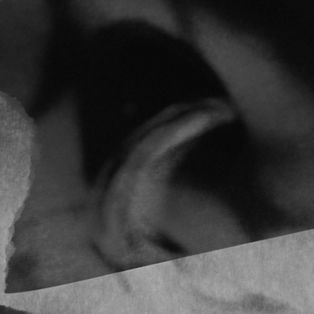
In the images above, I took my previous edits and made them black and white. I did this to solve the color problem that I had whilst I was editing my last developments and, in my opinion, this worked relatively well. Although this solved my problem from before, it also introduced me to a new dilemma; I found that (whilst I was customizing how light or dark each color is) if I made it, even fractionally too dark/light) makes the image completely black/white. So, in result of this I found that I had to stay in the middle area of the spectrum (meaning that in most of the above images, there is not much contrast.

Above are my 3 most successful images, these are my favorites for multiple different reasons. I like the first one because the two photos look so in sync with each other despite the change in color intensity and graininess. I like the second one because the long eyelashes give the image an additional feminine quality that the others don't have as much. I also like the ambiguity of this image, the fact that if you look at it briefly, your can't immediately pinpoint what it is. I like the last one because the rips in the images are defined and visible whilst in the first one it is not as much.


