
MAKING A GIF
RAW IMAGES


I chose these images from my third photoshoot, for Wolfgang Tillmans. These had multiple images that showed the full process of the water being dropped into the water, therefore I picked them to be the images I will combine for my first GIF.
PROCESS LOG :
1

2

3

I first looked in my folder for the images I wanted to select for my GIF.
I then went to GIF.ME and pressed the upload images to make my GIF with those images.
I then found the images and selected GIF so that they would upload as a GIF.
4
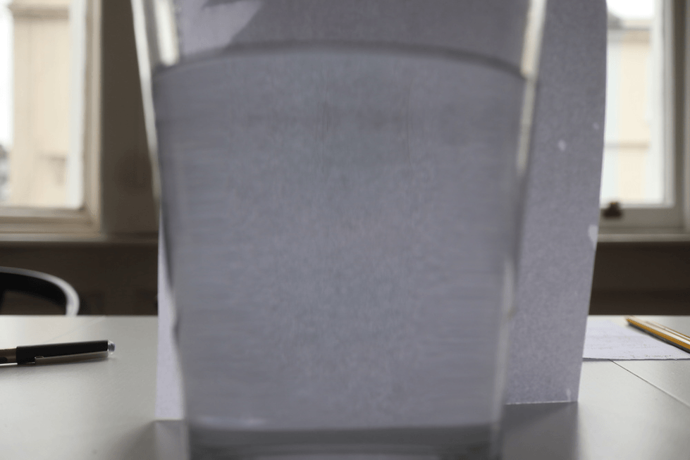
I was happy with the outcome of the GIF and the setting I picked were correct, however the raw images were just to out of focus and this is not the GIF I will want to use to show as a final development of experimenting with making a GIF. To develop this further I would add a colour hue adjustment on Adobe Premiere pro to see how colour look on GIF's as they change, but I wouldn't develop it further as the blur is a very bad aspect of this image that will tamper with developing the GIF.
COLOUR EXPERIMENT

I first took the video/GIF to VSCO where I added a subtle filter and some adjustments. I then took the video to Alight Motion ios and added the hue effect where I added key-frames and changed it from 0 to 180 at each end of the video. I then uploaded as a video at 1440p. That was the full adjustments and I liked the outcome of the colour however the original blur which was also a problem in the original GIF was a very unsuccessful aspect, which stopped this videos successfulness. I also experimented with sharpening the video however it appeared worse and over-edited.
SECOND ATTEMPT
CONTACT SHEET


PROCESS LOG


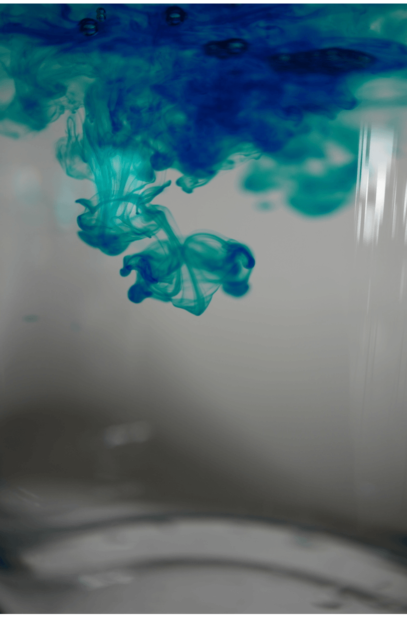
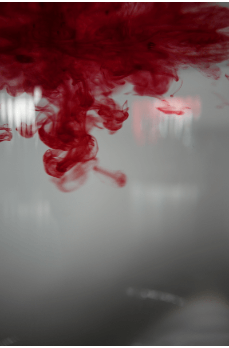
I started by importing and finding the images that I wanted to make into a GIF. These were then ordered into seperate folders to make the process quicker and easier. -> I then went onto 'GIFMaker.Me' where I added the images and they were then downloaded as a GIF at the canvas size '1320x2000' for them to appear in 2k. -> I then imported these GIF's as live videos onto Capcut, where I started by going to the adjust panel. -> I then used the HSL tool to adjust the colours, saturation and the luminance. I was happy with the outcome and not many changes were made between the raw and edited GIF's -> I then exported the GIF's at 4k with HDR 60fps and 24 and 25 fps for the turquoise and blue ink GIF.
RAW GIF'S :
DEVELOPMENTS


25 fps
24 fps

60 fps

60 fps
I edited these GIF's using Capcut IOS. I was happy with the clearness and colour in these GIF's. There was no blur in the images and the GIF's had very successful and pleasing tones of red and blue, which meant not many aspects other than slight hue and vibrance adjustment needed to be made. One aspect of these images that could be developed further is adding a negative or colour filter/effect that could possibly make the images appear even more in the tones and hue's in Wolfgang Tillmans work. This could be by using Premiere pro and inverting the light (background only) or the whole GIF (the GIF being a video or live photo). Or using Capcut's negative effect selection to adjust the image to multiple different tones and explore and experiment with those tones in Further developments. Overall, these GIF's were simple, pleasing and successful to me and I enjoyed the process and outcome of these GIF's more than the last developments.
HIGHLIGHTING SUCCESS

I chose this GIF to annotate the successful aspects of it further. I liked the background and it was not distracting and was also not overly exposed where it would also effect the colours of the ink. I liked the inks tones as-well. They were very clear and you could see all the details and bubbles as it moves. There was no blur around it and it had the most focus on the center where most movement was throughout the whole GIF. The only aspect that I didn't like was the smudge/area of light in the corner, however there is blur surrounding that area for most of the GIF's run time and it isn't to distracting to the point it effects the rest of the GIF's successfulness. I was happy with the GIF's outcome and the fps help makes the movement smoother. there was also more images in this GIF meaning it could slowed down once adding 60fps, which is why there is movement at every point of the GIF. I did not edit many aspects after having made the GIF meaning the appearance is also very close to the raw images, which is why I enjoyed the exposure and hue's.