

SHILPA GUPTA
ARTIST ANALYSES :
Shilpa Gupta is an Indian photographer from Mumbai and she takes multiple styles of photography in a very abstract and personal style. She is known for sculpturing and photography and went to a Indian school for both. Her photography style usually consists of using multiple objects and photo's and re-photographing them for the final photo. Her exhibitions have gone around in India, America and other countries. She was born in 1976 and is still a working artist. Her photography style consists of using very basic appearing objects, which unveil to show a lot more.
In my opinion I find her photo's very interesting as she explores very simplistic objects and is able to combine them by using colours that work together and objects that bring harmony when put together in a photo. in her photo's she adds photo's that are close to her and explore objects and areas around her. I also like the technique she uses as it does also explore editing and the use of angle, lighting, background and focus.
Shilpa Gupta adds meaning to her photo's through the use of her objects and her images. She usually adds images from around her area giving a sense of herself in her images and her objects are common household objects that feel as if they are her putting her home life into her photo's. She is interested in how information is visible or invisible and gets transmitted and internalized in her life. She reminds me of the Paul Mpagi Sepuya's style of abstract and contemporary photography, which both use in their photo's.
For her photo's she use a digital camera that is able to then send her images over to a editor where she can edit them. In her photo's she uses a very high key background and uses colourful printed out images that fit the theme of her photo's. In all of her photo's she frames her images and usually doesn't add much to them over than some other white images that fit the theme of a high key background. For her images to appear this way she uses a high exposure and a neutral ISO and the lense allows in a significant amount of vibrance for the raw images to look very close to the final edited image. She uses blur over her images so that any small disturbance's will not be visible due to blur in the image.


Her images also use long exposure in some images, which contain messages and have multiple different words lit up on a sculpture or written out using a light and long-exposure. None of her images include a very high amount of editing other than adjusting contrast, vibrance and sometimes exposure. for her images to appear fully white background, she has to increase the exposure of some images. What makes the center images stand out is also the colour, and to achieve this she has to use a high vibrancy and contrast to have no grey or faded appearance over the images.
To capture images similar to hers I would have to use multiple different images of colourful objects, similar to her work with framed photography. She often experiments with different colour combinations that are visually pleasing, which would have to be considered when planning for a photoshoot similar to hers. In my opinion her colour work and framed images are most successful and are what I would aim to achieve when re-capturing her work. artist other than her I would focus on are artist that use colourful, contemporary photography. I would also look at artist that experiment with collage and multiple photos layered together.
The images that I liked the most were her images with frames and colour. It uses both lots of colour selection and time as she would have to consider the main colours of a photo and the small details, which could make a slight change to how we see that image when paired with all the other images she has taken. Her images also have to be captured with multiple different amounts of sharpness. Some images can be blurry to show more prominent tones and some have to be captured with a very small amount so that all the small details and colours are clear. This is an aspect in all styles of her photos where their are always many small aspects to consider, which make a large image/development successful.
I am very excited to take images for this style of her work, although it is a very difficult process to understand, which will mean that their are a lot of aspects of experimenting and finding one successful way to take and edit images for this artist. An aspect which excites me is the final outcome of her work and the satisfaction of all the work in one successful image. - "Always be original and true to you and your art. Do not be something you aren't. " - SHILPA GUPTA
PHOTOSHOOT PLAN

CONTACT SHEET

For the photoshoot I took two set of photo's. The first set was not very successful as they did not capture much similarity to her work. Additionally, most of those raw images were not captured successfully and had unsuccessful ISO, lighting, exposure and background. For the second shoot I focused on capturing more close up images of different coloured items. I would layer these together when editing. I also took images of frames to layer under the images of paper as this would make the images appear framed and re-captured. For these images I wanted to capture them in more high-key lighting so that they appeared more colourful and I used the creative assist mode to capture the images with more vibrance.

PROCESS LOG
( Frame overlay owned by/found on Google Chrome not owned or taken as photos by me )

I used adobe fresco to edit the images. First I made a fully (light greyish white) white background. and added PNG frame images that were then lightened.

I then used some filters over the raw images such as increasing vibrance and saturation and added the images over the white page/background.

I tested different shapes that fit the images and frames and different colour combination (all with the same background). Then I exported them at two levels 1080p and 2k/4k
DEVELOPMENTS


I used a combination of adobe fresco and adobe photoshop to edit the images. Some images I used fresco to merge colour photos that I had taken of paper. I did not change the appearance of many images other than cropping and changing the shape of some images. I chose to add frames in my last developments as this looked more similar to her work and realistic. I found that it was more successful to darken the background to being a very bright greyish as this would increase the contrast between the frame colour and the background colour. I also lightened some images as this would let the shade of the frame images appear over the other images making them appear as if they were framed when the image was taken. This technique is something I would experiment more with in my re-draft. I would aim to use a darker appearance of the background across all my re-draft images as I found these images more successful. Overall, I found that these first developments were somewhat successful to help m understand the technique of capturing images in her style, however some of the images I captured at the start were not usuable, which is something I would have to change for my re-draft photoshoot.
HIGHLIGHTING SUCCESS

I found this image to be successful in capturing some aspects of her work. It included frames in the image, to make all the images appear framed before they were captured together over a white wall (which they were not). I used different red images and nature images that I had captured before and layered it over a pink paper image I had taken and adjusted to appear more red-tinted. What I found successful was that the theme of red was able to continue throughout the whole image, which some of my other developments had less correspondence in them.
CONTACT SHEET
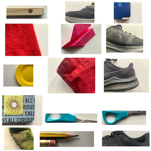
For this photoshoot I took photos of objects around my house. I chose to take images of objects that had good colour connections and had a white background. I had taken the images from bird´s eye view. For the images I considered the colours and how they would go together, additionally I considered the background and how much of the image was taken up by white space/colour.
For the images I tried to capture them at the same exposure and capture them at the same angle. I considered how much saturation was in each image and that each image had the same amount of colour, so that it could be increased equally when editing. I wanted a fully white background so I captured the images with a high amount of highlights. I captured the images directly under the light so that there would be no shadow decreasing the white shade of the background.
Aspects that were successful were the brightness and angle at which the images were captured. However, I found that the colour in some images was to vibrant meaning I would have to edit them before collaging with other images.
CONCEPT
-
Take images of different coloured items such as clothing and kitchen items.
-
Take images of outside areas with different coloured items and objects. Capture more than 20 images.
DEVELOPMENTS


I used Adobe Fresco to edit my re-draft developments. I found these images more successful than my first developments as they captured more colour and focused less on the surrounding objects. The images also have a more corresponding theme across them. I also found it successful that the images all captured similar aspects of colour across them and when all images of the re-draft are presented together they still appear as if they were one image together. When editing the images I used the same base background and frame image from my last photoshoot. I lightened the frame image as this would mean the shadow on the inside and outside of the frame would still appear over the image making it appear realistic (an aspect I copied from my first photoshoot). I used a very bright grey colour for the background as this would still allow the shadow to appear in the image and it would also contrast the white colour of the background and the frame.
( Frame overlay owned by/found on Google Chrome not owned or taken as photos by me )
FURTHER DEVELOPMENTS


I chose to make further developments by making the images B&W as this is a aspect of her work she has used in some of her images. However to keep more of the original aspect of her work I used VSCO and only decreased the saturation and increased the highlight in some images, without using a B&W filter. This kept the frame visible and the shadow around it. I found these further developments were able to capture similar aspects to her B&W work. If I were to take more further developments I would use similar images however capture them with a background image such as the sky layering over many images from these B&W photos. This would be inspired or be an re-creation of her photos of the sky including black images over them.
CONCEPT
THIRD PHOTOSHOOT : I will take images that align with her sky images, by capturing separate images of the sky and different black objects. For the editing of the images I could also use my further developments from my re-draft photoshoot as I found those images very successful in her style.
-For my third photoshoot I will aim to capture the same theme of her photography exhibitions, by printing out all images and re-capturing them and layering them over A bright-grey background. I could ten frame the whole image in Photoshop or Fresco (adobe software's).
DEVELOPMENT

For the final piece I recaptured the images over a white background. I used the frame image I had used in past photoshoots and I increased the light curve and exposure for a fully white background. I found the final out come successful in achieving the aim of her exhibition work.
( Frame overlay owned by/found on Google Chrome not owned or taken as photos by me )