

Catherine Hickey
Unit 2 - Identity
Marc Quinn
Marc Quinn is a visual artist that uses several different mediums such as; sculptures, painting and photography. In photography he mainly does take pictures of plant-life to convey his views on identity and environment. What I find to be the most interesting about his work is that Quinn is very skilled in what he does and uses an array of different materials that makes his work explicitly different from others.
Some of the work that he is most known for is being a sculptor, especially since he was given a solo exhibition at the Tait Britain. With that there is also that his work is very different from others with what his overall question he is exploring through his work. " what it is to be a human being in the world today". Quinn has been able to use that question to flow through all of his work and use it as a drive to be different not just by using different mediums and materials.

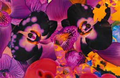


In my opinion I think that His work is very interesting because although some may see his photography as generic, I find that it is one of the most interesting in terms of composition and also use of color. He mainly uses warm tones for the flowers and uses the cool tones to create a contrast with the background. The contrast is a large part of the impact of the image and the multiple different shades of green and pink has a nice overall similar view of the entire image.
IN conclusion I find that his use of contrast plays a large role in how the image impacttes others. Also his work is overall appealing although it may seem very cluttered in terms of composition.
Photoshoot plan:

Contact sheet (RAW images)

-
Very Plain
-
Very boring and showing too much in the background.
Throughout the photoshoot I was attempting to capture images in the style of Marc Quinn. To do so what I needed to use was flowers a contrasting/ bold background and colored clay balls. When capturing what I was trying to focus on the different angles I could capture and how the colors could complement and or contrast with each other. What I would like to improve on is my use of color and also my use of contrasting colors.
However I think that I did a fairly good job from what I have achieved in this first photoshoot, and although I would defiantly like to improve on what I have done; I still think that I have done a satisfactory job.
These images will be edited more than once and will be altered so that there is not too much of a difference from the original, but enough for you to notice the change.
Developments exploring colour


For these first developments I have decided to completely change the hue of the images and by doing so changing the atmosphere of the original image. What I like about these images is that there is not much of a distinct color pattern that you must stick to, what I have found is that it is mainly based on what hues look the best (varies from image to image). While experimenting with different ideas it is important to stick with certain ideas, and not to stray to far away from it. Overall I believe that it is important for me to have a change in composition and that there needs to be a slight bit more contrast in background and the objects in the foreground.
Highlighting success
Further Developments:
Experimenting with color


For my further developments I have experimented more with my use of color, in this case I wanted to also experiment with saturation. In some cases I have found that there needs to be less variation is color saturation. When using saturation if it is overly saturated the colors are to bulky and there is a more messy atmosphere created. What I have done is rather than changing the hue I have decided to change the gradient, to give them a tonality that I think suits them. In conclusion I believe that some of the images now look more refined and have improved, however there needs to be improvement in the muddiness a few images.
Redraft contact sheet - raw images

-
Too much negative space
-
Too saturated with red
-
Blurry
During the photoshoot what I have been focusing on is the lighting and composition of the image and how it may effect the image and how it could be improved from previous photoshoots. What I have tried to accomplish is to create images similar to Marc Quinn, which will mainly be accomplished when editing due to his use of unnatural colors. I have made sure that some of the objects create a variety of positive and negative space, and to have more contrasting colors so that there will not be very similar images. Overall I believe that what I have done is quite successful and that there still are areas that could use more improvement, in this case it is lighting. However in comparison to my last photoshoot there is still improvements from what I have done there, improved in composition, and overall they are still successful.
Redraft Developments:


When developing these images what I wanted to make sure I did was to make it look realistic, with a unimaginable color range form them.
Experimenting with mirroring:
Artist reference- Damien Hirst:
What I wanted to reference in these developments is Damien Hirst's kaleidoscope. His work is very similar in a way, especially when I am going to be mirroring images; which makes them look quite similar to these images.


