

Catherine Hickey
Unit 2 - Identity
Final Piece Ideas
Consolidating my theme:
Maisie Cousins:
-
Flowers
-
Femininity
-
Sexuality
Annique Delphine:
-
Flowers
-
Positive space
-
Femininity
Marc Quinn:
-
Lighting
-
Hue
-
Composition


Lighting- When using lighting for these artists there is a common theme of contrast between to duel colors that are used. Without the contrast there will not be the same effect made on the images
Composition- In these artists, they all mostly use positive space to convey there work with a more clear message. Also when using positive space it allows for more flowers to be equally saturated in the contrasting lighting.
Color- The colors that are used are mainly chosen to contrast with each other and also to complement each other so than when it comes to editing them I will not have to worry too much about the colors looking the same. Also the artists tend to use warmer tones, for example Maisie Cousins.
Most successful developments:
Marc Quinn:
Annique Delphine:
Maisie Cousins


These are what I believe are my best images throughout my artists. By creating this it allows me to tell what are the necessary tones, lighting, and composition that my final peace will need. Now I know collectivly what I need to focus on and what I could improve on.
Final peace mood board:

Experimenting with double exposure:


For these developments I have decided to experiment with double exposure to emphasize the amount of color and contrast that is being used. I have decided to use warmer tones for the highlights and mid-tones, and cooler tones for the shadows; to create a strong contrast both with and without the layering. In some cases I have decided to create large amounts of positive space in order to allow the entire image to be covered in the layering of the same image. The main challenge of the photoshoot is the chance of the color changing entirely, especially when double exposing.
Experimenting with layering:


For these developments I have layered them on top of each other, so that they look like they are framing each other. When having to place images on top of each other, the main challenge is to make sure that the images are centered and that they are not uneven or lopsided. Also since these images are already edited what I wanted to do was if there was too much of a contrast I would use an opposite color of the main image, the image on top, and would put a layer of the opposite color, which the image could be oversaturated with. Overall I have found these images to be successful, with the exception of the repetition of images.
Experimenting with Boarders:


What I wanted to achieve with these developments is to create very cohesive images that not only work well together but also the complement the image and the frame. Throughout this prosses I have had to make sure that the color of the frame is one of the most prominent colors in the original image, so that it is consistent with the original color scheme. In some cases, like the last development of this series, there needs to be a small amount of contrast between both the frame and the image; however in this case I have used another image as a background to make the colors standout. I have also found that with the style of images I have, they look more consise when
Experimenting with Gifs-
changing color:
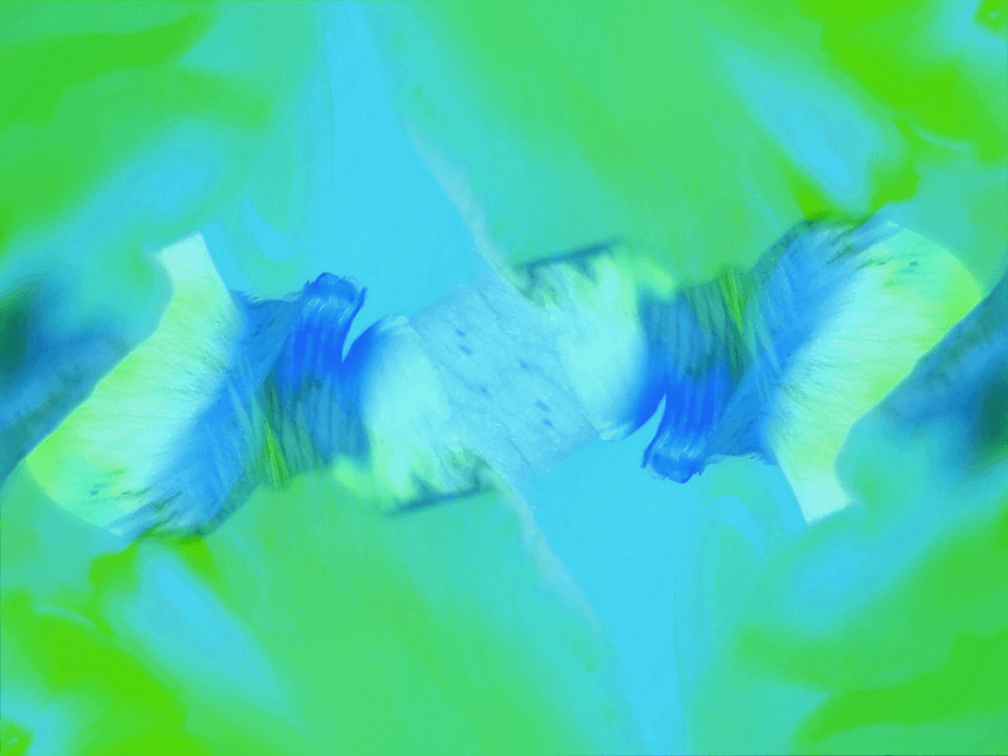
I have previously experimented on gifs in my previous unit (Fantastic and Strange). What I have found form that is when changing the hue, moving in intervals of 10 creates and overall drastic change between each frame of the gif. So then what I decided to do was to change the interval of which I change the hue to 5; thus creating a longer gif, and soother transition between the frames. when selecting the image I did not want to pick one with a large variety of color, instead I wanted to find one that stands within a specific tonal boundary so I can see the overall contrast as it shifts form one hue/tone to another.
Final piece:

For my final piece I have decided to work with layering and acetate since it incorporates different quality of my previous work. What I have found most interesting about the layering is that they can show different qualities of the same image of improve the overall appeal of them. As the images above display layering can display different effects it can; make up one overall image or show a mixture of images layered on top of each other. what I have decided to do for my final piece is to layer my images from my Annique Delphine project, and create a layering effect (which crates a more natural look since they are printed on acetate). The layering is very meticulous because I want the overall image to look put together from almost every angle. I have decided to use layering of images because it creates a more natural effect in comparison to what I have done of photoshop and allows there to be a more calming look. The images are also able to complement each other which creates a very easy structure to work off of.
I have also recently been working with acetate which is a very useful material since it is translucent and allows for light to pass through and also work well with different materials behind it. What I have done for my final piece is used photo mounts to frame the image and make a more put together look. Overall my use of layering has created a nice effect that complements the images when they not only stand alone, but when put together.