

Paolo Roversi


In 1964, Paolo Roversi's passion for photography was kindled as a teenager when he went on a vacation to Spain. Roversi was born in 1947 in the town of Ravenna, Italy where he was raised and after his vacation in Spain he set up a darkroom in his home where he spent hours developing film. In 1970, Roversi began his professional career where he started working for Associated Press; in the following year he met ELLE Magazine's art director Peter Knapp whom invited Roversi in 1973 to Paris which Roversi has never left since. In Paris, Roversi started working for the Huppert Agency as a reporter where his interest for fashion photography was sparked. Marie Claire published his fashion photographs after which he started gaining recognition.
Roversi is notorious for his dramatic and outlandish fashion photographs; he sometimes uses long exposure to capture the model's movement to give us a sense of time in his work ,but to also add to that surreal ambience in his work. Furthermore, there is a pattern in his work of this dream-like light (in image 1 above) which he does by using a large format Polaroid film. His work ranges with many different colours ,but he mainly does colourful photographs to have the model stand out more to the viewer. He shoots all kinds of different clothing with a lot of different colours ,but one thing that is consistent in his work is how striking and unique the outfits are. I would not classify these outfits as 'normal' (something that you would not normally wear for a casual outing). A lot of the outfits all have different textures ranging from ruffles to glitter. In addition a lot of his photographs are portrait making them more intimate to the viewer as the model is staring right at the camera (you) so you feel as if the model can see that you are looking right back at them.
Paolo Roversi usually shoots in the dark with another light facing the model; he usually shoots with a natural light in his studio from a large window ,but when he is shooting artificially he uses either a HMI light or a handheld Mag-Lite. Paolo Roversi uses the aperture 1/4 as he does not want too much motion captured but enough so that you can get a sense of the time and motion there is. To shoot he usually uses Hasselblad V camera when there is non of the soft light but when he does shoot with the soft light he uses the 8×10 Polaroid; I would say that the soft light in his work looks similar to the reflection of water. They are both this surreal form of light that has this unique aura to them.
Growing up Paolo Roversi was afraid of the dark to which he stated "When I was a child I was very scared of darkness, partly because my brothers would lock me up and scare me … So I became a very good friend of the light." When using the natural lighting from the large window in his studio he stated that "the sun and light are the beginning of life" and he uses the light to paint in his work which creates a personal and intimate element in his work. His goal is create this intense aura with the model ,but to also make the viewer feel as if there were there; he wants you to feel all of the fives senses smell, sight, touch, taste and hearing. The model staring at you through the camera along with the use of the polaroid camera really brings out this sense of intimacy but it is also similar to as if you were inside that room with the model and 'peeling away at all the layers within the photograph'.
Paolo Roversi's photographs are really compelling pieces of work; his personal photographs elicits a lot of reaction from me as I do feel like me and the model are in the same room (as Roversi had intended). Moreover, the outfits in his work are another form of art that will really pull you into his images. If I had the opportunity to ask him three questions I would ask him: how many shots is enough? Is the lighting the most important aspect in your work? Do you always like the outfits you are shooting? Overall, I am fascinated by the amount of thought that goes into Roversi's work along with the intense aura he creates and I do quite enjoy his work.

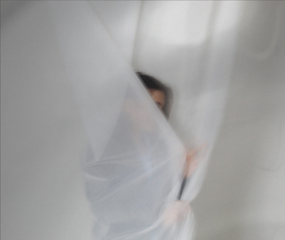
Anna, Paris 2017 Photo: Paolo Roversi/Courtesy of the Dallas Contemporary
This photo was taken by Paolo Roversi in 2017 and it is named 'Anna, Paris'. My first thought when looking at this image was how much darkness there is; there is more negative space than positive making the figure in the middle mysterious. The image contains the model Anna Cleveland gazing back into the camera with her figure being slightly blurred. She is wearing a striking, red dress that makes her stand out against the dark background. This juxtaposition makes us analyse her facials features and red dress and she is the only visible thing in the image. You can see the technique of long exposure being used here as she is slightly blurred. Furthermore, I am puzzled by her figure as I can not tell whether the skin in the front is her arm or her back. The photographer has capture him playing with the light here as you can tell that he is using one light to reflect onto the model whilst he shoots in a room of darkness. In the image it is as if the model is about to look backwards ,but you do not know when really bringing this image to life; it looks like the model is quickly glancing back. In my opinion, I quite enjoy this image as there are a lot of elements that bring it to life.

CONTACT SHEET

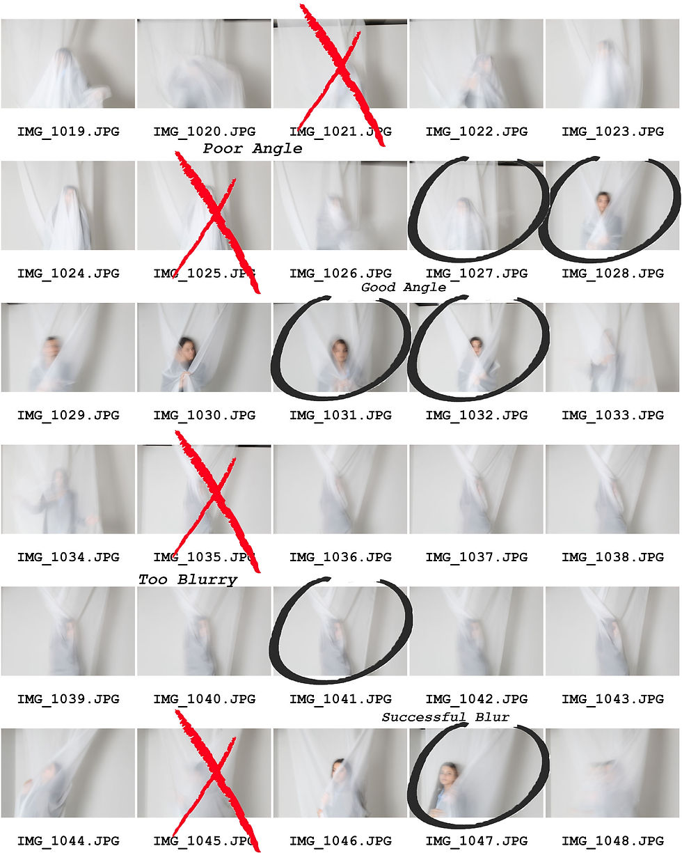


For this photoshoot, I was planning on capturing Paolo Roversi's dream-like ambience he has in his photographs ,but to also make sure to capture time well in my work. The camera I used here was a Canon e5 using aperture f/2.8 along with auto ISO; I decided here to use aperture f/2.8 as I felt that I wanted my images to contain a lot of long exposure ,but not too much so that the viewer can distinguish what they are looking at. With the lighting here I decided to use an artificial studio light so that everything is well lit and it makes everything illuminate more. One successful element here was the lighting as using a very strong light juxtaposed my model to my white background making my main focal point stand out more. For instance, in the images 1079 to 1080 you can see how the model stands out against the white background as the light was diagonal from her making it so you can see a shadow of the sheet so that you can tell the space in the image. One unsuccessful element was how some images were too blurry; as a result of this, in some images you can just see a faded silhouette which is not what I wanted and therefore I could not edit the image. For instance, in the image 1075 you can make out a person but it is too blurred to see any details. If I were to retake the images I would possibly increase the aperture for some images; with the aperture some photos turned out well and others did not so I would experiment with the aperture.
As you observe at the bottom there is a contact sheet with images of a candle and a flame. The reason for taking these photos is because to capture Roversi's surreal portrait images I need to have the soft light he has in his images which I will mimic by taking photos of candles (similar to burnt film images) and overlay them on top of the original images of the model.
PROCESS LOGS


I started off the process by using the 'Rectangle Maquee Tool' to copy and paste the candle overlay onto the portrait photograph. In order to move it I typed 'CTRL+T' to 'Free Transforrm' the image over the portrait to my liking.
Previously, I changed the overlay to 'Black and White' and now I have selected the blending option 'Multiply' so that the candle image is blended into the background but not too much.
Finally, I added 5% to add to the surreal ambience as I am recreating Paolo Roversi photographs who adds this surreal light to his work.
DEVELOPMENTS


To start editing this I added 5% noise; thereafter I opened an images of the candle and using the 'Rectangle Marquee Tool' I hovered over the entire image and I copied and pasted it over my original image. After, I selected 'Black and White' and used the blending option 'Multiply'. I choose to use 'Multiply' as it increases the saturation as well as making the background visible. Furthermore, using noise made the image have a more surreal ambience to it. I believe that overlaying the candle images overtop the background lay mimicked the soft light he does in a lot of his work. One aspect I enjoy here is how similar the candle image overlays are to Roversi's soft light that he uses in his work ,and how the overlay does not overwhelm and shadow over the background. One element I think I could have improved upon was how some parts of the images are too dark compared to other parts of the image; to improve upon this I could have decreased the opacity or saturation of the overlay. Next, I will change have the overlay different colours and saturations to further my experimentation of colour as in Paolo Roversi's work he has a large variety of colours and not just black and white.
FURTHER DEVELOPMENTS
experimenting with colour


To exhibit my experimentation of colour, here I double exposed the same candle images and I selected 'Hue/Saturation'. Using this I picked a colour to my liking and decreased the saturation as I did not want the colours to be too overwhelming or else would not be able to see the background layer. This technique fits in with my project as I am trying to recreate the different tones of colour Roversi's uses with his large format polaroid camera. One aspect I really enjoy is how the colours are solid colours but they are not too saturated. One aspect I could improve upon was to make my colours more soft next time although I stated that I did enjoy how they are not too saturated. Next time, I could possibly use a wider range of candle image layers and to also possibly find a filter that makes the candle overlay more 'soft looking'.


REDRAFT


My intentions for this shoot was similar to the last ,but this time I decided have my photographs a bit more exposed. Here I used the same camera as last time (Canon e5) and I experimented with the aperture; I mainly used f/2.8 ,but I also used f/4 to have less motion so that it can be more similar to Roversi's work. One successful element was the lighting as my intention was for it to be overexposed to make it more 'strange'. One unsuccessful aspect was how most these images had too much motion or the fabric was in the way; next time when taking more Paolo Roversi's photographs I will tell the model to not go as crazy or even increase the aperture. I believe that I have all the shots I need for this redraft as I have over 20 images that I have decided to edit.
DEVELOPMENTS


To began I editing process here I have added 10% noise as 5% was not visible. Afterwards, I opened a candle image, and made it 'Black and White' with the curve adjusted; then I copied and pasted the overlay onto my original image (of the model), and selected 'Multiply' so that the dark parts are highlighted which mimics Paolo Roversi's soft light. I then drew over the background image with the 'Burn' tool so that none of the creases of the black fabric would be visible. One aspect I enjoy is how perfectly the motion of the red fabric is captured; for instance in developments 7 and 17 the red is exaggerated more bring out the movement just as I had intended it to. However, one aspect I did not like was how some candle overlays did not show the highlighted parts as I had wanted so I had to get some candle overlays from the last photoshoot as they were better in having the highlighted parts. To improve next time I will try lighten the candle overlays so that they stand out more. Next I will create an image composing of three different images I took, and it will show the impact of different photos together.
FURTHER DEVELOPMENTS
experimenting with mirroring


Here I have started by firstly adjusting the curve to make the wrinkles of the background less visible and to make the model more visible; next I selected 'Colour Lookup' and selected the filter 'filmstock_50.3dl' to have the image more exposed and decreased the opacity so that the image was not too over exposed. After I selected another filer on 'Colour Lookup' named 'DropBlues.3DL' and decreased the opacity on that filter too as I did not want it to overwhelm the photo. I decided to use this filter as it not only enhances the colour of the fabric ,but it also enhances the colour of the clothing and makes the motion more smooth. To finish the process off I dragged the image down to the 'box with the +' (which made another exact layer) and selected 'Free Transform'; after which I held down both fingers on the pad and selected 'Flip Horizontally' which mirrored my image and selected 'Lighten'. One aspect that I like is how the colours work well together in these developments as the red and blue juxtapose each other making the main focal point stand out more; in development five you can see how much the red and blue work together to make the other colour stand out. Another aspect that I like is how smooth the motion is; as a result of the filters I used, it made the motion of the fabric come out more smooth which compliments the image more ,making it less chaotic. One aspect I do not enjoy is how in some images the model is too blurred so most of her body is either gone or undistinctive. To improve upon these developments maybe I could have chosen a different blending option as I did not decrease the image in anyway.
FURTHER DEVELOPMENTS
experimenting with black and white


My main objective was to make sure that these developments did not come out too dark, too dark so that the model was barely visible. To start editing I firstly selected 'Black and White' and decreased curve. Using the 'Burn Tool' I darkened the background so that the light in the background would be reduced to none and to also bring out the model's figure. Thereafter, I copied and pasted one the candle images and added it onto a new layer where I selected 'Black and White', but instead of leaving it there like the other further developments I decreased the curve in this layer as it highlighted all the details more so that it was more visible. Afterwards, I selected a blending option, but I did not select the same blending option for every overlay as it depended on the overlay as some would be too dark or too light. One thing they all had in common was that I decreased the opacity on all of them because it would overwhelm the photograph or not be visible at all. One element that I thought went well was how successfully I managed to make the figure look 'dream-like', but to also have it stand out from the background so that it did not fade into the background. I have thought deeply for the last 10 minutes about flaws in my work, but I can not think about what I could improve upon or something that is deemed unsuccessful. Maybe next time I can try some photographs why the model is more exposed, and not 'ghost-like' here.
FURTHER DEVELOPMENTS
exploring composition


To start editing my developments, I firstly selected three images that I took within seconds of each other as they would be really effective all together in one image, and it would exhibit time. Thereafter, I decided to all crop them to a 1:1 ratio so that they would all be around the same size, and compliment each other well. After putting all their sizes into a calculator to find out the width and height my black image needed to be, I selected 'File' and 'New' so that there would be a blank image to work with. I then copied and pasted all of them onto the new canvas and put all three of them into a row, and then I cropped the background so that there would be no white visible in the new photograph. I made three landscape photos ,but for the last image I decided to make the last one portrait to experiment with image layout. One successful element was how effectively these images demonstrate time as they all compliment each other. To improve for next time I could possibly experiment with more layouts.
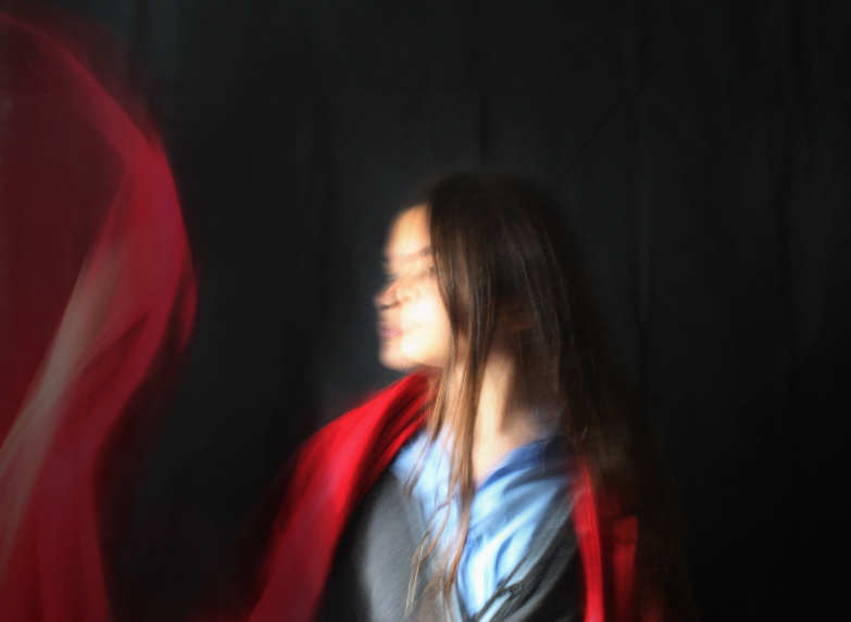
HIGHLIGHTING SUCCESS

I have chosen to highlight this particular image as I believe this was one of the more successful developments; all the elements here compliment each other as there is a perfect balance of blue and red. Furthermore, the composition here is successful as the two faces staring at each other along with the fabric at the bottom colliding with each other exhibits dynamic movement with the use of aperture. Moreover, the over-exposure here is very ideal and the exact exposure that I had envisioned when editing the further developments.
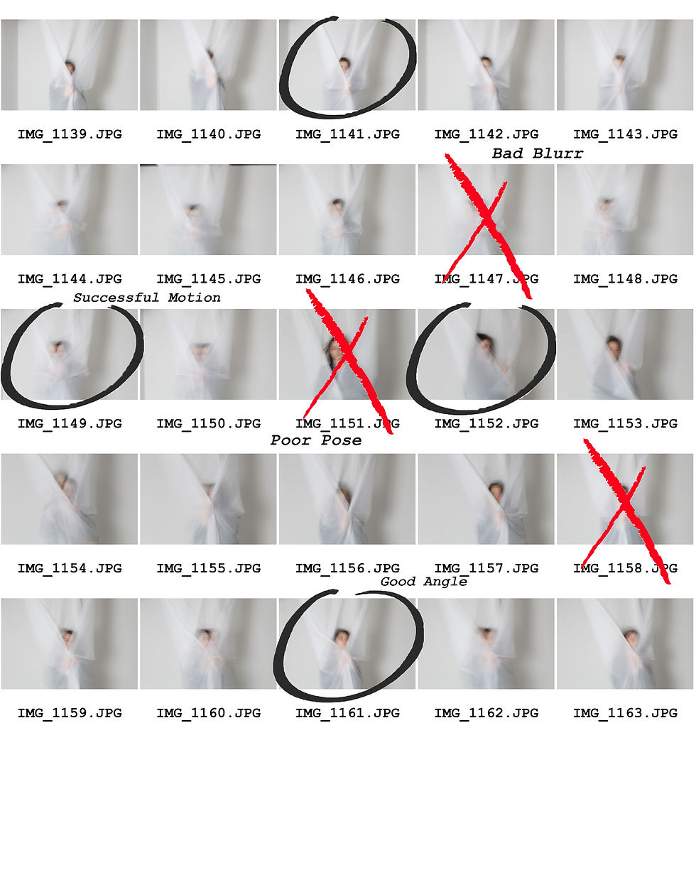
PHOTOSHOOT THREE


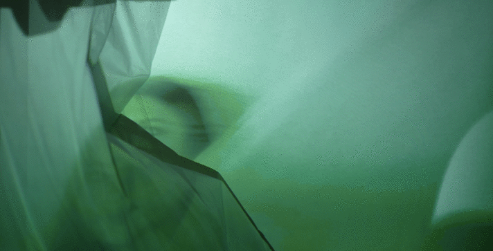
For this shoot, I decided to further develop my experimentation of capturing the fabric. This photoshoot would very clearly exhibit the movement of fabric. To take this shoot, I took some of my most successful images from my 'Paolo Roversi' page and project them onto a wall whilst at the same time having myself wave around the fabric in front of the projection. One successful aspect was without a doubt the fabric motion as the projector's light made all of the fabric's dark parts and highlighted parts more exaggerated and it also distorted the image capturing Paolo Roversi's surreal ambience. One unsuccessful element was how some of the images in the background was a bit overexposed and pixilated so I was unable to edit them. If I were to take these images again I would possibly experiment with different coloured fabrics to expand on my experimentation of colour within my page of Paolo Roversi.
DEVELOPMENTS


The editing process with these developments was very simple; I went to 'Image' then 'Image Rotation' and I selected '90° Clockwise' to rotate my image so that it would be facing the right way. Depending on the image I adjusted the curve so that the fabric's dark and highlighted parts are more exaggerated to bring more attention from the viewer to the fabric. I would say that this fits in well with my project as it is similar to how Paolo Roversi experiment with the light and darkness throughout his work. One aspect that I like is how perfectly the fabric is captured here in time as it perfectly displays the movement. One aspect that I did not enjoy was how some images did not distort the photographs the way I wanted it to. In some images, the fabric just made the entire images blur or it just made the background image not look distinctive. My aim here was to have the images distorted, but not too much so that the images was unrecognizable. To improve the photographs I could have possibly experiment with the contrast to emphasise the movement of the fabric even more. Next I will double expose my images to experiment with movement even more, and make a GIF to further develop the colours in my photographs
FURTHER DEVELOPMENTS
double exposure


To further develop I decided to double expose my images as I thought that double exposing these photographs would convey and add to this idea of movement with the fabric. To edit these images I used the 'Rectangle Marquee Tool' and hovered over the entire image to copy it. Thereafter, I pasted the image onto itself and selected the blending option 'Soft Light' as this option did not make the image too saturated. Using 'Free Transform' I moved the image slightly to one direction to as it gave the illusion to the viewer that there was two parts to the image. One aspect that I enjoyed was how the double exposure adds to the theme of motion to my photographs, and it also adds to the surreal atmosphere. One aspect that I did not enjoy was how some images had parts that were too dark or did not add affect at all (seen in developments 6 and 4). To improve for next time, I could have used 'Flatten Image' and adjusted the curve to make the image less dark or more dark. Next I will make a GIF of the colour changing because there was a lot of colour seen in this shoot so I would like to expand upon this theme of colour.
FURTHER DEVELOPMENTS
GIF making

Here I selected one of my most successful photographs and decided to make it into a GIF. To do this I firstly opened 'Hue/Saturation' and added it by +10 in Hue to change the colour of the entire image by a little. Afterwards I save it as a new jpeg. I repeated this process by adding it by 10 and saving it after. When I had finished saving the images ,by going up to 180 and going down to -180 reaching 0, I went to the site 'GIFmaker.me'. I input all of the saved images and selected 50 milliseconds ,which was the rate of the speed the images went by. One successful element was how it adds to the theme of movement which is somthing I mention frequently through out my portfolio. One unsuccessful element was how in some parts of the photo, it looks pixilated which is not what I was aiming for as I wanted a smooth transition in this GIF. To improve I coould have picked a different image where the colours are more 'smooth' in the image (where there is a nice gradient of colour).