

Final Piece Planning
MOST SUCCESSFUL DEVELOPEMENTS:


The images exhibited above are developments that I have decided as the most successful images from each artist. These images have helped me decide what to capture images off for my final piece as from looking at these as a whole helps my combine them better together. I have decided to mirror these images, and use long exposure as those two techniques have been featured frequently throughout my portfolio.

MAIN CONCEPTS:
Francesca Woodman:
-black and white
-long exposure
-lighting
Paolo Roversi:
-long exposure
-double exposure
-lighting
Bill Wadman:
-mirroring
-double exposure
-long exposure
- Every artist does something with long exposure, and exhibit time in their work which is something I want to incorporate into my final piece
- Recently a lot of white is being displayed into my work, and I would like to use white as a background for one of my final pieces
- Many of my further developments are experimenting with composition ,which is mostly putting three images together, and I will experiment with this for one of my final piece ideas to explore the impact of series.
ARTIST RESEARCH: HEATHER HANSEN


The images displayed above are pieces created by the performance and visual artist Heather Hansen based in New Orleans. Hansen was born in Idaho and she later graduated from TESC in dance and theatre design. This led to her moving to Tokyo and studying with the dancer Kazuo Ohno, where she later refined her skills in Paris studying classical fresco painting and contemporary dance. With this background of dance and art it has combined to produce the images we see above. Hansen has preformed in many countries ranging from The City Atelier, Lehmbruck Museum, Duisburg, Germany, Vilas Fine Art , Letchworth, UK to Hasla Gallery, performance for Ariang TV, Gangreung Seoul, Korea.
Exhibited here are kinetic drawings made by Hansen. She produced this art, simply by lying on a large piece of paper ,and by using charcoal, she uses the human body to translate it onto the paper below her. To the right, is a video named 'Emptied Gestures' which shows the process of her making the kinetic drawings to which she stated ''Emptied Gestures is an experiment in kinetic drawing. In this series, I am searching for ways to download my movement directly onto paper, emptying gestures from one form to another and creating something new in the process”
Hansen's work is mainly monochromatic as she usually uses black charcoal to transcribe her work. In 'Emptied Gestures' we can observe that she usually smudges the charcoal with her hands to create these dark, faded lines adding this peculiar look to it. Since she utilizes her body to create her work, we can observe that there is a lot of curved lines within her work; in all of her art there are circles, and she usually never draws straight lines. These curved lines add to the idea of movement as when thinking of the word 'movement' you would think of something that is very frantic and usually nonlinear movement. There is a repetition of symmetry within her work as Hansen's charcoal drawing looks like it has been mirrored similar to my third artist, Bill Wadman. The curved symmetry patterns link with the idea of 'movement' and 'motion' which is a recurring theme seen in my work.
In my opinion, I believe that Hansen's work is very eccentric. Through utilizing the human body Hansen creates these idiosyncratic, charcoal drawings where the idea of 'movement' is a repetitive theme throughout her art as the work she does is kinetic drawings; according to Google, kinetic is 'relating to or resulting from motion'. Heather Hansen's art relates to my project as we both have connotations to the word 'movement' which is the main reason why I have researched her for my final piece. If I were to ask her three questions I would ask: do you have any inspiration? How did you come up with the idea? What is your favourite piece and why? The most memorable aspect of her work would be not the art itself, but the process she does in order to create these pieces.
CONTACT SHEET


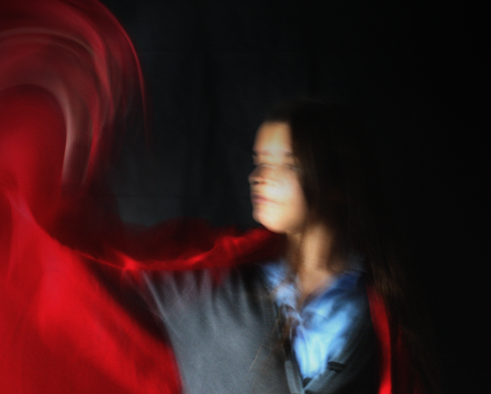
My intentions for this shoot was to ensure that the black fabric stood out ideally. One successful element was the pose and composition of the photographs; I believe that the movements along with the poses pulled the images together successfully. One not so successful element was the lighting; initially I planned on taking the photos during the day and having natural lighting that complimented the model and the fabric well. However, by the time it had gotten to take the photographs, it had already gotten dark and I had to use the light behind the model otherwise you would not be able to anything. If I were to take these images again I would definitely take my photographs during the day to so that I would have an improvement in lighting as lighting impacts the entire image itself. For this project, I could have taken even more so that I could have more images to edit in the future.
DEVELOPMENTS


To edit these images, I firstly made it 'Black and White'. Afterwards, I selected the 'Spot Healing Brush Tool' to edit out the framing of the wall so that the main focal point would be on the the model and the motion. Next, I increased contrast and brightness so that the overall image was more visible ,and so that there would be a larger juxtaposition between the black fabric and the white wall. To make the motion more dark I went over it by using the 'burn tool' to darken it and make it stand out more to the viewer. Thereafter, I used the 'Rectangle Maquee Tool' to copy and paste the image on top of itself; I then selected the blending option 'Soft Light' as it did not harshly mirror the image, but it was more of a 'soft' method of mirroring the image. This fit in with my project as it contains all the elements from each artist I researched: Francesca Woodman and black and white; Paolo Roversi and the use of fabric; Bill Wadman and the concept of capturing motion; Heather Hansen and the idea of kinetic drawings. One aspect I enjoyed is the harshness of the movement as it stands out a lot but not too much that it overshadows the model. To improve upon my work I could possibly try making the double exposure layer a bit more harsh and I felt that it is a bit too soft.