

Francesca Woodman


Francesca Stern Woodman was born in Denver, Colorado 1958. Woodman was exposed to art at a young age as she was born to a family of artists; she took her first self-portrait at the age of thirteen titled Untitled (Francesca in High School, with Bonnet). In 1973, she started studying at the Rhode Island School of Design. Woodman later moved to New York in 1979 to make a career in photography. Woodman's career ended up consisting of over 800 prints and a great legacy.
Woodman is most notable for her self-portraits ,occasionally of other models of similar age, nude ,or partially nude; in contrast, images of the nude model is often blurred or covered up. Woodman uses the technique of long exposure to capture the movement ,and freeze that moment of time to display it into her work. She has predominantly used high-key lighting in her work to better portray her models; her work is all natural lighting as she shoots in ruined buildings where there is a lot of light and open windows. Moreover, she uses wide angles to not only feature the model ,but to also showcase the ruined interior around her ,or the model.
Woodman's work is monochromatic; she shoots in black and white with a certain degree of grain to it to make us think back to the 1900s film camera. In some of her photographs she uses a mirror to play with our perception of space. We have to look closer to get the answer to what exactly we are looking at. Woodman experiments with space and time; she considers her space and the relationship between her and her background. In addition to this, she also makes us look in for a closer look when she adds white frames into her work ,which make her photographs more personal and intimate. In Woodman's work there is a recurring pattern of her either ,usually being the main focal point of the image but a bit more blended into the background ,or her being right in the middle but being covered up by an object. Whenever Francesca Woodman is nude in one of her images, this gives it a sense of vulnerability as she is exposing herself for the camera. However, she also makes an effort to cover her body which is usually blurred or covered up which contrasts with her being nude.
A leading theme in her work is Gothic literature due to influences of Victorian narratives. This is exhibited with many hints of religious imagery in her work and symbolism in her photographs such as derelict, tombs, ghosts, angles and ruined buildings. Furthermore this is portrayed in her long exposure images where the figure of a woman is blurred where Woodman refers to them as ghosts ,however, many today refer to them as an angel. The black and white atmosphere with Woodman's vintage clothes makes us question when these images were taken ,making them timeless along with the 1900s film camera aesthetic. Woodman made most of these images when she was a young teen to a young adult and so as a young person she brings up many questions of sexuality, questions of self, body image, alienation, isolation and confusion ,which relates to the world of teenagers who have to deal with these questions themselves ,which if the person looking at these images were a young person it would make it more personal towards them.
Francesca Woodman's intimate photos really evoked emotion out of me. She exposes herself throughout her work which bring a level of intimacy; not only that but I can relate to her as she asks questions that ,I, as also a teen can relate to. Visually, her work stands out from the rest; you want to find out more just from one glance. Woodman tragically died of suicide after a battle of depression and most of these images were taken when she was in that state of depression. These images gives us insight into a young woman's mind who had suicidal feelings and emotions; some images taken right before she died making them ten times more interesting as you would wonder what emotions she would have felt and if she had put those emotions into her work or not. If I could ask her three questions I would ask her: what is your favourite image you have ever taken? How much thought do you put when making each image? Would you have ever experimented with black borders or low key lighting? The most memorable thing about her work was the meaning behind her work and how much thought she incorporated into her photographs.

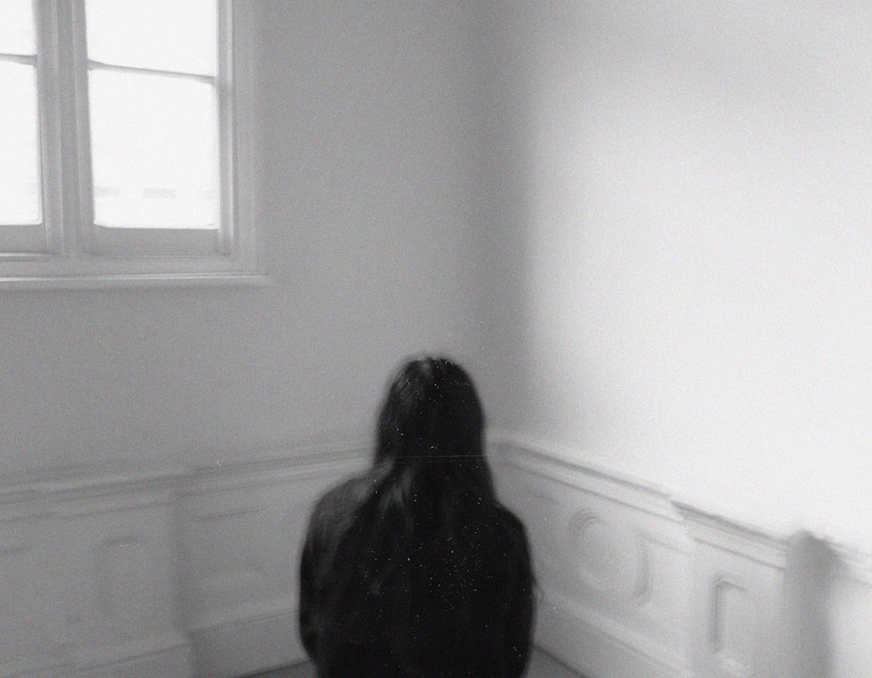
Untitled (MacDowell Colony, Peterborough, New Hampshire) 1980
In this image you can see a young Francesca Woodman wearing tree bark on her arms. This photograph is a reference to the Greek myth of Apollo and Daphne; Apollo had angered the God of love ,Eros, and as revenge Eros struck Apollo with an arrow of love so subsequently he fell in love with Daphne ,a woman who swore to remain a virgin. On the other hand, he struck Daphne with an arrow of lead filling her with hatred towards Apollo. Apollo chased Daphne for her love ,but Daphne was turned into a laurel tree by the river god Peneus who heard her cries.
In the following photograph you can see Francesca Woodman with tree bark on her wrists. She is centred with her arms sticking up in the air almost like she was one of the other trees; her arm is slightly blurred so that she blends into the background. The most captivating part of this image is the main focal point (Francesca Woodman). She sticks out but at the same time mixes in with the background. The background to the right is bit puzzling because you quite can not make out what is there. Is that a tree? Is it the film's grain? This carries on with Francesca's theme of playing with our perception. She continues to play with our perception by confusing our sense of space and time. You can tell that there is a woman in the front ,however, she blends into the background just like the tree and you can see her move which adds to the confusion. In this photograph, Woodman experiments with her relationship with nature as most of her work is in ruined buildings. She becomes 'one' with nature and blends in. Something effective about this photograph is how effective she is with making space and time so puzzling.


CONTACT SHEET


My intentions for this photoshoot was to capture Francesca Woodman's surreal portraits. Here you can see two contacts sheets; for the first one I took those photos on my phone to capture the model with the background. For the second contact sheet I tried taking photos with a camera (Pentax WG-10) to try capture long exposure ,but it did not turn out as I had hoped. In pictures 13 and 14 you can see that the light is too overexposed so the camera is not focusing on the main focal point (the model). One successful element was how I experimented with my space and time; in the second image (of the first contact sheet) you can see a girl swinging on a tree. You can not see it as it is too small ,but the legs are a bit blurred. The blur exhibits time ,similar to Woodman's work, and has good composition. Another successful element was how blended in my model was with my background. For photographs 25-31 the model slightly blends into the leaves ,but whilst also sticking out to the viewer ,which is exactly what I wanted. One unsuccessful element was my long exposure photos; I only took two long exposure images and those did not turn out as I had wanted them to so I can not use those. Furthermore, I decided not to take anymore as I knew the rest of my long exposure images would turn out the same. If I were to take my images again, I would possibly take them indoors this time to better capture my long exposure photos to display space better and add Francesca Woodman's puzzling aspect. I believe that I have enough shots for my project although I could have a wide variety of long exposure images.
PROCESS LOGS


To start the process, I have already made it 'Black and White' and now I have gotten an image called 'film grain filter' to overlay it on top of my background to give it that 'vintage camera look'.
In order to make my photographs look similar to the work of Francesca Woodman, I have decreased 'Contrast' to -50 and increased 'Brightness' to 74 as it makes the photograph high-key adding to this surreal ambience.
To finish off the process, I added 15% to add to the illusion that the photographs were shot on a film camera.
DEVELOPMENTS


These are my final developments; to edit these I adjusted the curve, decreased contrast, increased brightness and added 15% noise ,depending on the image. Furthermore, I double exposed an image of an old film camera overlay. To do this I searched up 'film grain filter' and selected the images I wanted; thereafter I copied it and pasted it onto Photoshop using Ctrl + V. Then I had decreased 'Fill' to at least 50% and decreased 'Opacity' to 50%. These editing techniques are really effective as they parallel to Francesca Woodman's work; Woodman does high-key lighting and edits it to look like it was taken on a film camera which is what I did here. She makes her photos timeless and make the viewer question what her images were taken on. This fits in with my project as ,although it is not self-portrait it has the unnatural and surreal element to it. An aspect I really liked was how all of my images had the perfect tone of it being in black and white and high-key lighting. However something I could have done differently was the camera's resolution. Woodman's work is all in high resolution and very clear ,even though it is mean to look like it was shot on a film camera, but mine is not that clear as I had wanted it to. Next, I will take a redraft with long exposure self-portraits to really capture Francesca Woodman haunting photographs.
FURTHER DEVELOPMENTS
experimenting with colour


In these developments you can observe the use of colour; most of Woodman's photographs are in black and white ,but in a few instances they are in colour. When editing these images I considered the saturation and how Francesca Woodman edits her photos that are in colour. Her work is usually in warm tones and are slightly saturated; during the editing process, I turned the saturation by +20 and added 15% noise. I added saturation as it brings out the colour of the leaves more and adds enhances the photo overall; I added the noise as in a lot of her work it is grainy to have the film camera 'look'. One aspect I really like are the colours. The colours here are mostly orange, blue and brown which adds to the old, haunting atmosphere. To improve upon the work I could have used a filter using 'Colour Lookup' to add to the colour.
REDRAFT


For this redraft I decided to focus on long exposure to capture the 'ghost like' figures ,similar to Francesca Woodman's series 'On Being an Angel'. To take these images, I used a Canon e5 on aperture 1/4. I chose to used 1/4 as anything below would capture too much light ,and I wanted something that would blur me but not too much. One successful element was without a doubt the long exposure. This time I have a large variety of long exposure images that capture Francesca Woodman's 'haunting' ambience which is exactly what I have done. One unsuccessful element was the use of material. Here I wanted to experiment with fabrics (9332-9335) but I had to take these inside with artificial lighting which did not work well and was not quite in the style of Woodman. If I were to take these again I would try get a more bigger and vintage fabric to really explore the use of materials here ,but I would not change anything about my long exposure images. I believe that I could have taken a couple more shots ,but overall I would say this photoshoot was successful.


For these developments, I considered how I could display space and time; I made sure to increase brightness, decrease contrast, add noise and overlay film filters. I chose to do the following as it brings the 1900s film camera look to make these look timeless just like Francesca Woodman's work; I chose to wear a long black skirt and a dark knitted sweater to add to the timelessness. One successful element was how time was exhibited; in development four you can see me jumping into the air which demonstrates Woodman's element of her unnatural poses. I noticed in a lot of Woodman's work that she blends into her background where as here I stood out from my background; the unsuccessful aspect here was how much I stood juxtaposed to my background. Although my background ,and I, had the timeless aspect I wanted they contrasted with each other too much ,which is not what I wanted. To improve next time I could possibly have a lower aperture to blend into my background more. Next I will make a GIF to further my experimentation of time.
During the photoshoot, I thought of making a GIF by taking a photo of me jumping and each time I take a step to my right. For the editing process, I kept it the same but made some changes; I increased brightness, decreased contrast and added noise. I decided not to add an overlay here as each time the image's overlay would be different making it look messy. I could have used the same overlay ,but since this is a GIF it would not look like it was shot on a film camera. I chose to make this GIF as the use of an aperture 1/4 and the images moving shows a pattern of rhythm but also exhibits my knowledge of displaying time in my photographs. However, something that I could have improved upon was how the camera was held; since these were self-portraits ,and I did not have a tripod, I had to ask a family member for help taking these. They could have held it more firmly so only I ,and not the background, is moving.
PHOTOSHOOT THREE


My intentions for this shoot was to take what I have learnt from my past two previous shoots and to combine them. I felt that the cobblestone road really worked well with the shoot I was trying to take here; in the third development you can see the model's reflection in the window which really fits in with my experimentation upon space and time as in a lot of Francesca Woodman's she plays with mirrors to trick her viewer perception. Something that did not work well was the lighting; my objective was to take my photos during the day to get natural lighting in my photographs ,however by the time I reached my location it had already gotten dark ,as it gets dark very early now. This time of round my subject blended more into the background which was very successful here. For this shoot, I believe that I have the amount of shots that I needed.


The portrayal of time is really successful; when taking the photographs I told my model to 'go crazy' and I managed to capture some very unnatural poses such as development 27. You can not really tell what is going on there and how she managed to make that pose which the aperture made even more puzzling. Furthermore, in development 15 you can see her reflection ,which although was not intentional, worked really well with the concept behind my photographs. When editing these images I used the same editing technique as I did last time ,but I increased brightness and decreased contrast a bit more here as these photographs are more darker; from developments 17-29 they have a more darker tone. An aspect I really enjoyed here was the poses and how the movement is shown here; in development 13 the arms' motion is exhibited really well. Something that I could have improved upon was possibly increasing brightness and decreasing contrast as I would say that the tones are too dark to showcase my model. Next I will experiment with composition and try to add borders.
FURTHER DEVELOPMENTS
experimenting with composition


Here you can see the demonstration of experimentation of composition; to make the first five developments I selected the image I wanted to experiment with ,and using the 'Rectangular Marquee Tool' I copied it. Next, I selected 'File' and 'New' to have a new, white canvas. Thereafter, I pasted the original image onto the new one and using 'Free Transform' I sized ,and moved, the image to my liking. For developments 5-10, I printed out some images I thought were really successful and printed those out; I then took some photos with them still attached to the paper ,and some I cut out and put onto white paper. I did not further editing in Photoshop as I felt that if I had increased contrast you would not be able to see the actual image and if I felt that that the image would be in high-key lighting which would not fit what I am trying to create. I think that the first five developments were really successful as all the border vary ,however I could have tried to make the borders smooth to really give it that old ambience. For developments 5-10, it would have looked better if the paper was bright white and not a dull grey but it would have been difficult to achieve.


To produce these images, I firstly picked three images that I thought would be really successful together; firstly, I went onto all three images and used 'Ratio' and then I selected a 1:1 ratio so that all images were around the same size; using the 'Rectangular Marquee Tool' I copied the first image. Thereafter, I went to the first image and extended the image ,with 'Crop', so that I could fit the second image. Afterwards, I pasted the first image onto the second image and using 'Free Transform' I sized and moved it to my liking. I then did the same with the last image. To make the border, I flattened the image ,so that I could copy it all together, and selected 'File', 'New' and chose width '10,000' and height '4,000' so that the image would not be too small or too big. This fits in with the work of Francesca Woodman as it has that personal element as well as the experimentation with composition. On aspect I really enjoy is the border size as it is not too big but it is also small enough so that you look in for a closer look. Something I could have improved upon cold have been possibly to have the images with borders in between them so there is more negative space than positive.
PHOTOSHOOT FOUR


When reflecting upon my last shoot, I thought that it was not good enough and one shoot that was really successful was my first photoshoot so my intentions for capturing these photographs was to capture captivating images. I had originally taken more photos than seen above on a camera (the ones above are taken on a phone) but the SD did not unfortunately register so therefore I could not use those images. One successful element was the composition because in this shoot there were lots of good backgrounds that my model could experiment with as I wanted her to really play with nature for this shoot. One unsuccessful element in this shoot was not really an element to the shoot, but I could have taken more photos on my phone to improve as you can never have too many photos.
DEVELOPMENTS


To edit these developments, I started by making it 'Black and White'. Afterwards, I searched up 'film grain filter' and copied and pasted that image onto my photograph; I put 'Fill' on 50% and 'Opacity' on 50% and selected the blending option 'Multiply' as it highlighted all the white parts of the overlay. Next, I selected 'Brightness/Contrast' and decreased contrast and increased brightness. I did this because this would fit into the style of Francesca Woodman where her images were high-key. Thereafter, I added 15% noise to add onto the idea of these images being shot on a film camera. One aspect that I particularly like is the adjustment of contrast and brightness as just by simply editing that really pulled the image together to make it look like the work of Francesca Woodman. To improve upon my work, I could try to make the overlay more visible to give the appearance of an film camera even more as I feel that it is not as visible as I would like for it to be.
FURTHER DEVELOPMENTS
experimenting with mirroring


Throughout these developments you can observe that they have been mirrored; in order to mirror them I firstly selected my most successful developments. Using the 'Rectangle Maquee Tool' I hovered over the entire image and I copied and pasted it over itself. Afterwards, I typed 'CRTL+T' to 'Free Transform' my image and held down to select 'Flip Horizontally'. Then I selected the blending option 'Lighter Colour' as I had decided that it was best suited to mirror my images because it was not too harsh and completely mirrored the image. One aspect that I enjoy is how the lighting still stayed with the image as usually images become really dark after they have been copied and pasted over itself. To improve for next time I could experiment with different blending options to have a variety of different mirrored images.