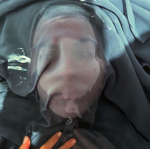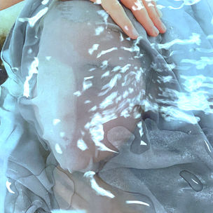
DAVID OLDHAM
ARTIST RESEARCH:
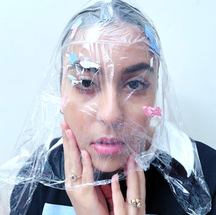
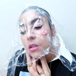
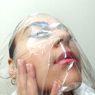
David Oldham is a British fashion and film photographer. He is popular for his editorials and fashion photography. He takes a variety of different styled photographs. There are a range of different style photographs from black & white, colourful and moody. He focuses on portraiture and also the body. While looking at his work there were multiple different features that are eye-catching and fun. However, his work is also simplistic. Oldham's portfolio labelled "Beauty" he took a variety of portrait photos of a variety of model's faces.
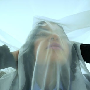
The mature role played by the model executes many meanings. Linking back to the concept of 'hidden identity' this is accentuating precocious similarities between the photographer Elena Oganesyan. Both photographers not only express themselves or the model express them selves using minimal expressions, but also there is a apparent sense of serenity that causes a sense of notion form the viewers. These are coupled with a strong but fluid composition. He utilised milk, make up , sheer thin fabric etc. Using these different mix medias left an effect on his works whole. Looking at his work, made me feel fascinated as took snapshots in different styles but was also able to show emotions and express them. I think David Oldham is a fantastic artist to look at as it is similar to my recent artist that I looked at (Elena Oganesyan). This is because he also looks at the concealment of face and obscuring faces and whilst maintaining the models beauty. Not only, it links to my overall project - hidden identity - as I am still wanting to express emotions form the inside but also and to show the beauty of the model. Looking at his snapshots as a whole , he prefers to shoot with high-key lighting. Using two contrasting light choices underlines and allows the occurrence of a delicate duality. The merge of being happy on the outside but hurt in the inside, vice versa. If Oldham does not use a diverse background, he won't be able to show the beauty of each model or the expressions.Thus, this allows the features and the body language to show and be striking. These images also look like they were shot in a digital camera and on a low sensitivity since he did not want to achieve that grainy effect over the pictures.
Manipulating photography, David Oldham creates images that are devoid of colours or minimal with colour. Creating images devoid with colours can make the compositions less distracting and focused on the main parts. However, using minimal colour palettes allows the viewers form a meaning behind the photographs. I find David Oldham's work interesting as he uses different mix media but he does not uses them to have the pictures turn out to be distracting. For example, using the sheer fabric can mean being trapped. I particularly appreciate that element through his work - using media to create a description about the snapshot. While the background could be a soft gradient of greys and whites, the subject immediately contrasts.
Perceiving his work and going into more detail, in my opinion I think he is trying to show the beauty of each model. He is doing this by turning some images black and white , colours to make it fun and colourful. In addition, he uses a high-key background to indicate emotions that are bright and also use low-key backgrounds to accentuate the dark emotions or sad emotions from the model. These two backgrounds accentuates the features of the body language and the beauty. This makes his photos distinctive. Portraiture is something I really enjoy and being able to take inspiration from his work and add it to mine.


PHOTOSHOOT PLAN :

CONTACT SHEET :


These contact sheets are a preview of my first photoshoot in the style of David Oldham. I used a plain white background to shoot my photographs. These photos where taken with just a plain white background in order for the paint strokes to show against the background and also the bright background provides me with high-key lighting. The use of the face and the cling film ought to be the central focus of the photographs. When taking these portraits, the model would alter her emotions by closing her eyes, looking away from the camera, and so forth. Incorporating more facial expressions manufactured each image quite pleasant to look at. Varying the moods were transmitted by the facial gestures. I shot these images with normal iPhone camera. In addition, I was also able to change camera angles. For example, tilting the camera, shooting from above, shooting from below and the left and right side. The photographs I have circled are successful images such as good compositions, right brightness etc. However, the images that are not circled are examples of bad composition, blurry, too close etc. Furthermore, there are some snapshots that did turn to to be successful but they are not circled. This can lead to utilising them in the editing process. In my first contact sheet you can see more images are circled. This is because they are eye-catching and distinctive. They turned out to be successful because of the compositions and the facial expressions being portrayed. Overall, using the successful raw images I want to transform them into my own unique style but also make them into the style of David Oldham. Thus, I want them to be idiosyncratic.
DEVELOPMENTS :

I have created this gallery to showcase me editing in the style of David Oldham. I have edited 18 photos in total. I have chosen these specific images as they have caught me eye when capturing them and they turned out be successful. The editing process was interesting as I have learned to transform them into the style of David Oldham.
These are showing the process of the editing of the images. I first opened the image in photoshop. I then used the brightness to increase the lighting of the image overall. To add that blue hint to my pictures that I wanted to incorporate from David Oldham's work, I utilized the colour look up icon. This provides me with many filters to choose from. The filter I used is called crisp winter. After applying this filter over the snapshot, I used the curve. By using the curve, increased the brightness, just to over expose the image. While using these exact steps. I was able to turn all the raw successful images into exceptional ones. In addition, all these steps had one aspect distinctive in every photo.
Developing these snapshots in the style of David Oldham aided me to discover new techniques in developing my photos and making them more striking. After looking at all my images closely when editing, I was able to pick out the technical aspects of the image and improve from the raw images I took. I used photoshop to develop my images mainly focusing on adding the hint of blue in all my photos and having the clingfilm be noticeable as well. Adding that hint of blue that I have seen in Oldham's work changed my photographs completely. On the cling film, I added some swabs of light blue and light punk pink to add a bit more fun to the images. To make the colours somewhat visible I adjusted with brightness of the colours to have them more distinctive. I think i could improve my work by doing something completely different. This means using a different mix media. For example, in some of his pictures he use sheer fabric. Therefore, in my next photoshoot I would to use sheer fabric. However, these developments did turn out to be successful and i was bale to produce many snapshots with the new skills that I have learnt. Whilst compelling this photoshoot and developing these 18 images - which are colourful and fun - it has taught me that I can utilise any mix media and thus make my illustrations clear and prominent.
FURTHER DEVELOPMENTS :
BLACK & WHITE

This gallery is showcasing my experimentation in black and white. Using my previous edited images I have further developed my photographs. By adding the black and white overlay, I wanted to achieve and leave an intriguing atmosphere to my photographs.
This is showcasing the process of editing these photos into black and white. I first opened the image in photoshop. I the added the black and white filter. To have the paint strokes to be visible I adjusted the colours of the paint and adjusted them to be dark and rich. I also increased the contrast to have features of the face be more prominent and also add some depth to the cling film. By using the contrast I was able to achieve a different atmosphere with each image that I have further developed. In addition, with the white background I removed some spots or anything that effected the snapshot. By doing that I used the eraser tool. I erased the dark spots on the white background. This aided the photographs made them look professional. The facial expressions used also left a distinctive aspect in each photograph. By using all these techniques, I was able to rectify and improve the pictures and having them as brand new compositions that catch the eyes of the audiences. For example, increasing the opacity of the colours on the cling film and increasing the contrast for the cling film made each and every photo make the subtle facial expressions be the focal point. Whilst compelling this photoshoot, I was able to produce many snapshots with just one step. That one step made my work very impactful and developed my photographs into new art. One snapshot that caught my eye is the last picture in the second row. This is because you can see how she feels confident in her own skin. Overall, these set of developments reached my expectations and turned out to be successful, captivating and appealing.

FURTHER DEVELOPMENTS :
DOUBLE EXPOSURE

This is a gallery showcasing my further developments of double exposure. I am using this double exposure technique to further develop these images and make them successful. Whilst double exposing two different images together, I was able to reconstruct new images and make them come to life.
These are showing the process of image blending. To double expose two images together I copy and pasted one image onto another image. After that I used the variety of filters given to me by photoshop such as overlay, screen, liner dodge, soft light etc , to merge them together. Choosing the right filter is significant through the process because one wrong filter can take away any miniature detail from the photographs. Throughout out this process, the second image that had been copy and pasted was mirrored - turned upside down - this gave it more of a fun and interesting. In addition, I adjusted some photographs, such as the brightness, if it was toned down and did not turn to how I like it. Thus, editing in the style of Oldham added more style. Overall, these set of images reached my exceptions because I was prepared to implement my abilities to my work and grasp on how to apply them accurately. Just by enhancing the brightness or the opacity, it was possible to manufacture a series of eye-catching snapshots. The process of making this gallery improved my skills and thus made my snapshots more prominent.
2nd PHOTOSHOOT INSPIRATION :


This second photoshoot I going to be more focused on using mix media, such as sheer fabric. In these pictures I can generate many emotions through the fabric as seen in these photos. Not only that, but it can also add a more eerie feel as I am using low key lighting as well as high key lighting. David Oldham uses both high and low key lighting.


These contact sheets are a preview of my second photoshoot in the style of David Oldham. With these specific photos, mainly focused on using sheer fabric as seen in my second photoshoot inspiration. I took half of these photos in a bright studio and the other half in a dark studio with just a spot light. Using both a bright and dark studio provided me with high key and low key lighting. I did this to incorporate the style that David Oldham uses in his own work. Using the sheer fabric should allow and provide a different atmosphere. This should also interlink with the emotions that I am going to be using whilst taking these photos. By changing the angle of the camera, my head and where I look enable each snapshot to have a multitude of moods. This can also be shown my the model tightening the fabric around her face or having loose and airy around her. To take these images I used a camera. The photographs I have circled are successful pictures such as good composition, good lighting etc. However, the images that are not curdles are images that are not successful such as, bad compositions , too bright , blurry etc. There are some snapshots that are not circled which can be used in the editing process. In this photoshoot, I also experimented with the model throwing the sheer fabric in the air. While doing that, I would leave the camera on so it can take many pictures at once. However, I will not use them in the editing process as they have not turned out how I wanted them to be. Overall, all the pictures were successful especially the circled snapshots. Thus, using the successful raw images I want to transform them into my own unique style but also make them into the stye of David Oldham.
DEVELOPMENTS :
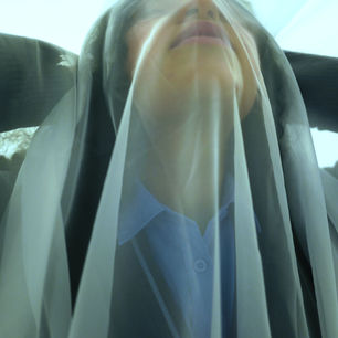


This gallery is showcasing my second redraft photoshoot in the style of David Oldham. As you can see I am experimenting with a different type of mix media, for example fabric. In his photos he uses high and low key lighting. While observing his work I wanted to use his aspects in my own work. In this specific gallery I edited 20 images total.
These show the process of me editing these snapshots in the style of David Oldham. In my gallery you can see how some snapshots are taken with high and low key lighting. In order to edit them both, I had to use different techniques. For the set of high-key pictures, I firstly increased the curve. This is because it will allow the models face be seen through the sheer fabric. I then increased the contrast to have some features be more striking to the eye. Finally, to achieve the blue tint on my photos I used colour look up and added the filter named crisp winter. For the low- key set of pictures i increased the curve and the contrast. This made the snapshots look simplistic but meaningful.
Overall, these set of images have reached my exceptions. There are so many details in this second photoshoot that is visible throughout all the developed photographs. For example, the facial expressions and the face overall behind the sheer fabric. By taking snapshots in this way can generate them to be seen as cool. Also editing these pictures in the specific way made them really eye catching.


EXPERIMENTAL PHOTOGRAPHY
CONTACT SHEET :


These contact sheets are a preview of my experimental photoshoot with water and fabric. Experimenting in different ways can expand my creativity and aid me to use two techniques that David Oldham uses in his work. I took these photographs in bath tub full of water. I submerged myself in the water and added a piece fabric that would allow my face to be shown underneath it. I took these pictures in high-key lighting because I needed my face to be shown and visible. I had created many compositions. For example, having the fabric covering my face, the fabric covering half my face and the fabric covering my eyes showing my lips and the lower half of my face. To take these images I used an Iphone camera. The photographs I have circled are successful pictures such as good composition, right brightness, good visibility of the model. However, the pictures that are not circled are not successful such as bad composition, too much shadow and bad lighting. There are some snapshots that are not circled which can be used in the editing process. Using the fabric in many ways created many successful images. This is shown when I am fully submerged in the water and having the fabric cover all my face. By looking closely this can have a meaning. The meaning that can be interpreted is that you can be fully closed off from the world. Thus, using the successful raw images I want to transform them into my own unique style but also in the style of David Oldham.
DEVELOPMENTS:

This gallery is showcasing the final developed images in the style of David Oldham. As you can see I'm experimenting with water and fabric. This means the editing process will be difficult but the same with all the other galleries. In this specific gallery I edited 15 images in total.

This process log is showing the editing process of all the images in the style of David Oldham. In the whole of my gallery you can see a constant blue tint over all my images. To have this blue tint I used colour look and used the filter called crisp winter. However, after adding the crisp winter filter I decreased the opacity to 50%. This is because I did not want the images to look over exposed and over edited. After decreasing the opacity, I used the curve to decrease the brightness. The final step in editing the images was adjusting the brightness and the contrast. I decreased the brightness to the number -16 and increased the contrast to the number 30. By increasing the contrast I was bale to have the face more visible under the fabric but also make the shadows against the high key lighting more prominent. Whilst editing the snapshots, I took all the editing techniques from all the other galleries and included it in these set of pictures.
Overall, these set of images have reached my exceptions. However, one aspect that is not successful is that my face is not really visible and the composition are not great but the editing process have fixed some feature go the photographs and made it look more appealing to the eye. In addition, the pictures that are themes successful is where I am fully submerged in the water because it has meaning. A meaning that can be interpreted by being trapped and locked away.
FURTHER DEVELOPMENTS CONTACT SHEET :


These contact sheet are showcasing all the images I have to further develop. To expand on my first photoshoot with the water, I printed out some photos and placed them in a tray. After doing that while taking the pictures I had someone pour water in a slow but quick manner on top of the photos. by pouring water on the photos it generated the ripple effect i wanted to achieve in my first photoshoot while experimenting with water and the fabric. This added more creativity to the snapshots and made it more prominent to the naked eye. I took these pictures using high-key lighting. This was to have my face and the model in the picture be more visible. To take these pictures I used an Iphone camera. Changing the settings to portrait mode, the photographs turned out to be professional. In addition, I used the mode studio light while again using portrait mode to take the snapshots. This made all the photos look clear and striking. The photographs I have circled are successful photos such as good composition, good lighting etc. However, the photos that are not circled are not successful images such as bad composition, blurry, not centred etc. There are some snapshots that are not circled that could be used in the editing process. Printing these images out and pouring water on them added an effect of realism. The water ripples were shown more and made it look like I was submerged underneath the water. By doing this, I am expanding my experimentation skills with photography and adding my own unique style to the snapshots.
EXPERIMENTING WITH COOL COLOURS :

In this gallery i am showcasing my experimentation with colour look up and how I am utilising the cool filters that come with it to create a link between Elena Oganesyan and David Oldham.
This process log is showcasing the steps of editing these images. Firstly, I cropped the images so that there is no unnecessary background with the overall picture. I then used the filters called futuristic bleak and winter crisp utilising the colour look up. These filters gave the photographs cool tones and the images more developed. However, it also drew a link to Oganesyan's work. To finish off the editing process I adjusted the brightness and the contrast. For the brightness, I adjusted it to -6. For the contrast, i adjusted it to -12. By adjusting both, I was able to make the water ripples more striking and also make the highlights add an effect.
Overall, these set of images have reached my expectations in terms of the usage of the cool colours and the defined ripples of water. Looking at these photos can give a meaning to the viewers. For example, being trapped because you are submerged underneath water. In addition, linking Elena Oganesyan to David Oldham expanded my experimentation skills. Instead of making these images bright and fun, I wanted to add more of an eerie feel to my pictures. By adding that moody atmosphere it generated a storyline and made this gallery more interesting. Being able to use and experiment with cool colours will allow these specific snapshots stand out.
FURTHER DEVELOPEMNTS :
BLACK & WHITE

This gallery is showcasing my experimentation in black and white. Using my previous edits I further developed my photographs. By adding the black and white overlay, I wanted to leave an intriguing atmosphere to my photographs.
.jpg)
This is showcasing the process of editing these photos into black and white. I first opened the photos in photoshop. I then added the black and white filter. To have the photographs be dark and rich I adjusted the curve. Using the curve I was able to decrease the brightness. To make the ripples of water prominent I adjusted the contrast on all the images. Adjusting the contrast made the ripples more harsh. It also had the imagery of realism. This made each snapshot different in their own ways. Doing all, these steps aided the photographs to be perceived as professional and clean. Furthermore, the overlay of black and white allowed there to be a connection between Elena Oganesyan and David Oldham. The compositions of the pictures also left a distinctive aspect in each photograph.
By using all these techniques, I was bale to rectify and improve the pictures and having them as brand new compositions that catch the eyes of the audiences. For example, cropping the images to delete the unnecesarry background or just decreasing the brightness or increasing the contrast to make the ripple s of water the focal point of the images as well as the facial expressions. Whilst compelling this photoshoot, I was able to produce many snapshots with just one step. That one step made my work very impactful and developed my photographs into new art. Snapshots that caught my eye that are successful are the last three in the gallery. This is because the composition of the model and the water contrast well together and overall generated a wonderful image. Overall, the set of images reached my expectations and turned out to be successful, appealing and captivating.
FURTHER DEVELOPEMNTS :
COMPOSITION

I am exploring composition with in this gallery. I erected arrangements by combing photographs from my first developments from my second photoshoot. This was accomplished by increasing the canvas from the very first image that is opened in photoshop. The second image was the copied and pasted onto extended canvas. Afterwards, I proceeded and repeated this process, however this moment with a different image. Subsequently, I obtained multiple images beside one another. I iterated this method a couple of times and resulted with nine compositions including one with different ideologies each. This is exemplified via the employment of graphics in a certain order. Constructing a scenario with only three shots and positioning them in strategic locations does indeed have a major influence upon that viewer. Observing at the composition can inspire the viewers to contend with their very own thoughts or develop something captivating in their imagination based solely on what they see. With some of the compositions , there are only two images that are beside each other. This is because the two images being used interlink with each other only and not the rest of the developments. For example, the compositions with only two images you can see how I placed images with the model closing her eyes and one with the model opening her eyes. In addition, all the other compositions with the three images are with the model looking away in the first picture, one looking at the camera in the second and one again looking away in last image. This makes them connected and this can be turned into a storyline. Consequently, it integrates the candid shots and merges them together. Through my configurations, I have fulfilled every one of my objectives and managed to produce several storylines. I was able to shoot in the style of David Oldham but put my own unique style on it. Overall, I believe all three compositions are successful and distinctive.


HIGHLIGHTING SUCCESS :


Every development I have done in the style of David Oldham were all successful. These two developments stood out to me the most and were successful.
The photograph on the right is successful because of the composition and how the double exposure added an effect of professionalism. For example, taking tow single and simple edits and just double exposing them made the image look fun and distinctive. The photograph on the left is successful because of the composition and the use of mix media. Using the fabric and covering my face, I was bale to create an eerie feel but also take in the blue tint of his photos in mine made it stand out.
Using these steps on both images transformed them into eye-catching photographs. Not only that, but adding the cool filter during the edited photos to create a more eerie atmosphere and double exposing aided it to be striking.


