

I D R I S K H A N
A r t i s t O n e
A R T I S T C O N T E X T :

The artist behind the series of images below is called Idris Khan. Born in 1978, Idris Khan is a contemporary British artist, who is based in London. Khan uses other techniques, such as photography, to create different kinds of installations. As well as exploring his religious identity through the Quran, Khan also explores the identity of different locations and buildings and landmarks, such as the London Eye, Big Ben and St Paul's Cathedral, which are all based in London. Khan sees photographs of different buildings and places as more than just pixels on a screen, Khan sees photographs as tools used to take one back
to a certain point in their life. This notion of the identity of places links to one’s personal identity through the memories one might have in a specific location, and the events that may have occurred to make someone who they are today. I chose Idris Khan as my first artist as I believe the concept of the identity of different places is an interesting link to who we are. When we visit places we have visited in the past, memories of certain events come flooding back and I strongly believe as people we do not acknowledge the importance of these places and how distinctive they are to our identities until we visit them again and experience the same atmosphere once more. I feel as if many of us fail to realize how important certain places are to us and how they influence our identities. When creating our identities we link certain places to past memories and experiences, which often cause us to connect with that same location. This sense of place can change like our identity; however it can also become part of who we are.
"The photograph is a tool used to take you back to a certain point in one's life, to remember a face or a place you once stood. I feel there is always something quite melancholic about a photograph" - Idris Khan


M O R E W O R K F R O M T H E A R T I S T :
 1 |  2 |  3 |
|---|---|---|
 4 |  5 |  6 |
 7 |  8 | 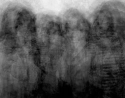 9 |
A R T I S T A N A L Y S I S :

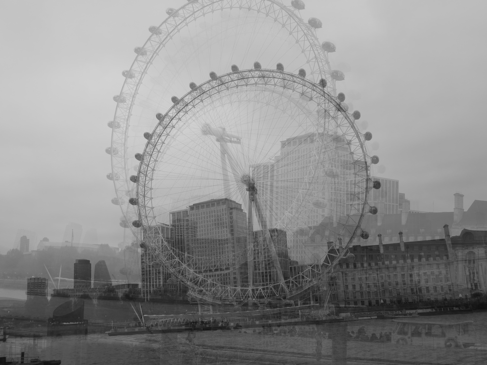
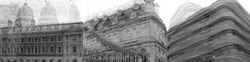
In this image, I can see several images of the London Eye layered above of each other, photographed at different angles. The theme of the work is landscape and perspective photography. There are many different concepts behind this image, and I believe that depending on the individual, this perspective will be distinct for everyone. Personally, I believe that this image could represent ones experience of a specific place, the London Eye in this instance. I think that each image of the London eye represents each time an individual has visited the Landmark. Therefore all of the different images merged together may represent how ones perspective of the London Eye slighting builds and differs every time they visit it. The fact that each image is similar as they are all of the London Eye represents the individuality this place may have to someone, whilst the way that each image slightly differs every time (through the different angles that the landmark is taken from in this instance) may represent how despite the fact that the person is visiting the same exact place they visited in the past, their perspective will inevitably differ and develop slightly each time and they will never experience it for the first time again. The fact that the London eye is always a clear element of every image could represent the fact that it is “something that’s been permanently imprinted in their mind, like a memory”. On the other hand, this image could also represent the different perspectives of different individuals all in one moment, and the different angles that this landmark has been taken from could represent the way that different people view things differently, despite the fact that they are looking at the same structure at the exact same time. Although these are my viewpoints of this image, I believe that this opinion is different for everyone.
Looking at the more formal elements of this image, Idris Khan has used black and white tones for this image to make his perspective of this image unclear to the viewer, to allow them to create their own personal meaning behind the image and to figure out what the image is telling them individually. In every image, the London eye is clearly visible to represent that from the perspective of the person that the image has been taken from, the London Eye is the main element of this location that always stands out to them every time they visit the landmark. Other than the circular shape London Eye, there are not many different shapes in this image, therefore we can infer that the constant shape of the London Eye, and how it looks like an oval from different angles, may suggest the way that a place and the information we discover about it may affect our perspective and feelings towards that specific place. The distinction between the different circular shapes may represent the strong influence one visit may have on our perspective. For example, we may thoroughly love a place, but once we experience something negative in that environment, our perspectives dramatically change and we start to question (or forget) all those positive past experiences. On the surface of this image, we can see that there are a multitude of bold buildings towards the bottom of the image. This could represent the things we do not focus on when visiting certain locations and the buildings being bold could represent that although we may not focus on these other elements of an environment; there are other people who do notice these aspects unlike us. I can see very intricate and detailed designs on the buildings, which make the image, look more appealing and conceptual to look at. I can see the consistent pattern of the London eye repeated many times throughout the image. This could represent each perspective one may have experienced when visiting the London eye. Each image slowly fades into the distance, which could represent the many times one may have visited this landmark.
It could also represent how new memories and events are experienced and how although these memories always remain in the back of our minds, they are brought to the front of our minds when we visit the same place, causing us to feel nostalgic. The delicate and textured design of the landmark and the dark tones used to allow the viewers to perceive this image in their own way, whilst also making their individual views even stronger, making this image more conceptual and personal to a viewer.
In regards to the process of this image, I believe that Idris Khan photographed the London eye around 100 times. He then layered every image above the other to make it appear as if there are many of the same building, adjusting the opacity for each image to create the effect that each version is fading into the distance, to represent how our more recent memories are always stronger and how despite our old memories are mostly forgotten, we are still able to recall small fragments of them when we are reminded of certain places. I also believe that Khan has added a filter to his image to allow the viewer to come up with a personal concept that links to their life, and increased the contrast of each image to make the London eye bolder. The process of making this image is evident through the multitude of images layered onto each other through an image blending technique and the lack of colour despite the high quality of the image implies that Khan did not have a lack of resources and that he did not use a film camera to capture his images, he specifically made it black and white to make the concept more independent and relatable to the viewer and to allow us to add paint to his canvas through remembering our memories.
This image makes me feel quite nostalgic and melancholic, as by looking at this specific landmark I am reminded of all the different times I have visited the London eye, including the different ages I was, the different angles I viewed it from, the different people I visited it with and my thoughts and opinions about the London eye each time I visited. I am also reminded of other events that occurred on the same day I visited, that I possibly may have not remembered if this image was of another landmark. I can remember memories such as the time I visited for the first time at age 8 with my mother and little brother, the time I visited again at age 10 on a class trip during the middle of summer, and the time I visited last year in late June with my mother on a sunny day. I feel nostalgic as I am reminded of all these past memories and the fact that my perspective will always differ is quite melancholic as it represents how our identities, views and opinions change over time (our opinions and viewpoints on specific locations in this instance).
Finally, for my interpretation of the work, I believe that through this image and the many others shown below Idris Khan is telling us to enjoy the world around us, whilst also acknowledging the way that our experiences may change us and the impact that each of our experiences have on our identities. Therefore, he is informing us as viewers how large of an impact a certain location can have on us as individuals, and how time, place, age and date all matter to our identities, and how these little details in our lives make us all different from each other.

P H O T O S H O O T P L A N :
 |
|---|
C O N T A C T S H E E T S :
 |  |
|---|---|
 |  |
 |  |
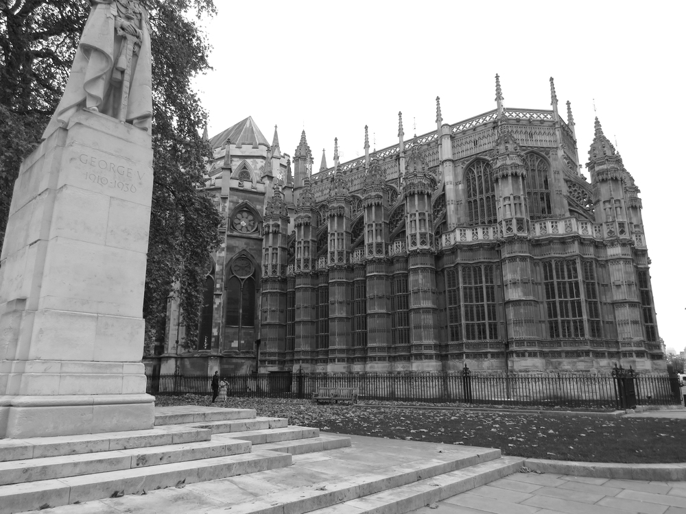
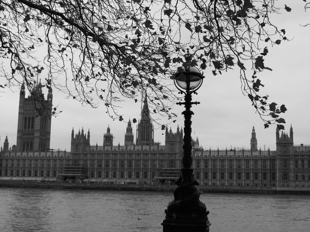
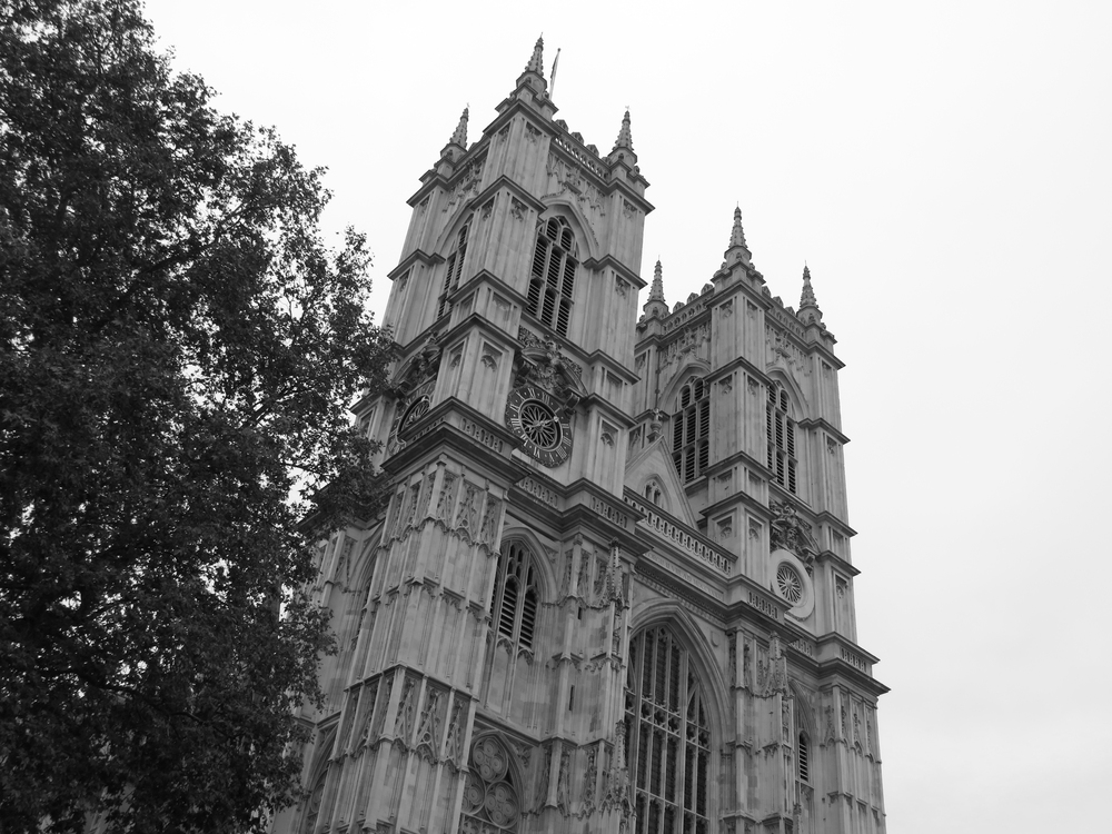
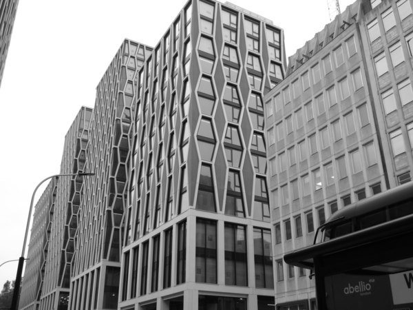
My intention for this shoot was to photograph images in the style of Idris Khan. I did this by travelling to Westminster London via bus and photographing the architecture in the area, varying with the composition and camera angle of my images each time. I used a Canon Powershot SX540 camera to capture my images. I took multiple photographs of each building, slightly zooming in and tilting my camera left, right, up and down to create an interesting layering effect in my images when edited (similar to the one present in Khan's work). I believe that the successful elements of this shoot were the wide variety of different buildings and landmarks captured and the multiple images taken of each structure. On the
other hand, I believe that an element of this photoshoot that could be improved is the compositions and angles that my images are taken from. I could improve this by navigating around each building more to capture more interesting and different images. For my redraft, I will improve this by taking my images from different areas near the buildings instead of tilting my camera, to create a more interesting and similar effect to the one present throughout Idris Khan's work. Overall, I really enjoyed capturing these images and exploring Westminister. Despite this, I believe that I have all the shots required to edit these images.
D E V E L O P M E N T S :
 |  |  |
|---|---|---|
 |  |  |
 |  |  |
 |  |  |
 |  |  |
 |  |  |
 |  |  |
 |  |  |
 |  |  |
 |  |  |
 |  |  |
 |  |  |
 |  |  |
 |
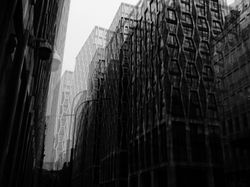
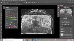
I think my images suit the artist that I am working on because the style of my images looks inspired by Idris Khan. I have done this by taking images of architecture from different angles and different compositions using a Canon Powershot SX540hz camera. To do this, I travelled to Westminster in London via bus and visited several buildings and landmarks present in that area. To make each image more individual and to create a nice layering effect when editing, I slightly tilted my camera when capturing each building to make my developments look more interesting. I used a layering technique to edit my images. I did this by firstly making my images black and white using the 'black & white' tool. After this, I opened several similar images for each building by clicking 'file' and then 'open'. I selected an image to be my background and then pasted all the other images by selecting the images using the 'rectangular marquee tool', clicking 'ctrl + c' to copy and then 'ctrl + v' to paste my images. After pasting all my images above one another I adjusted the opacity of each image to approximately 50% depending on the individual image and then clicked 'normal' and then either 'multiply' or 'lighten' for my double-exposure effect, I selected these depending on the specific image. After making these adjustments, I had an interesting layering effect that made it seem as if there were multiple buildings behind one another, similar to the effect present in Idris Khan's work. After doing this, I adjusted the contrast and brightness for some of my images using the 'brightness/contrast' tool until I was pleased with the outcome and finally added a filter to my images by clicking the 'colour lookup' button on the right side of my screen above the layers section. I mainly used the filters '2Strip.look' and 'Crisp_Winter.look' however I experimented with other filters for a few of my images as well. For my second technique, instead of copying pasting several different images above each other, I copied and pasted the same image and rotated it to the left and right each time. After repeating this around 8 times, I then flattened my image and adjusted the brightness and contrast of my image using the 'brightness/contrast' tool. I also added a filter for some of my images to make them look more appealing. This editing technique made my images more mysterious and conceptual, as it represents the negative change that buildings undergo. Overall, I really enjoyed editing these images and I am very pleased with the interesting finished products. For my redraft, I would like to experiment with different layering techniques to make my work seem more similar to the work of Idris Khan.
C O L O U R E X P E R I M E N T A T I O N :
 |  |  |
|---|---|---|
 |  |  |
 |  |  |
 |  |  |
 |  |  |
 |  |  |
 |  |
F U R T H E R D E V E L O P M E N T S :
 |  |  |
|---|---|---|
 |  |
For my further developments, I have tried to make my images more interesting by using 'gifmaker.me' to create a few gifs using my favourite developments. I did this by editing my image on Adobe Photoshop. Firstly, I opened several image by clicking 'file' and then 'open'. After opening my images, I selected an image to be my background layer and edited it by making it black and white using the 'black and white' tool. After doing this, I selected my images using the 'rectangular marquee tool' and then clicked 'ctrl + c' to copy my images and 'crtl + v' to paste them onto my selected background image. After pasting all my image layered onto one another, I set the opacity of all my pasted image to 0%. After saving my background layer as a 'JPEG file' I then started to increase the opacity of my images one by one, saving every image after increasing the opacity by 10%. After saving all my images, I then used 'gifmaker.me' to upload my images and create a gif. I also adjusted the 'animation speed' to the desired amount of milliseconds, which controls how fast the opacity of the images transitions. I set mine differently for each image (from around 200-400 miliseconds) so that my gifs do not all appear the same, but I made sure to keep the speed quite moderate so that the transition is smooth and all the images are visible throughout. Although this process was quite long, it was definitely worthwhile and I am very pleased with the final outcomes.
R E D R A F T C O N T A C T S H E E T S :
 |
|---|
 |
 |
 |
 |
 |
 |
My intention my redraft photoshoot was to improve my previous images whilst also further exploring the work of Idris Khan. I did this by travelling to Marble arch via bus this time and then walking to Trafalgar Square. On my journey, I photographed architecture in regions such as Oxford Street, Soho, China Town and Leister Square. Instead of tilting my camera when capturing my images this time, I varied with the angles that I captured my images from. I did this to make the layering effect of my images more appealing and to better suit the work of Idris Khan. I used a Canon Powershot SX540 camera to photograph the architecture. I took multiple photographs of a wider variety of
images this time to improve on my previous photoshoot. I believe that the successful elements of this shoot were the wide variety of different buildings I captured and the interesting variety of angles that my images were captured from. On the other hand, an unsuccessful element of this photoshoot was the weather. There was very heavy rain on the day I
photographed my images so I had to exclude some of the images taken as there were droplets on my lens and the buildings appeared distorted. To improve this, I will check the weather and make sure that it does not rain on the day I photograph my next photoshoot. Despite this, I thoroughly enjoyed capturing these images and I am very pleased with the visible improvement in the variation of building and camera angles.
P R O C E S S L O G :

S T E P 1 ) Firstly, I opened all the images I wanted to layer by clicking 'file' and then 'open'. I selected many images by holding the 'ctrl' key and then clicking the images I wanted to use for the image.
S T E P 2 ) After this, I copied and pasted each image by selecting them using the 'rectangular marquee tool' and then clicking 'crtl + c' to copy and then 'ctrl + v' to paste them onto the other images. After doing this, I had approximately 7 images layered above each other. To make every image visible, I changed the opacity to every layer to approximately 50% to get this interesting layering effect.


S T E P 3 ) After layering my images I made my images black and white using the 'black & white' tool to match the style of Idris Khan.
S T E P 4 ) After this, I adjusted the contrast and brightness of my images using the 'brightness/contrast' tool to make my image appealing and to make every layer of the image visible.


S T E P 5 ) I then added a filter to my image by clicking 'colour lookup', 'Load 3D LUT...' and then scrolling down the filters until I reached a filter that would make my image appear more interesting. For this specific image, I used the filter 'Bleach Bypass.look'.
S T E P 6 ) Finally, I adjusted the opacity of my 'colour lookup' layer to 50% to make the filter less harsh like the image above. After doing this I used the 'burn tool' to accentuate the shadows of the buildings.

R E D R A F T E D D E V E L O P M E N T S :
 |  |  |
|---|---|---|
 |  |  |
 |  |  |
 |  |  |
 |  |  |
 |  |  |
 |  |  |
 |  |  |
 |  |  |
 |  |  |
 |  |  |
 |  |  |
 |  |  |
 |
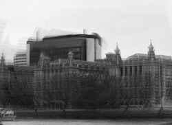
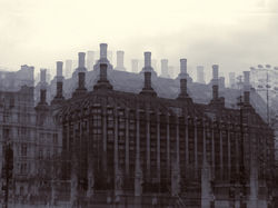
I believe that my images reflect the artist that I am working on because my images look inspired by Idris Khan. I have taken this redraft by photographing architecture from different angles using a Canon Powershot SX540hz camera. I did this by travelling to Marble Arch via bus 148 and then walking through places such as Oxford Street, Soho, China Town, Leister Square and Trafalgar Square. To edit my images I used a new layering technique. I did this by firstly making my images black and white using the 'black & white' tool and adjusting the contrast and brightness of my images using the 'brightness/contrast' tool. After this, I opened several images of the same building by clicking 'file' and then 'open'. I then selected one of those images as my base (background) and then pasted the rest of images above. I did this by selecting my images using the 'rectangular marquee tool', clicking 'ctrl + c' to copy and then 'ctrl + v' to paste my images. I then adjusted the opacity of each image to 50%. Instead of clicking 'normal' and 'multiply' or 'lighten' for my double-exposure effect, this time I left my image the same as the contrast in my previous set of developments was too harsh. After adjusting the 'opacity' of my images, I then selected a light filter such as 'DropBlues.3DL' to make the layering of my images more visible. I finally used the 'burn tool' to draw in order to accentuate the shadows of the buildings and to make my images more interesting and similar to the style of Idris Khan. Overall, I believe that this set of developments is much more successful than my previous set, as the contrast of my images is less harsh and my images are not too bright or too dark. I really enjoyed editing these developments and I believe they appear more accurate to the work of Idris Khan than my previous set.
F U R T H E R D E V E L O P M E N T S :
 |  |  |  |
|---|---|---|---|
 |  |  |  |
 |  |  |  |
 |  |  |  |
For my further developments, I have tried to make my images more interesting by double-exposing my favourite developments together. I did this by editing my image on Adobe Photoshop. Firstly, I opened my developments by clicking 'file' and then 'open'. After opening my photographs, I selected 2 images, copying one by selecting the image using the 'rectangular marquee tool', clicking 'ctrl + c' to copy it and 'ctrl + v' to paste it onto my second image. After doing this, I adjusted the double exposure effect by clicking the 'normal' button on the left side of my screen and then clicking 'overlay' to create an interesting antique effect on my images. I then used images of ink that I photographed by speaking ink-water on paper using a brush and photographing the interesting effects. I double-exposed these images of ink onto my two images, adjusted the opacity of the images to 50% and adjusted the double exposure effect by again clicking the 'normal' button and then clicking 'multiply'. I also drew with the 'burn tool' to increase the contrast between the shadows of the building and the areas affected by light. I saved my images as 'JPEG files' by clicking 'file', 'save as' and then changing the names of my images to 'further development 1,2,3..'. I really enjoyed the outcomes of these developments and I think the double exposure effects on my images look really interesting and suit the style of Idris Khan's work very well.
E X P E R I M E N T A T I O N W I T H W A T E R
 |  |  |
|---|
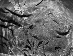
My intention for my third photoshoot was to further develop my previous developments whilst also exploring water photography by photographing my images underwater. Firstly, I placed several transparent glass plates on a mirror, each with a unique and intricate design. I filled these plates with water and placed print-outs of my developments under the water then captured them using a Canon Powershot SX540. For a few of my images, I captured the print-outs under still water, to allow the ornate designs on the plates to still be clearly visible when viewing the images. However, in other images I captured my photographs as the water was in motion, pouring it as I took my photographs to create lots of interesting water splash effects. I captured my images from a close-up, birds-eye point of view. I captured my images using low-key lighting (in a dark room at night) to prevent any artificial lighting from giving my images a yellow colour, however, I still used a flashlight to make the water effects more visible and to create clear contrast in the ripples in the water. For some of my images, I experimented with different camera angles by slightly tilting the camera and zooming it in to make each and every image more individualistic and unique. I took multiple images of several different printouts of my images so that my images do not all appear the same. I believe that one of the successful elements of this photoshoot was the wide variety of unique images I captured. Another successful element of my work I would say is the interesting patterns the plates and motions of water created, as they are very intricate and captivating. An element of this photoshoot I believe could be improved is the timing of my images as I am pouring the water into the bowl. Although the outcomes were quite successful, I believe that my images would be even more successful if the water was not visible from the top as it is unclear and blurry. To improve this, I will focus on the timing of my images, making sure that I capture the water being poured at the right moment, as soon as it hits the surface of the water in the bowl. Despite this, I really enjoyed capturing these images and experimenting with water as I also continue to develop my images.
D E V E L O P M E N T S :
 |  |  |
|---|---|---|
 |  |  |
 |  |  |
 |  |  |
 |  |  |
 |  |  |
 |  |  |
 |  |  |
 |  |  |
 |  |  |
 |  |  |
 |  |  |
 |  |  |
 |
 |  |  |
|---|---|---|
 |  |  |
p r o c e s s l o g & a n n o t a t i o n :
For my developments, I used the photographs from my previous photoshoot, where I placed my images underwater / placed them under plates full of water with intricate designs and recaptured them. To edit these images, I used Adobe Photoshop. I first opened my images by clicking 'file' and 'open', then I made my images black and white, to ensure that there isn't any colour within my images and to match the style of Idris Khan. After doing this, I used the 'curves' tool to decrease the brightness of my images and give them more low-key lighting and create a more prominent contrast (in order to make the intricate designs of the plates and my images more visible). After doing this, I used the 'Brightness/Contrast' tool in order to add to this effect and I used the 'contrast' tool to increase the contrast within my images and make my images clearer and more visible from beneath the plates. The final step in this process was to crop my images to get rid of parts of the mirror or the edges of the plates that I did not want to be visible in my images. To do this, I used the 'crop' tool and selected the parts of my image that I wanted to be visible and cut off the rest by clicking 'enter'. In some cases adjusting the contrast of my images was ineffective as there were still some areas I wanted to darken, so I drew with the 'Burn tool' to add contrast and shadow to certain areas of my images. To save my images I clicked 'file', 'save' and then saved my images as 'JPEG files' in order to make them visible as images. Overall, I believe these images looked even more successful after being edited and I think increasing the contrast in my images was a good choice as it makes the rippling effect of the water more visible and makes my images look even more interesting. I really enjoyed editing these images and I am very pleased with the outcomes and fascinating effect the water effects added to my previous images. In the future, I would like to experiment with different textures other than water to make my images even more appealing and exciting.
C O N T A C T S H E E T S :
 |  |  |
|---|---|---|
 |
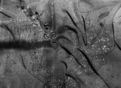
My intention for my this photoshoot was to develop my previous photographs as I also explore using materials in my work by double exposing my previous developments to images I captured of different types of materials. Firstly, I placed several different types of materials. To add variation to my work, I used different colours of cotton, nylon, and plastic to create different textures within my work then captured them using a Canon Powershot SX540. For a few of my images, I captured the materials in different positions, for example, I scrunched up the nylon and stretched out the plastic bag to create different effects and create variation in my images. When capturing my images, I also used a flashlight and held it in different positions (for example, in some images I held it to the left, right, top, bottom, and even above my camera). I did this to make the textures of my materials more prominent in my images and to create a clearer contrast between the areas hit by light and their shadows (when I shone the flashlight at the same angle as the plastic - on the right - you can see that the bumpy texture of the plastic is more visible than in the previous images where I shone the flashlight above my camera from a birdseye angle). I captured my images from a close-up, bird-eye point of view. For some of my images, I also zoomed in on specific areas of the material so that I wouldn't be only capturing a certain area of the material. I captured my images in low-key lighting (A dark room) during the night to prevent any artificial lighting from giving them a slightly yellow colour, however, I used a flashlight to make the materials and their different textures visible I believe that one of the successful elements of this photoshoot was the wide variety of angles and positions in which I captured my images. Another successful element of my work I would say is the choice of material. Although my images didn't have too much variation in terms of material, I think that the materials I selected created very nice and interesting effects. An element of this photoshoot I believe could be improved is the variation of material in my images. Although the outcomes were successful and interesting, I believe that my images would be even more successful if I had used a wider variety of materials. If I were to recapture this photoshoot, I would use materials such as satin or lace to give my work a wider variety of materials and also create an interesting effect, once I double-expose them with my previous developments. Despite this, I really enjoyed capturing these images and I am very interested to see the outcomes once I double-expose these images with my pervious photographs.
F U R T H E R D E V E L O P M E N T S :
 |  |  |
|---|---|---|
 |  |  |
 |  |  |
 |  |  |
 |  |  |
 |  |  |
 |  |  |
 |  |  |
 |  |  |
 |  |  |
 |  |  |
 |  |  |
 |  |  |
 |
| | |
|---|---|---|
| | |
p r o c e s s l o g & a n n o t a t i o n :
For my further developments, I decided to merge the images from my two previous photoshoots (the ones from my water photoshoot where I put my images underwater and the ones from my fabric photo shoot where I captured different types of fabric to create different textures) to create more interesting effects in my work and to further develop my images and experiment with different textures in order to make my images more interesting and appealing. To edit my further developments, I used the software Adobe Photoshop. The first step in this process is to open my images, which I did by clicking 'file' and 'open' then selecting the images I want to double-expose together (one already edited development from my water photoshoot and one from my fabric photoshoot). After doing this, the next step was to open up my chosen fabric image and to copy it so that I can paste it on my water development (so that I can double-expose them). I did this by selecting my image using the 'rectangular marquee tool' and clicking 'ctrl + c' in order to copy the images. I then clicked on my water development then clicked 'ctrl+v' in order to paste the fabric image on top. For some of my developments, the two images were not exactly the same size (usually the fabric development would be either bigger or smaller than my water development) so I clicked 'ctrl + t' to select my image, making sure I was on the same layer as the fabric photograph, and then I adjusted its size to match that of the water development. After doing this, the next step was to go to where the layers were on my screen and click 'normal' so that I could select the double-exposure effect I wanted for my development. For this particular set of developments, I used 'multiply' so that both my water and fabric images would still be visible. After doing this, I realised that my images were too dark so I used the 'Brightness/Contrast' tool to decrease the brightness and make the images in my water developments clearer and more visible. After doing this, I adjusted the contrast of my images also using the 'Brightness/Contrast' tool in order to make the contrast between the shadows in my image clearer and to make the water and fabric effects more visible. After doing this, there were still some areas I wanted to add contrast to, so I drew with the 'Burn tool' to add contrast and accentuate the shadows of these areas. After this, I clicked 'file' and 'save' to save my developments, making sure to save them as 'JPEG files' so that they are images. Overall, I think that merging the fabric and water effects was a really good idea and I think that it truly helped to further develop my images and create a more interesting effect within them. I truly enjoyed experimenting with textures and materials more and I am very satisfied with the effects that the double exposure has created. I would like to experiment further with different textures in the future as I believe they make my images more interesting and appealing to look at.
I M A G E B L E N D I N G :
 |  |  |
|---|---|---|
 |  |  |
 |  |  |
 |  |  |
 |  |  |
 |  |  |
 |  |  |
 |  |  |
 |
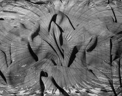
To further develop my images and experiment with fabric and water even more, I decided to double-expose my fabric and water images (from my previous set of developments where I double-exposed my fabric developments with my underwater developments) with one of my previous sets of developments (my redraft where I went outside and searched for interesting buildings that matched the style of my artist's work). I did this to develop my images further and experiment with double exposure even more, as I think my previous sets of developments where I experimented with different techniques of double exposure were very successful. To edit these images, I used to software Adobe Photoshop. I first opened up my chosen developments and fabric images by clicking 'file', 'open' then selecting the images I wanted to use. After this, I selected a development from my redraft photoshoot and scrolled through the different images of fabric, trying to find the correct texture for the image (one that I thought would help it to look more interesting). After finding the desired texture, I selected the image using the 'rectangular marquee tool' and clicked 'ctrl + c' in order to copy the image. I then went back to my Idris Khan development and pasted the image of the fabric on top by clicking 'ctrl + v'. After doing this, I found that some of my images were too small and were not the same size, so I decided to select the image by clicking 'ctrl + t' (and ensuring that I was on the correct layer) and using my mouse to stretch the image to the correct size (making sure that I don't lose the shape of the image to prevent it from looking distorted). The next step was to double-expose my images, which I did by going to the layers section of my screen and clicking the button that says 'normal', and scrolling through the different types of double-exposure until I found the one that I wanted to use. For this set of developments, I experimented with 'darken' and 'multiply' so that both of the images would still be visible. After doing this, I drew with the 'burn tool' to accentuate any shadows and make the texture of the fabric more visible in the image. Finally, I adjusted the brightness and contrast of my image to make the texture clearer and to make the images beneath more visible and clear by using the 'Brightness/Contrast' tool. In conclusion, I think that this idea was very successful as double-exposing these images together helped to create a more interesting texture and pattern effect. In the future, I would like to experiment with charcoal to further develop my images and experiment more with a wider variety of different textures.
D O U B L E - E X P O S U R E : C H A R C O A L :
 |  |  |
|---|---|---|
 |  |  |
 |  |  |
 |  |  |
 |  |  |
 |  |  |
 |  |  |
 |  |  |
To experiment further with double-exposure, double-exposed images I captured of charcoal textures with my previous Idris Khan redrafted developments. To achieve this texture, I started off by rubbing charcoal on a piece of card, sideways, ensuring that I leave gaps of white throughout to create contrast throughout the textures. After doing this, I captured images of the charcoal on paper in different positions using a Canon Powershot SX540. To edit these images, I used Adobe Photoshop. I began by opening my desired images by clicking 'file', 'open' and selecting the ones from my contact sheet that I decided to edit. After opening the charcoal image, I copied the image by selecting the image using the 'rectangular marquee tool' and clicking 'ctrl + c' to copy it. Next, I headed back to my Idris Khan development and pasted the image of the charcoal texture over it by clicking 'ctrl + v'. After this, I scaled the image to the same size as the one below, clicking 'ctrl + t' to free transform the image and using my mouse to drag the image to adjust its size. Next, I made my image black and white using the 'Black & White' tool. I did this as the charcoal images weren't edited so they still had a little bit of colour, which I got rid of so that both of the images would be black and white instead of having one in colour and one in black and white (I also did this to match the style of Idris Khan). I think clicked on the layer with the charcoal image, went to the layers section of my screen, and clicked the 'normal' button which then showed a bunch of different double-exposure techniques. After this, I selected the technique I thought was suitable for the development (one that would enable the viewer to see both of the images clearly and make it look as if the charcoal was a part of the original development) and clicked it. For this set of developments I also used 'multiply' and 'darken' as they match the style of my artist and when I use them, I am able to see both of the images instead of being able to just see one with techniques like 'lighten'. After doing this, I adjusted the brightness and contrast of my images using the 'Brightness/Contrast' tool. I adjusted the brightness as the charcoal images made my developments significantly darker, which made the image underneath more difficult to see (so I made it brighter to make my redrafted Idris Khan development more visible). I adjusted the contrast to also make the charcoal more visible (as the double-exposure effect had decreased its opacity, and I wanted my image to appear as if the charcoal effect was a part of the image(instead of it being slightly transparent). After this, I drew with the 'burn tool' to enhance the darkness of the charcoal and make it more prominent and visible within the image. After this, I saved my image as a 'JPEG file' by clicking 'file' and 'save as' (or 'ctrl + s'). To conclude, I am very pleased with the outcome of these images and I believe that double-exposing charcoal with my developments turned out to be very successful.
H I G H L I G H T I N G S U C C E S S :
|
|---|
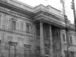
I decided to highlight this development as successful as the buildings matches the style of Idris Khan and his use of famous buildings and landmarks within his work to relate with the viewer. This building is of the National Gallery in Trafalgar Square, which displays one of the worlds most famous paintings, 'sunflowers' by Vincent Van Gogh. I chose this specific building to photograph as it is a common landmark and place that several people have visited, therefore it means that the viewer will be able to relate a personal meaning or memory with the Gallery when looking at my image.
C O M P O S I T I O N S :
 |  |  |
|---|---|---|
 |  |  |
 |  |  |
 |
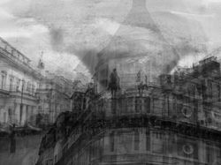
To further develop my work, I decided to create different composition sequences out of my Idris Khan redraft developments. To do this, I edited my images using the editing software 'Adobe Photoshop'. First, I opened my images by clicking 'file', 'open' and then clicking on my chosen images (I created sequences of 3 for this series). After opening my images, I expanded the canvas of one of my developments using the 'crop tool' to make it 3 times wider. After this, I went to my other images and copied and pasted them by firstly selecting the images using the 'rectangular marquee tool' and then clicking 'ctrl + c' to copy and 'ctrl + v' to paste the images onto the expanded canvas. After this, I clicked 'ctrl + t' to free transform the image and move it to the empty space. I repeated this process twice. After this, I used the dodge tool to draw between the images in order to blend the skies together so that the images look like one big picture. To do this, I had to consider the compositions of my images beforehand and select the images that worked well together. Finally, I saved my image by clicking 'file', 'save as' and then saving my image as a 'JPEG' file. I created these sequences to create more variation throughout my work as I have more than one building in each image. The theme of my work is dark and ambiguous like the style of Idris Khan's work.