
H I L L Y V A N E E R T E N
A r t i s t 3
= annotations to
add to
A R T I S T C O N T E X T :
_jpg!Portrait.jpg)
The creator of the work below is called Hilly Van Eerten, a Dutch artist who is situated in Amsterdam. Born in 1957, Hilly Van Eerten is famous for her former monoprint art in 2007. In 2015, Eerten began to create digital art, which I will be taking inspiration from to create my work. Besides exploring her identity and perspectives as a Dutch citizen, Hilly Van Eerten also explores the identity of different buildings and construction sites, and the impacts they have on us. Hilly Van Eerten sees buildings as more than what they really are; she believes that they have an important relationship with our identities. This notion of buildings and construction sites links to personal identity through the
thoughts one might have of these places, the memories and the positive impact change can have on all of this. I selected Hilly Van Eerten as her work had an interesting link to the idea of the impact of time on the identity of buildings and how change influences their identities from our perspectives. Over time, buildings eventually change, whether it’s that they inevitably grow old, or whether they are selected and reconstructed/refurbished. After this process, it is natural for our perspectives of these buildings and their locations to change as they themselves have changed in appearance. This is due to the impact of time and the change it can have on these buildings. For example, if you were to visit a construction site and then revisit it two years later where it once was, you would see a new building and have a completely different opinion from the one you had when it was in construction. I think this concept is very intriguing and presented in a very interesting way through the work of Hilly Van Eerten below:
M O N O P R I N T S :


.jpg)


D I G I T A L A R T :
 |  |  |
|---|---|---|
 |  |  |
 |  |
I really like to mix, fuse and combine the images, but only from my own photos. Because I first need to experience and feel the contact. It is this meeting between my eyes and the city.
- Hilly Van Eerten
A R T I S T A N A L Y S I S :

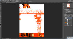
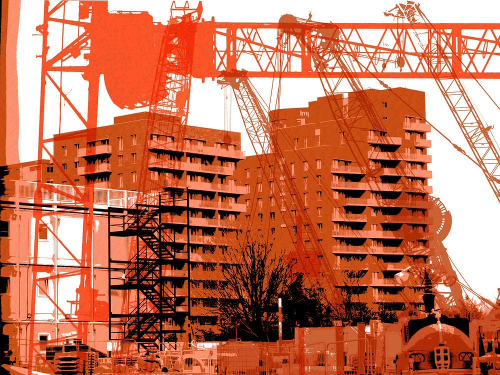
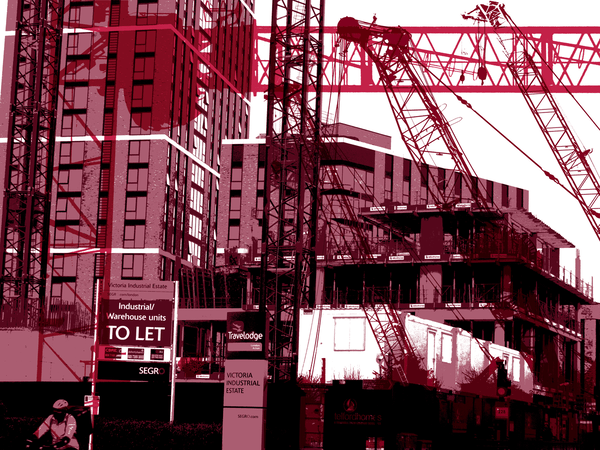
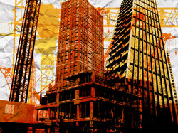
Looking at the subject of this work, in this image I can see two images layered on top of each other, one is of a construction site with cranes and one is of the outline of a building, coloured in orange. I believe that this image represents the impact of change on the identity of a building as it is in construction and the outcome of this building will have a very different appearance in comparison to its current appearance and state. This change in appearance will also influence our perspectives and views on its identity. In this instance, when a building is further developed or being in the process of construction, our opinions on the building are normally improved. In other words, we have better views on these buildings due to the change that takes place in these buildings, which is evidently due to the time taken for this change to happen. This work is called ‘Pile driving constructions at Oosterdok, Amsterdam 1.’ I looked up Oosterdok in Amsterdam and went to images, and now this place looks extremely different to the way it did just a year ago. This is due to the impact of time on the buildings there. This changes the way we perceive the work as we form two different opinions on this place in Amsterdam, one on the way it used to be (as evident in the image above) and the other after looking at its progress in the present and the change that the structures there have undergone. I would say that the themes of this work are landcape, as it is captured in landscape and it is of a construction site, message, as it portrays the impact time has had on Oosterdok, and memory, as it is an image of the area in the past tense, which appears very different from what it looks like in the present.
Looking at the formal elements of this image, Hilly Van Eerten has used a black and white filter on the image of Oosterdok in construction and layered an orange image of a building over the black and white. I believe that this is conceptual as the black and white image could represent Oosterdok in its previous state as it was in construction. The black and white filter is effective as it not only represents the past as we associate black and white with the past, but it also represents its old state, which would have been damaged and antiquated. The fact that the orange is covering the black and white is hinting towards its bright and positive future, which is reinforced by the fact that orange represents joy, creativity, success and most importantly change. The black and white background of the image is the Oosterdok’s melancholic past which is replaced with this vibrant orange outline of a set of buildings, representing it’s bright future (as orange represents change) and making the change seem positive and hopeful. The fact that the orange is placed over the black and white suggests that Eerten’s work focuses on the positive impact of change on the identity of buildings instead of the negative impacts. The fact that the black and white is still visible suggests that despite the fact that the building will take a different from, its past state will still remain a memory in the hearts of those who visited it before the change occurred. This colour organisation acknowledges the negative impact of change whilst mainly focusing on the positive impact it can have on the identity of a building. The outline layered over the black and white image could represent the buildings bright future or its state in construction, hinting to its new and improved version in the future. The fact that the buildings new and improved state is only an outline of colour is suggestive of the fact that it has still not taken form yet and therefore we do not have a clear image of its state after it has been refurbished. This creates suspense for the viewers as we are curious to see what the building will look like after it has undergone change. Overall, the background of this image is dark and melancholic but despite this, its hopeful and vibrant surface takes away from this sense of melancholy.
In terms of the process, it is evident that Hilly Van Eerten captured two images before editing this image. The first she captured is one of Oosterdok in the process of construction, which she captured from an eye-level angle during the day using high-key natural lighting. This represents Oosterdok’s previous state as it was in construction. The second image she captured is of buildings in Oosterdok, presumably after construction. She also captured this image from an eye-level angle, using high-key natural lighting as the buildings are outside. If Hilly edited this image using the editing software ‘Adobe Photoshop’ she probably would’ve firstly opened the two images by clicking ‘file’ and then ‘open’. She then would’ve made the image of Oosterdok in construction black and white using the ‘Black and white’ tool or potentially using the ‘colour lookup’ tool and finding a black and white filter. After this, she probably would’ve made the second image an outline of buildings by firstly making it black and white also using the ‘black and white tool’ or the ‘colour lookup tool’. Next, she would’ve used the ‘threshold tool’ to level 225, to make all the colours in the image the same shade to create one solid outline. Finally, she would’ve copied and pasted an orange overlay on top by clicking ‘ctrl + c’ to copy and ‘ctrl + v’ to paste, in order to make the image a solid orange outline. To merge the two image together, she would’ve copied and paste the image of the outline over the black and white image by clicking ‘ctrl +c’ to copy it and ‘ctrl + v’ to paste it. To merge the two together she would’ve clicked ‘normal’ and then ‘multiply’ to make the outline slightly transparent so that both images are visible.
In terms of the mood of this image, I would say that in contrast to Idris Khan and Michael Wesley’s contemplative and reflective mood presented by their work, Hilly Van Eerten’s work communicates a mode thoughtful, elated and celebratory mood in response to change. Her work makes the viewer feel positive emotions towards the impact of change on the identity of buildings, without extenuating the fact that change can have a negative impact. The fact that she gives us a glimpse of the past but then gives us a glimpse into the buildings positive future suggests that she acknowledges the disadvantages of change but also believes that despite this, the positivity behind change outweighs the negativity. I feel like this because the vibrant orange layered over the black and white allows us to also acknowledge the positive impact of change on the identiy of buildings, which is the fact that the building will continue to live on, despite it taking a different form. Another advantage of change would be the fact that the building would look better than it did in its previous state. This positive emotion is evoked by Eerten’s use of a vibrant orange colour within her work and the form of Oosterdok after construction as it makes us look forward to the change it is undergoing.
Looking at the meaning behind the work, I would say that Hilly Van Eerten is trying to communicate the fact that although change is something we all dislike, it can have a positive impact on the identity of building because despite the fact that the buildings will not appear the same as they do in our memories, they will take a better and improved form instead of being completely destroyed, which is something we should look forward to. I think Eerten’s use of the colour orange in her work reinforces this idea of change but the fact that the orange is vibrant conjures the image of a beautiful and refurbished building, making the viewer hopeful and optimistic of the change that the buildings are undergoing. Overall, I think Hilly Van Eerten’s work is very conceptual and well thought out as she has communicated her concept of “the positive impact of change on the identity of buildings” very well throughout her work, in terms of the images she captures and the wide variety of vibrant colours she uses in her work.
P H O T O S H O O T P L A N :
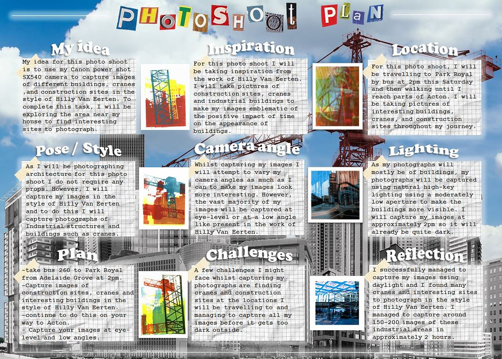
P H O T O S H O O T 1 - C O N T A C T
S H E E T S :
 |  |  |
|---|---|---|
 |  |  |
 |
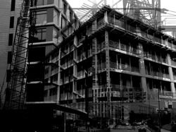
For my initial photoshoot, I wanted to gather images of construction sites, cranes and urban buildings to be able to produce images in the style of Hilly Van Eerten. I went to Acton via bus 260 at around 10am to capture these photograph. I decided to capture my images on a cloudy day as the sky was blank which would make my images easier to edit and make them more similar to the work of Hilly Van Eerten as there were no shapes of clouds in the sky that would disturb the images. I explored Acton and searched for run-down factories and industrial areas to find good buildings, cranes and construction sites to photograph. I went early in the morning so that it would be brighter outside despite the gloomy weather, so that the buildings would be more visible in my images, due to the bright environment. I captured my images from a low-angle and also experimented with an eye-level angle. I captured images of cranes because Hilly Van Eerten layers different colours and kinds of frames over her images to make them more varied and conceptual, as we associate bright colours with positive emotion (and because having a wide variety of them creates a more pleasing experience for the viewer as they are able to see several different colours in one image. We associate vibrant colours with strong emotion as they stand out from their surroundings and grab the viewers attention, interesting them. In contrast, black and white imagery is devoid of colour, and as a result causes us to reminisce on the past as the lack of colour leaves us no choice but to associate the dullness of the image with the timelessness of the past and how these places and buildings will never be the same way they were when we originally experienced them. I used high-key natural lighting to capture my images with a Canon Powershot SX540Hz camera, using a high ISO so that the gloomy weather would not impact the clarity of the buildings within my images. I used a fast shutter speed to quickly capture the buildings in the moment. This creates a contrast between Hilly Van Eerten's work and Michael Wesley's work. This is because Wesley's work focuses on the identity of buildings over a long period of time, whereas Eerten's work focuses on the identity of the buildings in the present and their potentially bright future (as suggested by the vibrant colour scheme within her work). I zoomed in on the cranes to get clearer shots of them and tried to find them in different shapes and sizes to create more variation within my work. The construction sites in my work represent the process of change that the buildings undergo, which is supported by the images of cranes I captured and the urban buildings represent the buildings current state, before it has undergone any change. A successful element of this photoshoot would have to be the high-key lighting in my images, as the sky is blank and does not draw the viewer's attention from the buildings and the contrast in colour compliments them instead.
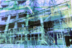
D E V E L O P M E N T S :
 |  |  |
|---|---|---|
 |  |  |
 |  |  |
 |  |  |
 |  |  |
 |  |  |
 |  |  |
 |  |  |
 |  |  |
 |  |  |
 |
P R O C E S S L O G & A N N O T A T I O N
 |  |  |
|---|---|---|
 |  |  |
 |  |  |
 |  |  |
 |  |  |
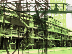
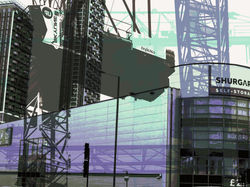
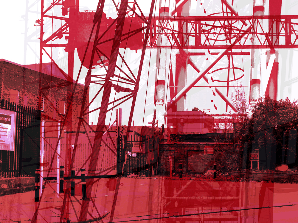
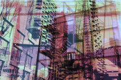
For my first set of developments, I attempted to create a series of colourful developments, taking inpiration form the work of Hilly Van Eerten. I edited this series of developments using Adobe Photoshop. I firstly began by opening images of construction sites and buildings, as well as several different kinds of cranes I photographed. After this, I then clicked the 'posterize tool' to make my image look simpler (as the 'posterize tool' decreases the number of tones in an image so that there isn't much colour variation, making the image simpler and therefore giving it a cartoon-like effect, like in Hilly Van Eerten's work). After doing this, I made the image black and white so that I could give each image an individual colour. After making the image black and white, I went on the internet and searched up different colours present in Eerten's work such as 'orange', 'red', 'blue', 'green', 'purple' and 'yellow'. I then copied the different colours by clicking 'ctrl + c' and then pasting them onto my black and white posterized image by clicking 'ctrl + v'. After pasting the colours onto my image, I clicked 'normal' and then 'lighten' to make the black and white image the colour I pasted on top. After this, I opened my images of cranes and used the 'black and white' tool and the 'posterize' tool to repeat the same process, making the cranes black. After this, I searched the internet for similar colours, for example, if my building image was orange, I would search for lighter and darker shades of orange to create a specific colour palette within each image as well as creating variation within my work. After changing the colour of my cranes, I then flattened the image by right clicking on the background then clicking 'flatten image', so that all the layers of the image are copied as one layer. I then copied and pasted my cranes onto my building image by clicking 'ctrl + c' then 'ctrl + v'. After this, I then clicked 'normal' and 'multiply' to make my cranes transparent over the building of the image and layered several different cranes, with different shaes of the same colour, over the building of the image. I also experimented with having a wider variety of different colours in my work by experimenting with layering completely different colours of cranes over eachother. I really enjoyed editing these developments and I am very pleased with the final products. I strongly believe that Hilly Van Eerten's work conveys a positive attitude towards my concept of 'the impact of time on the identity of buildings' as the wide variety of vibrant colours makes the atmosphere within the image joyful and lively, focusing on the positive impact of change (as the building will look even better after it has undergone change), rather than the negative impact of change (that the building will never be the same as it was in the past). A successful element of my work would have the by the exuberant emotion behind the images and how they clearly convey positive emotion towards change. An element of my work that I would improve is the vibrance of the colours within my image. I will do this by using the 'hue tool' to decrease the saturation of my image to make the colours more neutral. This is better as the colours are not too saturated, but not too muted either, which could also be conceptual as it could potentially represent the fact that although change has a negative impact on the identiy of buildings (as it replaces past memories), it can also impact buildings positively by saving them from potentially collapsing and improving them. I believe this series of developments turned out to be really successful and link very well to my concept and the contrast between Hilly Van Eerten's work in comparison to Idris Khan and Michael Wesley's work.
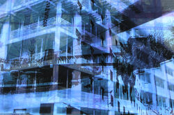
B L A C K & W H I T E D E V E L O P M E N T S
 |  |  |
|---|---|---|
 |  |  |
 |  |  |
 |  |  |
 |  |  |
 |  |  |
 |  |  |
 |  |  |
 |  |  |
 |  |  |
 |  |
P R O C E S S L O G & A N N O T A T I O N
| | |
|---|---|---|
| | |
| | |
| | |
| | |
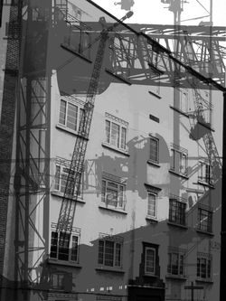
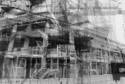
For this series of developments, I experimented with black and white imagery to refine my work and link Hilly Van Eerten's work to Idris Khan and Michael Wesley's work as they both use black and white imagery within their work. I used my previous developments from my first photoshoot for this series and I edited my images using Adobe Photoshop. I firstly began by opening my images by clicking 'file', 'open' then selecting my desired images. After this, I used the 'black and white' tool to make my images black and white like the work of both Idris Khan and Michael Wesley. A successful element o this series would have to be the impact of the black and white filter on my images. I believe that adding a black and white filter not only helped me to link my artists' works together, but it also links to my concept of 'the impact of time on the identity of buildings'. I think the black and white filter perfectly reflects this idea of the past and the melancholic emotion behind change. Looking at this image, in contrast to the positive emotion behind change present in Hilly Van Eerten's work (due to her use of a wide variety of different, more vibrant colours). I think the concept behind my original images drastically changed from positive to negative after I added the black and white filter. This is because we usually associate black and white with melancholy as a result of the dullness and lack of colour within the image. When an image is devoid of colour, it immediately becomes perpetual, timeless and nostalgic, as it an cause you to reminisce on past memories that you miss. This adds to my concept of 'the impact of time on the identity of buildings' as it reinforces the idea that these buildings have undergone change and will never look the same way they did in the past. This is melancholic as we cannot reverse time no matter how strong our desire to reverse its impact is. To save my images, I clicked 'file' then 'save as' and saved them as 'JPEG' files. Overall, I think this series of black and white developments links to my concept and other artists really well as it explores the negative impact of change, in contrast to Hilly Van Eerten's positive representation of change.
P A S T E L D E V E L O P M E N T S
 |  |  |
|---|---|---|
 |  |  |
 |  |  |
 |  |  |
 |  |  |
 |  |  |
 |  |  |
 |  |  |
 |  |  |
 |  |  |
 |  |
P R O C E S S L O G & A N N O T A T I O N
| | |
|---|---|---|
| | |
| | |
| | |
| | |
To refine my work, I decided to experiment with neutralising the colours within my developments. To edit these images, I used Adobe Photoshop. I first opened my image by clicking 'file' and then 'open'. After this, I then used the 'hue tool' to decrease the saturation in my image. Finally, to save the final product I then clicked 'file', 'save as' (So that I don't overwrite the previous development) and then I convert my images as 'JPEG' files. I decided to make my images neutral to make my work more conceptual. In Eerten's work, the vibrant colours represent the positive impacts of change on the identity of buildings, whereas, in Idris Khan and Michael Wesley's work, the black and white imagery is representative of the negative impact of change on the identity of buildings. To try and make my work emblematic of both the advantages and disadvantages of change in the identity of buildings, I decided to make my previous set of developments neutral. Not only do the neutral colours within my work suit it better, but they also make it more conceptual and less straining for the viewer's eyes (as it reduces the saturation of the bright colours). I think the neutrality in the colours within my image represents both the advantages and disadvantages of change well as the colour represents the advantages, but the fact that the colour is faded and less saturated represents the disadvantages tainting the advantages, but not to the extent to which change is a completely negative process. A successful element of my work would have to be the conceptuality behind my work, as I think this notion of the positivity of change being tainted by the negativity of the past is a creative concept that links well to my overall concept of "the impact of change on the identity of buildings". An element of my work that could be improved is the colour variation in my work. To improve this, if I were to recreate this set of developments, I would change the hue of my images and the saturation (using the 'hue tool') to create a wider variety of different colours within my work. Overall, I really enjoyed experimenting with neutralising the colours within my developments and I believe that by doing so I have experimented with making my work even more conceptual.
R E D R A F T C O N T A C T S H E E T S :
 |  |  |
|---|---|---|
 |  |  |
For my redraft photoshoot, I wanted to refine my work by capturing even more photographs of cranes, construction sites and buildings. I went to Portal way via bus 207 and 607 at around 1pm to capture these images. I decided to capture my photographs again on a cloudy (but slightly brighter) day as the sky was blank which would make my images easier to edit and make them more similar to the work of Hilly Van Eerten as there were no shapes of clouds in the sky that would disturb the images by drawing attention from the work itself. I explored Acton and again searched for industrial areas to find interesting buildings, cranes and construction sites to photograph. I went early in the morning so that it would be brighter outside despite the gloomy weather, so that the buildings would be more visible in my images, due to the bright environment. I captured my images from a low-angle and also experimented with an eye-level angle. I captured images of cranes because Hilly Van Eerten layers different colours and kinds of frames over her images to make them more varied and conceptual, as we associate bright colours with positive emotion (and because having a wide variety of them creates a more pleasing experience for the viewer as they are able to see several different colours in one image. We associate vibrant colours with strong emotion as they stand out from their surroundings and grab the viewers attention, interesting them. In contrast, black and white imagery is devoid of colour, and as a result causes us to reminisce on the past as the lack of colour leaves us no choice but to associate the dullness of the image with the timelessness of the past and how these places and buildings will never be the same way they were when we originally experienced them. I used high-key natural lighting to capture my images with a Canon Powershot SX540Hz camera, using a high ISO so that the gloomy weather would not impact the clarity of the buildings within my images. I used a fast shutter speed to quickly capture the buildings in the moment. This creates a contrast between Hilly Van Eerten's work and Michael Wesley's work. This is because Wesley's work focuses on the identity of buildings over a long period of time, whereas Eerten's work focuses on the identity of the buildings in the present and their potentially bright future (as suggested by the vibrant colour scheme within her work). I zoomed in on the cranes to get clearer shots of them and tried to find them in different shapes and sizes to create more variation within my work. The construction sites in my work represent the process of change that the buildings undergo, which is supported by the images of cranes I captured and the urban buildings represent the buildings current state, before it has undergone any change. A successful element of this photoshoot would have to be the high-key lighting in my images, as the sky is blank and does not draw the viewer's attention from the buildings and the contrast in colour compliments them instead.
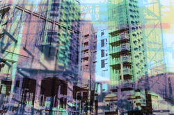
D E V E L O P M E N T S :
 |  |  |
|---|---|---|
 |  |  |
 |  |  |
 |  |  |
 |  |  |
 |  |  |
 |  |
P R O C E S S L O G & A N N O T A T I O N
| | |
|---|---|---|
| | |
| | |
| | |
| | |
For this series of developments, I used the same editing technique as I did for my first set of Hilly Van Eerten developments, but experimented with layering buildings and cranes over my images instead of only layering cranes, to make my images more interesting and varied.
I M A G E C H A N G I N G G I F S :
 |  |  |
|---|---|---|
 |  |  |
P R O C E S S L O G & A N N O T A T I O N
| | |
|---|---|---|
| | |
| | |
| | |
| | |
To refine my work and delve even deeper into my concept of "the impact of time on the identity of buildings, I decided to experiment with making image-shifting gifs out of my redrafted developments. I created these gifs using the editing software 'Adobe Photoshop' and the website gifmaker.me'. I firstly began by opening 3 chosen developments (to create variation within my work) by clicking 'file' and 'open' then selecting my chosen developments. After this, I then selected one of my three images to be my base layer (and the image presented first within my gif), and then I pasted one of the other two images over the base layer by clicking 'ctrl + c' to copy and 'ctrl + v' to paste my image. After this, I changed the opacity of my pasted image to 10, then saved it, which I did 10 times to get to an overall opacity of 100. I did this so that when I create my gifs, the shift between the two images would look more natural rather than my gif simply being one image suddenly snapping to another. I repeated this process twice in all of my gifs to present a total of three images in each gif. After doing this, I ended up with a total of 30 images. I then headed to 'gifmaker.me' and uploaded all of my images to create one gif and changed the animation speed to 200 milliseconds, to make the transitions between the images smooth. This links to my concept of "the impact of time on the identity of buildings" as the change in the images within the gifs could be emblematic of the shift in the form of building over time and the change they undergo. The shift in the buildings in my work mirrors the shift in form buildings undergo over long periods of time and how they change as a result. The vibrant colours present within my images represent the positive impact of time on the identity of buildings as we associate vibrant and saturated colours with positivity. A successful element of my work would have to be the smooth transitions between each image. Conversely, an element of this work that could be improved is the number of images presented in each gif. Although three is a reasonable amount of images to include, I think adding more images in each gif would make my work more conceptual and also more satisfying to look at as the several images presented within it could be representative of the change in form that buildings undergo under extremely long periods of time. Overall, I am extremely pleased with the outcomes of these gifs and I think that they turned out to be very successful and link well to my concept of "the impact of time on the identity of buildings", as the shift in image is representative of the passing of time.
D O U B L E E X P O S U R E :
 |  |  |
|---|---|---|
 |  |  |
 |  |  |
 |  |  |
 |  |  |
 |  |  |
 |  |
P R O C E S S L O G & A N N O T A T I O N
| | |
|---|---|---|
| | |
| | |
| | |
| | |
To further refine my developments, I decided to double expose them with other developments from the same series to explore different colours within my work in order to make it more interesting. I edited these developments using the editing software 'Adobe Photoshop'. I firstly began by opening two images from my set of developments. After this, I selected one of my images using the 'rectangular marquee tool' and then clicked 'ctrl + v' to copy the image. After this, I then clicked 'ctrl + v' to paste the development over a different development. After this, I clicked 'ctrl + t' to free transform my image in order to scale it to the correct image size. After doing this, I then clicked 'normal' and experimented with different double exposure techniques that I could use to merge the two developments together. For this particular set of developments, I found that the 'multiply' double-exposure technique worked best with my images, as it made them seem like one individual image instead of two images merged together. After this, I used the 'brightness/contrast tool' to increase the brightness of my image because merging the two developments together had darkened the colours within them. Finally, I then saved my image by clicking 'file', 'save as', and saving my image as a 'JPEG' file. A successful element of this work would have to be the interesting effect that merging the two images had on my work. I think double exposing these two images was a good idea and made my image look even more interesting and conceptual as the colour variation makes my image more interesting to look at but also links to my concept of "the impact of time on the identity of buildings" as it is representative of the positive impact change can have on the identity of buildings. On the other hand, an element of this work that could be improved would have to be the colours in the developments that I merged together. Some of the colours didn't coordinate very well and to improve this I will try to colour coordinate my images in future by double exposing warm colours (such as red and orange) with warm coloured images and cool colours (such as blue and green) with cool coloured images. Overall, I really enjoyed editing these developments and I think these images turned out very interesting and successful.
E X P E R I M E N T I N G W I T H T E X T U R E - P A P E R :
 |  |  |
|---|---|---|
 |  |  |
 |  |  |
 |  |  |
 |  |  |
 |  |  |
 |  |
P R O C E S S L O G & A N N O T A T I O N
| | |
|---|---|---|
| | |
| | |
| | |
| | |
To further refine my developments, I decided to double expose them with textures of paper to make my images look more interesting and to explore the different ways that I could present my work. I edited these developments using the editing software 'Adobe Photoshop'. I firstly began by opening two images, one from my edited developments and one image from the internet of a paper texture. After this, I selected the paper texture image using the 'rectangular marquee tool' and then clicked 'ctrl + v' to copy the image. After this, I then clicked 'ctrl + v' to paste the paper textured image over my edited development. After this, I clicked 'ctrl + t' to free transform the paper image in order to scale it to the correct image size. After doing this, I then clicked 'normal' and experimented with different double exposure techniques that I could use to merge the paper texture with my development. For this particular set of developments, I found that the 'multiply' double-exposure technique worked best with my images, as it gave them a more naturalistic look and made them appear as if my images were actually printed onto the paper which I thought created a really interesting effect. After this, I used the 'Brightness/contrast' tool to increase the brightness of my image because the paper had made my image significantly darker which made the colours difficult to see. I also increased to contrast in my image to make the paper texture more prominent, but not too much to maintain its naturalistic look. Finally, I then saved my image by clicking 'file', 'save as', and saving my image as a 'JPEG' file. A successful element of this work would have to be the interesting effect that the paper texture had on my image. I think double exposing these two images was a good idea and made my image look even more interesting. On the other hand, an element of this work that could be improved would have to be the paper textures I used. Although the paper textures worked well with my images, I would improve my work in the future by capturing my own crumpled paper photoshoot to make my work more individualistic. Overall, I really enjoyed editing this set of developments and I think these images turned out very successful and that the paper texture helped add to the urban aesthetic within my images.
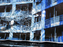
P H O T O S H O O T 3 - W A T E R :
 |  |  |
|---|---|---|
 |  |  |
 |  |
My intention for my third photoshoot was to further develop my previous developments whilst also exploring water photography by photographing my images underwater. Firstly, I placed a transparent glass plate on a mirror. I then filled the plate with water and placed print-outs of my developments under the water then recaptured them using a Canon Powershot SX540. For a few of my images, I captured the print-outs under still water, to allow my developments to still be clearly visible within the images. However, in other images I captured my photographs as the water was in motion, pouring it as I took my photographs to create lots of interesting water splash effects. I captured my images from a close-up, bird-eye point of view. I captured my images using low-key lighting (in a dark room at night) to prevent any artificial lighting from giving my images a yellow colour, however, I still used a flashlight to make the water effects more visible and to create clear contrast in the ripples in the water. For some of my images, I experimented with different camera angles by slightly tilting the camera and zooming it in to make each and every image more individualistic. I took multiple images of several different printouts of my images so that my images do not all appear the same. I believe that one of the successful elements of this photoshoot was the wide variety of unique images I captured. Another successful element of my work I would say is the colour variety within my work. An element of this photoshoot I believe could be improved is the timing of my images as I am pouring the water into the bowl. Although the outcomes were quite successful, I believe that my images would be even more successful if the water was not visible from the top as it is unclear and blurry. To improve this, I will focus on the timing of my images, making sure that I capture the water being poured at the right moment, as soon as it hits the surface of the water in the bowl. Despite this, I really enjoyed capturing these images and experimenting with water as I also continue to develop my images.
D E V E L O P M E N T S :
 |  |  |
|---|---|---|
 |  |  |
 |  |  |
 |  |  |
 |  |  |
 |  |  |
 |  |  |
 |  |  |
 |  |  |
 |  |  |
 |
P R O C E S S L O G & A N N O T A T I O N
| | |
|---|---|---|
| | |
| | |
| | |
| | |
For my first set of developments, I experimented with saturating my images more than they were when I captured my underwater images to refine my work. I did this by using the hue to increase the saturation within my image. The use of saturated colours is representative of the positive impact of time on the identity of buildings as we associate vibrant colours with positivity, which links to my concept of "the impact of time on the identity of buildings".
D O U B L E E X P O S U R E :
 |  |  |
|---|---|---|
 |  |  |
 |  |  |
 |  |  |
 |  |  |
 |  |  |
 |  |
P R O C E S S L O G & A N N O T A T I O N
| | |
|---|---|---|
| | |
| | |
| | |
| | |
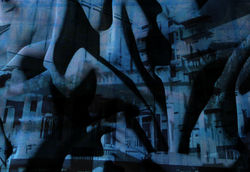
To further refine my developments, I decided to double expose them with my previous under water developments to explore different textures within my work to make it more interesting. I edited these developments using the editing software 'Adobe Photoshop'. I firstly began by opening one image from my developments and one image from my under water photoshoot (where I recaptured my developments underwater). After this, I selected the water image using the 'rectangular marquee tool' and then clicked 'ctrl + v' to copy my image. After this, I then clicked 'ctrl + v' to paste the under water image over my development. After this, I clicked 'ctrl + t' to free transform my image in order to scale it to the correct image size. After doing this, I then clicked 'normal' and experimented with different double exposure techniques that I could use to merge the water texture with my development. For this particular set of developments, I found that the 'multiply' double-exposure technique worked best with my images, as it made them seem like one individual image instead of two images merged together. After this, I used the 'opacity tool' to decrease the opacity of my image because the water developments had made my edited developments difficult to see. I also increased to contrast in my image to make the water texture more prominent. Finally, I then saved my image by clicking 'file', 'save as', and saving my image as a 'JPEG' file. A successful element of this work would have to be the interesting effect that the water developments had on my image. I think double exposing these two images was a good idea and made my image look even more interesting as the glistening of the water created a galaxy effect. On the other hand, an element of this work that could be improved would have to be the colour of the water developments I double-exposed with my developments. Some of the colours didn't coordinate very well and to improve this I will try to colour coordinate my images in future by double exposing warm colours (such as red and orange) with warm coloured images and cool colours (such as blue and green) with cool coloured images. Overall, I really enjoyed editing these developments and I think these images turned out very successful.
E X P E R I M E N T I N G W I T H T R A C I N G P A P E R :
 |  |  |
|---|---|---|
 |
For my fourth photoshoot, I decided to experiment with tracing paper to make my work more interesting. I did this by printing my developments out on tracing paper, layering them on top of each other over a lightbox to create an interesting double exposure effect. I captured my images using a Canon Powershot SX540Hz Camera. I also captured my images in a dark setting with low-key natural lighting to prevent any artificial lighting from making my images yellow or too bright. However, I used artificial lighting via my use of the lightbox to create a white background behind my images and make the double exposure effect of the tracing paper more visible. I tried all sorts of different combinations to create variation within my work. I captured my images from a bid-eye angle to make sure that the images were entirely visible. A successful element of this work would have to be the wide variety of different colour combinations and building combinations I tried with the tracing paper as I think they turned out very appealing and interesting. Another successful element of my work would have to be the clarity of my images, as both of my developments are completely visible as a result of the light from the lightbox which helped make my images looked naturally merged together. Overall, I think this idea turned out to be very successful and I am really pleased with how interesting the images turned out to be.
D E V E L O P M E N T S :
 |  |  |
|---|---|---|
 |  |  |
 |  |  |
 |  |  |
 |  |  |
 |  |  |
 |  |  |
 |  |  |
 |  |  |
 |  |  |
 |  |  |
 |  |  |
 |  |  |
 |  |  |
 |
P R O C E S S L O G & A N N O T A T I O N
| | |
|---|---|---|
| | |
| | |
| | |
| | |
For this set of developments, I experimented with making my images more saturated than they were when I captured my tracing paper images to refine my work. I did this by using the hue to increase the saturation within my image. I also used the 'Brightness and contrast tool' to increase the contrast within my images in order to make the colours within them more prominent. The use of vibrant colours is emblematic of the positive impact of time on the identity of buildings as we associate vibrant, saturated colours with happiness and positivity, which links to my concept of "the impact of time on the identity of buildings".
F U R T H E R D E V E L O P M E N T S :
 |  |  |
|---|---|---|
 |  |  |
 |  |  |
 |  |  |
 |  |  |
 |  |  |
 |  |  |
 |  |  |
 |  |  |
 |  |  |
P R O C E S S L O G & A N N O T A T I O N
| | |
|---|---|---|
| | |
| | |
| | |
| | |
For this set of developments, I experimented with making my images black and white to make them more conceptual and to refine my work. I did this by using the 'black and white tool' to make my images black and white. The black and white imagery is emblematic of the negative impact of time on the identity of buildings which links to my concept of "the impact of time on the identity of buildings".
F U R T H E R D E V E L O P M E N T S :
 |  |  |
|---|---|---|
 |  |  |
 |  |  |
 |  |  |
 |  |  |
 |  |  |
 |  |  |
 |  |  |
 |  |  |
 |  |  |
P R O C E S S L O G & A N N O T A T I O N
| | |
|---|---|---|
| | |
| | |
| | |
| | |
To further refine my tracing paper developments, I decided to double expose them with my previous under water developments to explore different textures within my work to make it more interesting. I edited these developments using the editing software 'Adobe Photoshop'. I firstly began by opening one image from my tracing paper developments and one image from my under water photoshoot (where I recaptured my developments underwater). After this, I selected the water image using the 'rectangular marquee tool' and then clicked 'ctrl + v' to copy my image. After this, I then clicked 'ctrl + v' to paste the under water image over my tracing paper development. After this, I clicked 'ctrl + t' to free transform my image in order to scale it to the correct image size. After doing this, I then clicked 'normal' and experimented with different double exposure techniques that I could use to merge the water texture with my tracing paper development. For this particular set of developments, I found that the 'multiply' double-exposure technique worked best with my images, as it made them seem like one individual image instead of two images merged together. After this, I used the 'opacity tool' to decrease the opacity of my image because the water developments had made my tracing paper difficult to see. I also increased to contrast in my image to make the water texture more prominent. Finally, I then saved my image by clicking 'file', 'save as', and saving my image as a 'JPEG' file. A successful element of this work would have to be the interesting effect that the water developments had on my image. I think double exposing these two images was a good idea and made my image look even more interesting as the glistening of the water created a galaxy effect. On the other hand, an element of this work that could be improved would have to be the colour of the water developments I double-exposed with my fabric developments. Some of the colours didn't coordinate very well and to improve this I will try to colour coordinate my images in future by double exposing warm colours (such as red and orange) with warm coloured images and cool colours (such as blue and green) with cool coloured images. Overall, I really enjoyed editing these developments and I think these images turned out very successful.
F U R T H E R D E V E L O P M E N T S :
 |  |  |
|---|---|---|
 |  |  |
 |  |  |
 |  |  |
 |  |  |
 |  |  |
 |  |  |
 |  |  |
 |  |  |
 |  |  |
P R O C E S S L O G & A N N O T A T I O N
| | |
|---|---|---|
| | |
| | |
| | |
| | |
To further refine my tracing paper developments, I decided to double expose them with textures of fabric to make my images look more interesting and to explore the different ways that I could present my work for my final piece. I edited these developments using the editing software 'Adobe Photoshop'. I firstly began by opening two images, one from my tracing paper developments and one image from my fabric photoshoot. After this, I selected the fabric image using the 'rectangular marquee tool' and then clicked 'ctrl + v' to copy my image. After this, I then clicked 'ctrl + v' to paste the fabric image over my tracing paper development. After this, I clicked 'ctrl + t' to free transform my image in order to scale it to the correct image size. After doing this, I then clicked 'normal' and experimented with different double exposure techniques that I could use to merge the fabric texture with my tracing paper development. For this particular set of developments, I found that the 'multiply' double-exposure technique worked best with my images, as it gave them a more naturalistic look and made them appear as if my images were actually projected onto the fabric which I thought created a really interesting effect. After this, I used the 'Brightness/contrast' tool to increase the brightness of my image because the fabric had made my image significantly darker (as I captured images of dark grey fabric) which made the colours difficult to see. I also increased to contrast in my image to make the fabric texture more prominent, but not too much to make it appear naturalistic. Finally, I then saved my image by clicking 'file', 'save as', and saving my image as a 'JPEG' file. A successful element of this work would have to be the interesting effect that the fabric had on my image. I think double exposing these two images was a good idea and made my image look even more interesting. On the other hand, an element of this work that could be improved would have to be the colour of the fabric I photographed. Although I increased the brightness the fabric still affected the colours within my image and to improve this if I were to capture another fabric photoshoot I would use a lighter shade of grey fabric so that the fabric textures and patterns are still visible but the colour of the fabric will be light so it won't interfere with the colours in my image. Overall, I really enjoyed editing this set of developments and I think these images turned out very successful and that the fabric has helped to create a really interesting effect within my work.