
HIBAH JEWHAR
ARTIST ANALYSIS
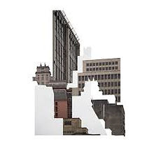
Leticia Lampert is a Mexican photographer who explores the identity of buildings. She was born in 1978 in Porto Alege Brazil. She graduated in graphic design and visual art with a MFA in visual poetics. Lampert is also a freelance graphic designer. Her work is focused on how architecture mends the relationship between with places. she focuses mostly on collage and layering. Her main style is capturing images of building and covering them with blank spaces randomly to give the audience a chance to create spaces through there huge imaginations .She also works and plays with shadows and shapes them in very surreal ambiguous ways.

The most captivating parts of her work is how she is able to do both spectacular image taking with experimenting with shadows and digitally edit her images as well. She digitally edits her images by covering them unsystematic-ally which denotes confusion to the viewers. Lampert is also known for her famous artwork "known by sight" this is a book that she has created that explores the urban perspective of houses in Brazil Sao Leopoldo. Brazil is known be a very densely populated country so therefore it is most likely going to be filled with plenty of homes. What Leticia Lampert came up with was to capture peoples homes in there raw states. This includes capturing through peoples windows to capture other peoples homes. Most of her artworks really highlight the differences between urban and rural households by placing them next to each other really emphasises the differences between them. however it also does the exact opposite where it relates the common similarities.
Artist statement (from the internet)
Cities and how we relate to them are a predominant theme in my work. My interest is mainly about the perception and awareness of how urban environment affects the way we see the cities, how it can determine dwellers behaviors, and the differences between public and private spaces.
Photography is my main medium and I like to use it to think about aspects of everyday life that the banality of habits made us forget that we might question. Photography for me is not only a way of seeing but mostly a reminder that the view is always partial, that it can always be opposed, that there is much more outside the frame.
Besides photography, I have also worked with video, installation and artist's books. I understand that each project has its own needs so the medium is not a limitation, it can always be changed. The influence of my previous education in Graphic Design is quite apparent in my productions, both by formal care in the compositions, as by the need to clearly communicate the concepts I am working with.
MY INSPIRATION
LETICIA LAMPERT

.jpg)
.jpg)
.jpg)
.jpg)
.jpg)
.jpg)
.jpg)
.jpg)
.jpg)
.jpg)
.jpg)
.jpg)
.jpg)
.jpg)
.jpg)
.jpg)
.jpg)
PHOTOSHOOT PLAN

CONTACT SHEET


When I captured my images I tries to look around for ancient abandoned rural places as can be seen in the images. I captured my images with various angles such as a low angle and medium shots. I captured these images in deprived places to mainly mimic Leticia work. When capturing these images I had to make sure there were no / few distractions for example trees, as they ruin the surreal effect of of the architecture. I travelled around places around London to search for buildings. I captured thee images with a low aperture with both high-key and low key lighting. For example i had to consider the time of day to ensure that I could have an equal amount of high-key and low key lighting. The low key lighting were captured in the night which gives an eerie kind of atmosphere for the images. Most of Leticia Lamperts work is surreal and confusing and to imitate this kind of concepts I shot my images in different lighting.
DEVELOPMENTS


When capturing these images I had to know how how to copy and paste images ,to,collaging in order to create a successful collage. Firstly I had to edit several image that do not look similar. I increased the brightness decreased the contrast to enhance the shadows in the background. i used some keys on the key board when trying to edit my images. I pressed Ctrl C on the key board to draw with the selecting tool and I selected fragments of the image in various sizes. I then pasted then on top of the original image however I shifted then slightly out of space to create a distorted view of the image. Whilst repeating this process several times i managed to create a collage image done digitally successful image.
PROCESS LOGS

I first changed the image to black and white then carefully selected fragments of the image and re arranged then slightly to create a slightly glitched like image
then by repeating this process multiple times to create this image.

FURTHER DEVELOPMENTS MIRRORING


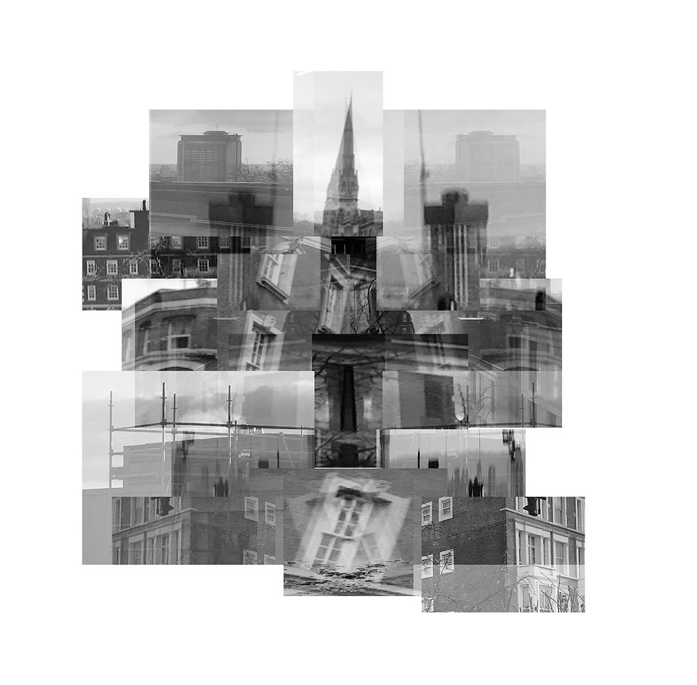
For these set of images I took some of my original images and had to mirror it. By doing this I was exploring the different ways on how to mirror my images. When creating these images i first had to edit the image black and white this is significant as the black and white filter portrays a different mood.For example extremely vibrant saturated colours often portray positive happy emotions. Due to the absence of colour in my images this therefore reflects a melancholy depressing mood to the viewers. After editing my images black and white I flattened my images in order to prevent any previous edits to be lost. I then drew with the select tool and selected fragment and shapes. I then pressed the following keys on my keyboard ; (Ctrl C, Ctrl V and Ctrl T) I pressed Ctrl C to enable the fragment I just selected to duplicate itself, I pressed Ctrl V in order for the image I had just selected and copied to paste itself. I then pressed Ctrl T so i could have access to monover the fragment around. I slightly shifted the fragment away from there original spaces and pasted then on top. I then repeated this process multiple times to successfully collage these images. However to further refine and develop my work I had to mirror it. Mirroring is a simple process which only requires a couple steps. I first have to draw with the select tool and to select the whole image I then had to press Ctrl C so it could create a replica of itself in doing so i pasted the copy of the image and flipped it 180 degrees I then have to position it in a place where it seems that there is a mirror in between the image to give it a mirror effect .
PROCESS LOGS

First I had to collage my images digitally using Photoshop and make it appear as if it was collaged by hand. I increased the contrast and decreased the curve to enhance the shadows.
Then I mirrored my image by copy and pasting the photo, flipping it horizontally to create this mirror effect.

FURTHER DEVELOPMENTS IMAGE BLEND


when creating these image I used the previous developments duplicated them and image blended them on top of each other to create this mirrored surreal look. I then increased the contrast and decreased the curve to give the building a dark and shadowy theme. to further reinforce the darkness and shadows I decreased the brightness slightly to enhance the distorted surreal theme the artist goes for. I tried on every different method for image blending until I found the most suitable one for my artist, these include: pin light ,darken, soft light and colours blend. This work seems confusing and perplexing as the audience get puzzled by the confusing mesmerising architecture. I had to image blend these images so I could further define and experiment with the previous development I have taken. One successful thing about my work is that the image blending technique is similar to the mirroring technique because as it as it fuses the two identical images together it also slightly mirrors them together. However the mirroring technique is completely different as they both have very obvious differences.
EXPLORING COMPOSITION


For this exploring composition I selected three images that complimented each other all these images align with each other to give the effect that they are all one image. This was done to create a long vertical image. I deliberately captured these images at the same/ similar location to make the image run smoothly when switching to present the other images. I edited these images by mirroring my previous development which creates a duplicated effect.
PROCESS LOGS

I first change the filter to black and white and decreased the curve by a bit.
I then duplicated my image and copy and paste it on top of the image. Then I went on the function image blend and went through the different filters and decided which one looked most pleasing.

REDRAFT CONTACT SHEETS


When I captured these images I had to look for a balance of rural images of building and a bunch of deprived desolated images so I could be enabled to collage them together like Leticia Lamperts work. I took close ups of the building and zoomed in and out of the images to highlight the tiny intricate details on the buildings. I captured theses images using a variety of different modes such a such as HDR and portrait mode. I did this so I would be abled to get a clearer view of the architecture. I also had to capture them in many different angles to capture the different perspectives of the buildings. I also captured my images horizontally and vertically so I could get a wider range. I tried my best to capture these images during the daylight to include the natural lighting from the sun. However one of the struggles was that the sun was not shining bright. Another one of the struggles were trying to balance the amount of urban and rural architecture images I took, however I feel as if I did my best at that. One of the successful elements of this shoot was that i was able to capture the tall skyscrapers from a low angle.
REDRAFT CONTACT SHEETS


For these set of image I had to print out all of my unedited images so I would be able to collage them by hand. To insure this would be possible had to use scissors and cut out fractions and fragments of of my images. I would then have to work on my composition and place then in different places. After doing these I would have to make sure that I used images that look different to juxtapose the two different themes: The modern word and poverty. I have collect a series of images that represent the modern world of architecture and the deprived part of architecture. Therefore collaging them together juxtaposes the true meaning which is similar to Leticia Lamperts work as she explores building from different perspectives. When cutting them out I tried to cut them randomly and in different shapes to elevate the look. As I was cutting out my images in different sizes and shapes I realised cutting them in thin triangles really emphasises how the images are supposed to fit together as it mimics a puzzle layout.
REDRAFT DEVELOPMENTS


For these images I edited them by increasing the brightness and contrast and I decreased the curve to enhance the dark theme. To further reinforce my work I added noise to my images to increase the grain in my images, this also gave a more pix elated effect of my images .I also added the noise to my images as it DE-saturates my images. I also used a variety of different compositions to elevate my work. To add noise I had to click on edit on the top of the screen and add noise then I could determine how much noise I wanted to add. The amount of noise simply determined on the quality of the image and how it would benefit from looking more grainy then the others. However one thing tat went wrong when editing was that I might of added to much noise which gave the image a harsh grain pix elated effect which I was meant to stay away from. So therefore in order to cancel out the noise I had to increase the brightness to reduce the noise and decrease the contrast to lighten the shadows.
REDRAFT DEVELOPMENTS
BLACK AND WHITE


For this set of development specifically I have had to capture this image with various compositions and from a birds eye view. I then selected an image that I was especially proud of to incorporate that into my set of developments. I then used the cropping tool to cut out any excess negative space in the image to limit the overall focus the the composition of the buildings. I then had to use the black and white filter to achieve this early 19s look. Immediately after i had flattened the image and increased the contrast to darken the corners of the image, then increased the brightness to make sure the image was vivid and visible. After all this had been done, I clicked on "filter "and clicked on "noise" then "add noise" .I then had the freedom to adjust the noise to really grain or light depending on how it looked on each image. Finally I flattened the image again and saved it as a jpeg.
REDRAFT FURTHER DEVELOPMENTS


For this process of editing I got my original images from the previous edited images and I copy and pasted another image on top. However before this I had to alter the contrast and brightness to suit my look. I then had to place then exactly on top of the image to make sure when I add the image blend effect no spaces would be left untouched and blank. I specifically chose to leave this gallery completely in color to explore both different types of color filters throughout my work. Then I had to go on effect and I had to choose many different effects to show how to edit my image. I normally go for:
`soft light`
`Pin light`
`Color pin`.
However I would choose the one which suited and matched that specific image. Then it would result in a wonderfully digitally edited image blend. I made 15 of then to try the technique on lots of different image to receive different but unique results.
PROCESS LOGS

First I added noise to my image whilst not forgetting to increasing the brightness to eliminate the harsh noise.

I then had to change the filter to black and white and increase the contrast to enhance the black and white eerie theme to the image.

Next, I opened another image and I made sure to edit it the same way as before (increasing brightness, contrast and adding noise) however I made sure to not change this image to black and white.
Here I went onto the second layer as I copy and pasted the previous image onto this image. I did not flatten the image because then the two seperate images would become one.

I then used the polystyrene tool and was selecting the lots of fragment and sections of the building to reveal the black and which image underneath.

Here I repeated this process multiple times as I added the shadows. First I had to go onto layer, then from there to layer shadow, then to inner shadows. After this I was able to change the size of the shadow and the pigmentation of the shadow.
REDRAFT FURTHER DEVELOPMENTS


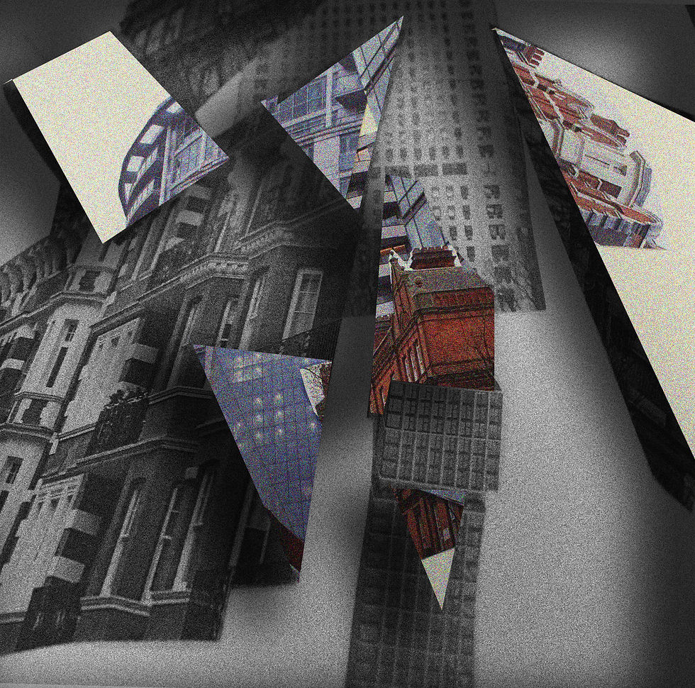


For this techniques of editing, it was more complex then the first set of development due to the multiple steps required to achieve this shadow look. Firstly I had to copy and paste a different image on top o the original image I would actually prefer to make sure one of the images are saturated with color and the other one in a bleak black and white. Next I would use the select tool then change the different setting and change it to the polystyrene tool. I then had to flatten the image so the previous edits would be lost. I then would select each a fragment of the image and create any shape I wanted. After this I would double click my mouse and go onto layer, then layer style then to inner shadow and then I would adjust the shadow size and length then finally I would blend it all it which creates the shadowy look around the cut out of the shape which reveals the hidden image with color underneath it. It would also create the shadows around the outside of the image to enhance the sinister distorted look I was aiming for. I would initially select many different shapes and sizes of the fragment of the building which I would delete/ cut out and instead of revealing a blank space it would show a magnificent buildings underneath.
EXPLORING COMPOSITION


HIGHLIGHTING SUCCESS
I am particularly pleased with this specific image due to the composition and the way the coloured and non coloured images blend together easily to form an exceptional image. the grainy rough textured building revealing a brightly coloured browned orange is juxtaposing both elements of photography. The melancholic grained black and white image, has a vibrant coloured bulging underneath which express identity perfectly through buildings. The way both of the different themes of art are coming together through the crevices and cracks on the top image is what makes this image my favorite from this artist.
