
HIBAH JEWHAR
ARTIST ANALYSIS
ALEXEY BOGOLEPOV
Alexey Bogolepov is an artist who`s work explores compromises architectural photography and explores the modernism world wide. He is a Russian artist born in 1985 in Vyborg Russia. He graduated from university of Alaska BLA in fine art, he then started a photo foundation. His photographs have been featured in solo and group exhibitions in U.S. Alexey is also commonly known for him adding red lines over layered onto the intricate details of the buildings to over accentuate the image. The extremely saturated red enhances the shape of the building as if focuses on many small details of the piece of architecture. The simple technique really highlights the building which improves the quality. He would normally use black and white images to add contrast to the image however the red streaks across the image are left a vibrant red to make the image stand up. Bogolepov usually explores with modern urbanised architecture and highlights them with a bright red. The usage of black and white images enhances the shadows in the background of the images. Alexey also explores his composition with his red lines creating complex shapes to layer on top of the buildings. The hued red highlights and the decayed building enhances the image by converting it from simple to an outstanding piece of artwork.

Alexey Bogolepov is known for being interested in modernism and the ideological expressions of architecture. The three words he said that sum up his type of photography is Language, Surface and Fiction. He is also strict about re imaging photography as a strictly conscious activity, where you are deliberately making choices on how you edit and capture these photographs. His work is very visually inspiring as he explores different combinations of photography. The most captivating parts of his work is how he transforms dilapidated broken buildings into something aesthetically pleasing to the eye. Bogolepov is also known for his love for photography especially ancient deprived looking building as he takes them and transforms it into something pleasant and less eerie. Alexey is mainly famous for his unique technique and styles of editing images where he takes something dull and "boring" and then completely transforms that whole image by adding the vibrant primary colour red. The colour red symbolizes power strength and originality. Although the colour red usually being associated with death, I personally feel like Bogolepov has used it to portray his confidence and internal strength that is unable to be explained in words. Alexey Bogolepov explains his personality beautifully by just "a couple of red lines on a page" and this reflect his personality through art which I think is wonderful which is I chose this artist. Is simply unbelievable how just one colour can evoke emotion out of someone and inspire then to do the same in the form of art.
Artist Statement "I'm in the centre of the photographic act from start to finish, recasting the object by spotlighting it in a new way. This means I generate the light that has not been encountered by the object before. In this case it's an assembly of flashes. Creation of new light is a routine ontological gesture, an instance of working with a material. It produces a new set up, a new configuration of circumstances."
PHOTOSHOOT PLAN
WHAT IS MY IDEA
For my photo shoot I am planning to capture picture of deprived and modern building and double expose then with bright vivid red strips .Similar to my own artist (Alexey Bogolepov) he converts his images to black and white before he adds the bright pop of color.
POSE/STYLE.
I am going to be capturing my image of tall skyscrapers
,deprived building in different angles.My style I would just capture building of different shapes and sizes and experiment with composition.
SETTING AND LOCATION
For the setting I will be going to multiple places around London so I can capture a variety of building types in different areas. I will be traveling near the tall buildings and the short narrow ones to explore different compositions.
LIGHTING
For my lighting I will be using natural lighting from the sun or artificial lighting from the headlight around the streets depending on what.
WHO HAS INSPIRED ME.
I have been inspired by my own previous artist as their work make me want to continue exploring other artist similar to theirs.
CAMERA ANGLE AND POSITION
For my camera angle I shot at a low angle to capture it from the bottom to experiment with composition. I also put the camera on portrait mode and HDR mode to explore the different effects. I also would be experimenting with capturing medium shots.
MAIN CHALLENGES OF THE SHOOT
One of the main challenges for me were trying to capture many different types of architecture in one shoot to do this I had to travel around London to capture a variety of different building and architecture to stop the shoot from appearing mundane and repetitive with the style of buildings.
COLOUR SCHEME
REFLECTION OF THE SHOOT.
Overall I feel as if the shoot has gone well as I managed to capture a variety of different buildings and architectural sites relating to my artist. In my opinion the shoot has gone well however I feel as if I could of captured more images that were similar to my artist.
CONTACT SHEET


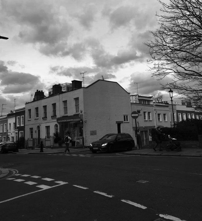
I attempted my first Photo Shoot in the style of Alexey Bogolepov. I began capturing images of houses and industrial buildings. I tried to find building that were all one solid colour preferably white as that is what my own artist does. I also tried to search for tall sky scrapers with intricate designs on then again to relate back to my own artist. I used a low aperture to enable more light to enter the lens of the camera. I needed to capture these images with different compositions to capture different types of perspectives of the buildings. I also managed to balance the modern architecture and the old fashioned ancient building so my images would be given a different effect. I tried my best to capture buildings which have a simple structure and shape so it would be easier to image blend them and edit the red lines on top and around them. I also purposely capture half of and image so then when I got to the stage of editing and mirroring it would be more realistic when mirroring. I managed to captured these images in various compositions to enable editing to be easier. Overall I feel as if this shoot could of gone better if I had taken much more.
DEVELOPMENTS BLACK AND WHITE


For these set of developments simply converted them to black and white. This evokes a mood and convey an strong sad emotion. Black and white images make you view the image differently and not the same way colour can. So I desaturated my image to mimic Bogolepov work and to convey emotion in my images. When capturing these images I had to focus on capturing images which were predominately simple plain buildings. I did this to keep the base of the image simple so that in the future when I drastically edit my images with the colour red the image wont be too much going on in the image. After each and every step of editing my building images I make sure to flatten my image to ensure none of the layers of the image do not show or get deleted.
FURTHER DEVELOPMENTS


For this technique I made sure to use my previous set of development just before this and digitally edit red lines across the buildings. This was inspired by my own artist work as she is also known to incorporate the colour red in most of her images. I went onto google chrome and searched red background colour then copy and pasted it on top of my image, the after multiple attempts of trying to position the red lines into the right place I found a technique that worked for me, I also incorporated some of my own individual ideas on how this image was going to be portrayed by image blending I made sure to outline the building to enhance the "boring and "plain" image. Not only did I outline the background I also made sure to outline the windows. I repeated this process multiple times and I have also inserted a process log to o give you a visual image on exactly how I created these successful images in the style of Alexey Bogolepov.
FURTHER DEVELOPMENTS MIRRORING


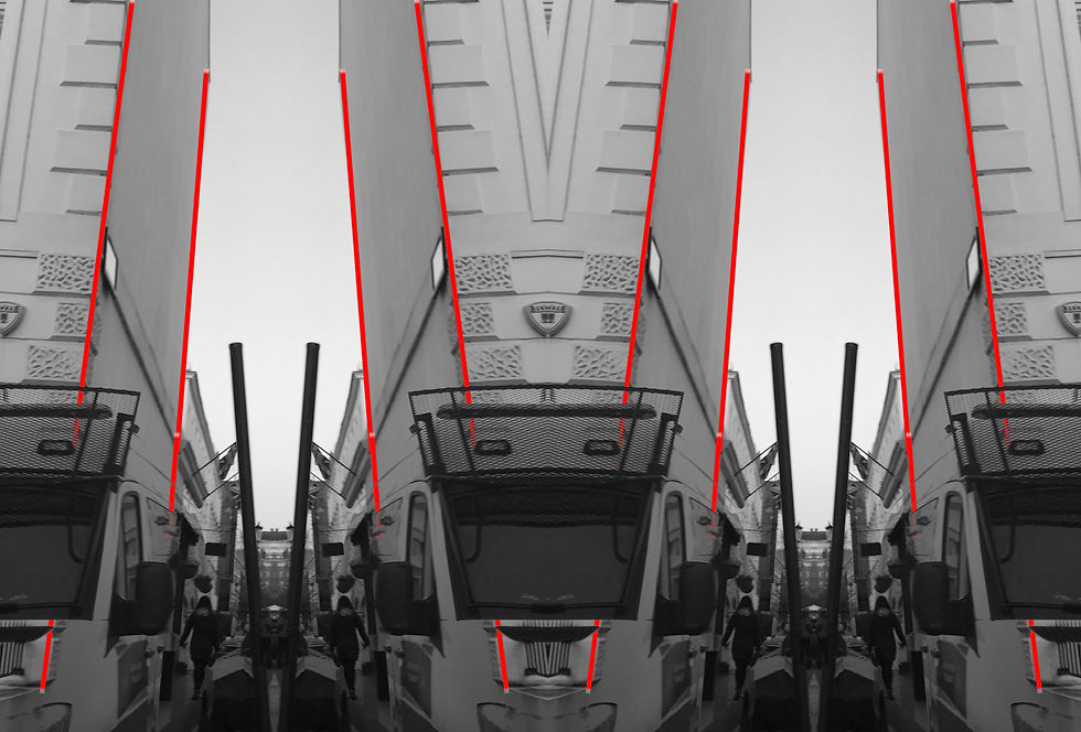


For this particular development I have further developed and my work as I used a mirroring technique I copy and pasted the image and flipped it around then I placed it on the sides of the image to then make it seem as if the picture was mirrored. I then had to crop any excess space. I have also made sure to increase the contrast to enhance the dark shadows in the images however I increased the contrast. By creating these developments it has created a mirrored image or it creates a perfectly symmetrical image. The idea of it being perfectly symmetrical suggest that this is unrealistic. Another technique I have also done was image blending the image flipped around and on top of each other which is when you image blend and mirror at the same time, by placing to identical images on top of each other whilst one has been flipped inside out creates and illusion of the images being mirrored when in fact they were not.
PROCESS LOG

Firstly I edited my image black and white as my artist explores black and white architecture.
I then added red lines mimicking the shapes of the building that seem as if they are a shadow surrounding the buildings.


I then added more red lines then imaged blended then together which merged and mirrored the images.
CONTACT SHEET REDRAFT


When capturing these developments I had to ensure that I had to capture a variety of different images that didn't look too similar to relate to my artists work. These images were captured outside of London which is where I was able to capture an ancient old fashioned castle looking building. I also captured ancient architecture figures to enhance my theme of buildings. I also found it easier to capture image from birds eye view , captured from a high building (the eleventh floor). For this shoot I was originally going to capture images that had similar characteristics, however I found it better to capture images with significant differences so when I image blend the images with a light box the wont look to similar.This is why I captured images in different sizes and shapes. I also shot these images with a low aperture to increase the light which enters the camera lens, I intended to use a fast shutter speed to make sure the images are not as blurry.
BLACK AND WHITE DEVELOPMENTS


For this set of development I simply captured images that were simplistic and plain as I was going to edit them in very big proportions later on in my portfolio, I have been using these images as a base to then edit and further refine(experimenting)them to create the other images. I converted these images to black and whit as my artist does not use colour in his images except for it being the bright red lines he edits on top of his images. My artist is known for juxtaposing the melancholic dark black and white with the vibrant vermilion red and me being inspired by him is willing to do the same which is why i am starting of with the plain ordinary black and white images.
FURTHER DEVELOPMENTS


For these set of developments I have just converted my raw images into black and white, in order to act as a template. These images were vital for the making of my other developments as later on in my portfolio I have printed these images of and did some physical work (image blended them using a light box). I also managed to increase the contrasts of my images in order to make the image stand out. I then had gone a step further and mirrored my images. I first extended the canvas (by going on the crop tool) to allow the to be space for the other half of the image to go. Next I copy and pasted the image by pressing these keys on the keyboard, (CTRL C) (CTRL V) and (CTRL T) The Ctrl c enabled to to copy the image ,Ctrl v pasted the image and Ctrl t enabled to to move around the image and adjust the width and length. Then I placed the image onto the opposite side to make it look like a mirror (hence the name MIRRORING on the title)
CONTACT SHEET


For this shoot I first printed out my previous images from my previous set of developments, in order to further refine and develop my work I experimented with composition in these final ways. Firstly I had to print out my images on acetate which enabled my image to be transparent. The transparent image enabled me to layer all my image on top of each other to create a distorted blurry effect. I also printed a red sheet on acetate and cut it up into red strips, to then layer it on top o the buildings to mimic my artist and my previous developments where I edited the lines on digitally
DEVELOPMENTS
EXPERIMENTING WITH COLOUR


For these set of developments i printed out my images on acetate to then i age blend them digitally on the light box.I was able to adjust the brightness of the light box to then make the overall image more orange or red. Due to my artist mainly focusing its attention on making his images appear red I wanted to save that aspect in my further developments. I made sure to minimise the brightness of the light box to make the image appear more red. I also printed out my images on acetate to make them transparent to allow the images to image blend successfully. I then edited these images by increasing the hue of the colour and decreasing the contrast. I increased the contrast so the dark shadows within the image (which are mostly not looked at) become enhanced and highlighted within the image. This draws attention to the intricate details on each building. Overall, I can tell that there is a huge difference between digitally image blending my image (shown directly below) and hand image blending them.I honestly thing they both suit my images well however when you are (hand) image blending them it gives a more realistic and genuine approach as there are not any colour fading.
FURTHER DEVELOPMENTS
DIGITALLY EDITED IMAGE BLENDING


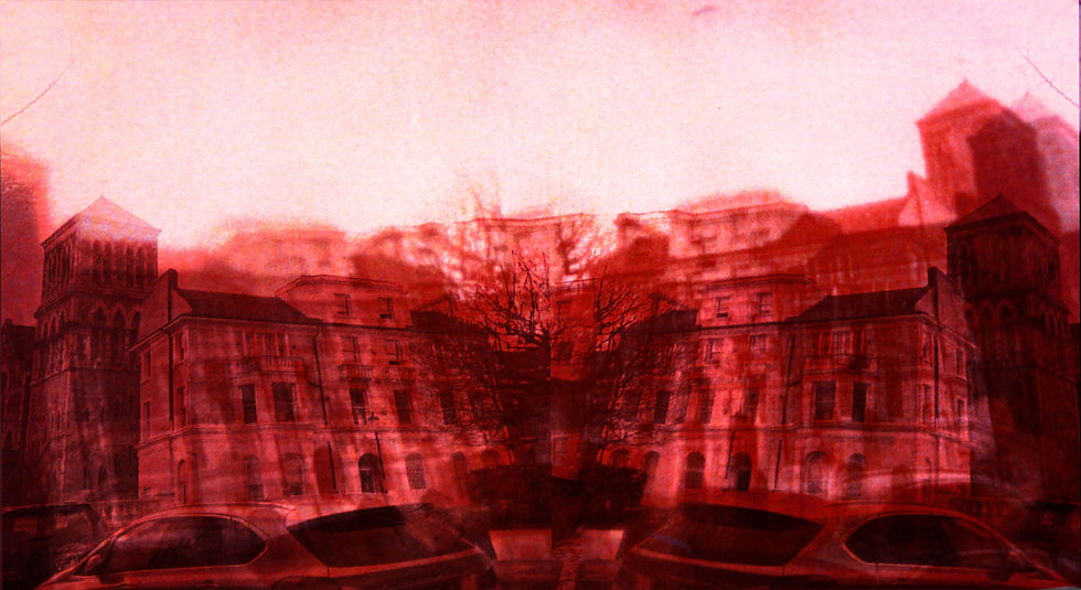


For these developments I printed out my images on acetate then I put all my images on the light box and layered them on top of each other to then capture them with a camera. I had the freedom to choose how bright I wanted the light box to be (this varied depending on the image).I also printed the a red template on acetate to image blend it with the images of the buildings. I then went on to photo shop and digitally imaged blended the image together to increase the effect of the distorted view of the image. These images are known for being an inspiration of Alexey Bogolepovs work. I also made sure to strengthen the pigment of the colour as it was intended to look like a harsh vermilion red however the light box washed some of the pigment out. So by increasing the colour, I went on the hue function to darken the colour. By doing this I strengthened the image by converting it from a light washed orange to a bright red. I drew with the eraser tool to correct the pigment and rub some of it out to eliminate the harsh colour. This is how I successfully digitally imaged blend my image blend made by hand and the light box.
FURTHER DEVELOPMENTS


For these images I image blended to image which create a blue/purple/red, the combination of all of these colours create a harmonious colours which blend with each other smoothly. By image blending the same image multiple times it creates a blue/magenta shade which really am proud of.These images are, in fact the exact same images I used in my previous development instead I used a different editing technique to create the blue/ pink hues. I maintained to keep the red stripes in the images to make sure the theme of the artists work is still incorporated within my own work. How I created the red strips were in these following orders, I first printed out a red sheet on acetate ( a transparent material), next I cut them up into tiny thin lines using the guillotine, into various lengths and sizes.I then placed them into different compositions whilst outlining the buildings.Overall I feel as if these images are successful as they truly portray elements of my own personality and identity fused with my artist Alexey Bogolepov .However I would feel better if I had improved the overall quality of my image.