
 |  |
|---|---|
 |  |
 |  |
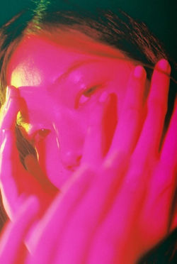
Petra Collins, born December 21 1992, is a Canadian artist, actress, director of photography and fashion model. Her photography is distinguished as a feminal, ethereal-like feel, all through the lens of a female gaze. Her fondness with the camera started at the age of 15, leading her to that same infatuation years later. She has directed a number of short films, including music videos for well known artists such as Carly Rae Jepson, Lil Yachty, Selena Gomez, Olivia Rodrigo, and Cardi B. Olivia Rodrigo's renowned song "Good 4 U" was directed by Collins, it was the number one song in the world.
Petra Collins captures photographs that showcase a life that is idolised and desired. For me, personally, it symbolises how we willingly put ourselves through pain to achieve a look that is deemed in style or fashionable. Whilst going through these severe transitions, we forget to take care of ourselves and forget our basic needs. However, it also symbolises the journey to finding who we are, our true identity. It displays the lengths we travel to understand our interests and who we are as people.
The series that intrigues me most is "24 hour psycho" (2016), it is a gallery of images that showcases multiple girls with various lights reflecting onto their faces, exposing their tears. The message that seems to be translated through the photographs is the stereotype that women are overly emotional and therefore need to be managed. Collin's use of the word "psycho" usurps the concept of feminine hysteria and embraces it through intense, dramatic, and beautiful imagery of young women, who despite their suffering, have a choice.
"girls' sadness is not passive , self-involved or shallow; it is a gesture of liberation, it is articulated and informed, it is a way of reclaiming agency over our bodies, identities, and lives" - Audrey Wollen.
I am excited to start taking photographs and working in the style of Petra Collin's as I have not worked in this style. I plan to incorporate the use of bright lights to illuminate and almost expose the emotions that may be buried beneath the coloured lights. Emotions will play a strong part throughout my work on Petra Collins, depicting sentiment in a completely different light. I am ready to experiment and play with different ideas when doing the photoshoot
PHOTOSHOOT PLAN

CONTACT SHEET

This is my contact sheet that I created with my photoshoot, inspired by Petra Collins. I took these photos using my iPhone camera and another phone to project the different coloured lights to add the element of experimenting with lights to my photoshoot. To take these photographs, I made use of a blank, white wall in my room to act as my background. This was the best option as the solid-coloured backdrop would accentuate the lights quality, it would not disrupt the solid colours. I used an app on my phone to create the different coloured lights, I placed it beside the camera at a slight angle to ensure a full coverage of my face. I also had to ensure that the rest of the room was pitch black, I desired a completely dark scene as it would project the lights in a higher quality, illuminating the face. I believe at the beginning of the photoshoot, I had not figured out the approach best suited for me, resulting in IMG_1070-1108 not being my best images. However, as the photoshoot progressed, it is visible that I became more accustomed to capturing photos in the style of Petra Collins. I think that the most successful elements of the photoshoot were the expressions depicted on the faces, I'm also very pleased with the outcome of the compositions. I enjoyed the process of taking these photographs and executing the ideas I had in mind for the photoshoot.
DEVELOPMENTS


The images displayed above, display my photographs from my contact sheet, developed and edited. I have edited in the style of Petra Collins, who experiments with colour and lights. I used "Adobe photoshop" to develop these photos, I used this software as it had various tools that were of benefit to me. I began the process by selecting the image I wished to edit, and opened it up on Photoshop. in some of the pictures, the lighting was not as bright or refined as I would have liked it, so I "adjusted" the brightness and "contrast" to fix these small factors.
When altering the brightness, I had to ensure that I did not turn the brightness too low as it would result in a dimly-lit image, reducing its lighting qualities. I also had to be cautious when altering the contrast, going too high would result in a really sharp image, which would ruin the photograph all together. However, going too low would flatten the prominent elements of the image and result in an overall monotonous image.
To further edit my photographs, I reduced the "curve" to give attention to the areas of the image that stood out the most and where the colours from the lights surfaced the
most. When I had finished with those steps, I went back to re-adjust the lighting and
contrast as those elements in the phot, may have been dulled down when proceeding
with the other editing steps.

What I would like to do next is merge the images together and almost distort them to bind not only the colours but the emotions present.
FURTHER DEVELOPMENTS


The images above display further developments of my Petra Collins inspired photos, I edited them on Photoshop. My aims for the photos were to highlight the images underneath the ones I double exposed to exaggerate the colours and create interesting results. The editing process for the images was not complex, it consisted of opening two images up on Photoshop and copying one image onto the other using the Marquee Tool. I then reduced the opacity to achieve the desired effect. I made these edits to also mirror the meaning behind Petra Collin's photography, I was trying to make the images seem disoriented and present the message of women being hysterical and chaotic. One thing I would like to improve on in the future is the quality of the pictures, and by this I mean the sharpness and conciseness of them. In my future photoshoot I would like to capture my images on a higher quality camera and really dive into portraying visibly intense emotions. I would also like to stick with one coloured light, by this I mean to use solid colours rather than a gradient.
CONTACT SHEET


To further improve my photoshoot, I decided to re-capture the images in the same style and set up. However, this time, I chose t use a camera rather than my iPhone which I believe made a significant improvement. Not only did it improve the professionalism of the whole photoshoot, it allowed all the emotions that I desired to be portrayed, to shine throughout the series of images. I also emphasised the low key lighting by capturing the photographs in the complete dark, this was really fun as the different coloured lights were illuminating on the face very nicely. To execute this, I got a friend of mine to be my model and stand in front of a plain wall with a green sheet of paper on the wall to add some colour to the background. I then dimmed all the lights to achieve the atmosphere best suited for the photoshoot, while taking the photos, I held my phone, that had led lights on it, to different areas of her face to experiment with compositions. I added some tears to streak down her cheek to represent the message that women are seen as "overly emotional". I believe that this photoshoot was very successful as I managed to paint the emotion and moral of it well, it also turned out very good because it did not require much editing as the quality of the images turned out great.
COLOUR SCHEME
These are the colours that I would like to focus most on as they are ones that are most frequently seen throughout Petra Collins photography. I will be using coloured lights in these specific ranges to achieve this. I'd like the colours to represent and reflect the emotions felt during the photoshoot. The dark pink colour to represent positive and content feelings as it transitions into an angry red colour, mirroring the response of the girl in the photograph. I would also like the facial features to be an indication of the emotions expressed. The final purple/blue colour representing the solemn and defeated emotions that seem to engulf the rest of the photoshoot.
REDRAFT DEVELOPMENTS


My aims when developing my second set of images was to accentuate the colours and clarity. To achieve this I used Photoshop as it contained the primary editing tools that I required to develop the photographs. During the editing, each image varied based on how clear and concise the details in my original were, but for every image, it comprised of adjusting both the brightness and contrast of the images. I also increased the curve on images that seemed to be lacking light and used the burn tool to almost black out areas that I did not want present in the photo. When adjusting these, it was crucial that I did not disturb the original qualities of the image as they could turn out too harsh or too grainy if it became over edited. When taking the photographs, I ensured that the images elicited the emotions that I desired for the whole photoshoot, like a story. At the early stages of the photoshoot, the girl portrays normal facial expressions and seems quite monotonous. However, as the photos advance, you will notice that she becomes progressively solemn and upset. Capturing Petra Collin's message that women are portrayed as overly emotional or sensitive, I believe that her stoic face and the single tear running down, really captures the message that I was trying to illustrate throughout the photoshoot. What I would like to do next is to implement the experimentation from my first photoshoot into this one, I would like to experiment with merging the photographs and double expose them to create the illusion of a shadow.
PROCESS LOG

I first started by increasing the brightness, this was so the lights appeared brighter and the facial features became more engrossed within the lights. The increase in brightness also improved the clarity of the image as the low key lighting hid most of the face. I then adjusted the contrast to create an overall concise image, I ensured that I didn't increase the contrast too much so the image did not turn out saturated and over edited.
The next was to slightly increase the curve so the image received a final touch up on the lighting. When I used the curve, it also made sure I was able to decrease the brightness if it was required. This step, for me, is crucial when editing my photos as it emphasises any qualities or features of the photograph that were not prominent.


Lastly, I used the burn tool to erase any clothing that was visibly within the image, this mainly consisted of the collar and jewellery. This step prioritised the professionalism of the photoshoot and ensured that there were no distractions in the photographs that would reduce the overall quality.
HIGHLIGHTING SUCCESS

I am particularly pleased with how this image turned out due to the accuracy of it. I believe it captures Petra Collins work perfectly. The part that I'm most proud of is how the lighting captured the facial expression vividly, it is evident that the person in the photograph appears to be distressed and almost hurt. The camera itself is extremely detailed resulting in a clean and professional photo. I thoroughly enjoyed taking these images as I had improved locations and equipment, allowing me to properly equip for the photoshoot. Another reason as to why this if a success is due to the meaning and message that Petra Collins illustrates throughout her work. The stereotype that women are over sensitive or fragile is completely false and outdated. Petra Collins creates a series of images all depicting those stereotypes. My photograph seizes that portrayal.
FURTHER DEVELOPMENTS


For my further developments, I have taken images form my previous developments and double exposed them. The editing software used was Photoshop. I began by opening two images up in Photoshop that I wanted to double expose. I used the Rectangle Marquee Tool to select the first image and pressed Ctrl +c to copy the image and then Ctrl + v to paste the image onto the second photograph. To allow the image underneath to become visible, I reduced the opacity to make the photograph peak through the one layered on top. One I was happy with the appearance, I browsed through the normal options to see which one best suited the image. I didn't want the image to become overly edited and desired to keep a sense of simplicity to the developments. I am pleased with the options I selected for each photo as it complements the nature of the image perfectly and still maintains the emotion behind the original. Something I would like to try next is experimenting with physical developments and physical layering. I would preferably like to try using acetate as it has a translucent look to it which I believe would be great for layering colours and emotions.
HIGHLIGHTING SUCCESS

For highlighting success, I have chosen this image as it represents the emotion and colour imagery that I wanted to portray throughout my work on Petra Collins. The transparency is perfect due to both images almost harmonising, especially in regards to the colour of both images. The solemn tones that shine through the blue juxtapose the anger that seems to radiate off of the red. It demonstrates the two sides to both emotions. In moments of grief, lies strong undertones of anger and resentment. In moments of anger, lies vulnerability and dejection. This development epitomises the truth behind emotions and I am very pleased with the outcome.
FURTHER DEVELOPMENTS: CONTACT SHEET

For my photoshoot, I did physical layering using that had my images printed onto. I also used a lightbox to place the images onto and almost illuminate them. I began by placing a single image onto the lightbox and then capturing them using a Canon Camera. After trying out various compositions, I decided to layer them. I layered them by placing them slightly in front of the image and then inverting the sheet of acetate to create the illusion that the two faces are in opposite directions. I tested multiple colours and compositions to create a diverse range of photographs to choose from during the editing process.
PROCCESS LOG

The steps taken to edit these images was not too complex due to the images themselves having a lot going on. So I believe it was best to keep the editing process simple and not too elaborate. I began by adjusting the brightness and contrast. In some cases I would increase it if the images appeared dull, or I would decrease the brightness if the lightbox had rendered the image too bright that it overpowered the image as a whole.

The next step was to adjust the curve. I believe this step to be crucial as it can finish the editing process with an extra touch of brightness that elevates the whole image. However, in most cases, I would decrease the curve as it would make the overall quality of the image significantly better.
FURTHER DEVELOPMENTS


For these photographs, I have done some physical developments using acetate and a lightbox. I began by layering to images that were printed on the acetate onto each other to create an allusion like the image is almost shadowing itself. I used Photoshop to create my edits as it had the primary tools that I required to transform my photos into a higher quality one. I began by adjusting the brightness and contrast as the lightbox was quite bright. So adjusting these two aspects of the image, would create a cleaner finish as the image is not as bright and the main features are still prominent. I would then use the curve tool and decrease it to allow the coloured lights in the image to shine almost better than it would if I hadn't taken this step. I feel that the curve completes it as it gives some additional control with respects to the lighting and luminosity of the image as a whole. The last step taken was to use the burn tool, I used this tool and drew around certain areas of the image to make it darker.
HIGHLIGHTING SUCCESS

I have chosen this image to highlight success with as I believe the distortion in the faces has turned out really nicely. The transparency in the faces adds a a very necessary touch that draws in the image all together. The colour combination is also an added bonus because the blue has illuminated into something almost animated, the slight hues of pink and purple in the back adds a mix of colours. I am pleased with the way that the heads have shadowed one another, creating a cyclicality to the faces.