
Unit 2 : Identity
Brooks Shane Salzwedl

Brook Shane Salzwedel's work centers around normal and unnatural scenes detached from their standard environmental elements or places on schedule. Bringing out sensations of destruction, forlornness, pass on schedule, and disarray of spots. Through these landscapes: old trees, rotting vegetation, and frosty mountains dark since a long time ago neglected places and items, immediately recognizable and unrecognizable, making a space for rumination that moves the relationship to their importance. I picked out this photo out of all his other photos because I think it looks interesting. I really like how it looks saturated, foggy and blurry. The surrounding is plain and I like how it focuses on the trees and shadow. It creates a isolated mood which really brings attention to people who view this photo. Salzwedl doesn't take up much space and this is really effective since it is a technique to keep people focused on what he only wants them to focus on and hopefully I will be able to create this. His technique has evolved over time, but in essence his process is to draw on layered sheets of paper with varying opacities then coat the finished piece with resin. He layers sheets of Mylar, Duralar, and acetate, drawing on the layers with a mixture of different artistic tools such as My intentions for my first photoshoot will be to use flowers and tracing sheet to create a similar effect.
Salzwedel`s art evokes an ephemeral world shrouded in mist, like classical Chinese ink & wash paintings addressing postindustrial themes . There's also a vaguely unsettling quality to his work that hints at the post-apocalyptic but the overall impression is more of a momento mori than scenes from Armageddon.

Contact sheet - RAW images

I think the photoshoot went really well. I managed to take a lot of pictures and it was a very fun. The process itself was very fun and I used tracing paper and a plastic cover, then placed it over the flower and pressed down which gave it a blurred effect. I think the ones circled in red are the best ones since they were very close to the Brooks Shane Salzwedl's work. It was very difficult to pick out the best ones because I think they all turned out great. I decided to increase the ISO for one of the picture I captured but it didn't go as planned, the image became to bright and you couldn't see anything but light. Some of the pictures I didn't circle were extremely blurred so I didn't really want them. For this shoot I used natural lighting so it's not too bright or too dark. I took a close up of the pick so you can see the flower a bit better. I think the first set of pictures I took are better than the second and third shoot because everything was more clear and you could see the lowers and water droplets better. I also used black ink drops for some of the photos so it will look better once it is edited. The theme I was going for this was a dark, dull and foggy look.


Moreover, I wanted the flowers to look soft and I wanted to make sure the light were on the petals of the flower so when I change the Contrast on Photoshop, I can show the difference between the darker areas and the lighter areas. I think the tracing paper gave the picture the most
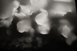
DEVELOPEMENTS - exploring black and white imagery (9)
 |  |  |
|---|---|---|
 |
FURTHER DEVELOPMENTS - DOUBLE EXPOSURE
 |  |  |
|---|---|---|
 |  |  |
developments : colour, saturation and gradient
 |  |  |
|---|
The pictures I edited turned out really well, but I think I could do better. For this set of photos I decided to make it look desaturated and soft to further experiment. I think I achieved to make it look a bit more close to the photographers work. I like the foggy texture because it adds an isolated mood. My main aim was to add mood to the photos and make the picture speak for itself.
Redraft shoot

For my redraft photoshoot I used the same technique as the last shoot. I decided to add more water droplets to the plastic sheet covering the flowers so when edited it looks really nice but at the same time I think I overdid it but for now we have to trust the process. One mistake I made was that I didn't buy flowers that looked different but instead they all looked the same, so maybe for my further developments I might experiment with colour to show the difference in the flowers. My challenge when doing the further development is to keep the mood dull so it can link with my last edits. Another mistake is that I don't like the lighting used, because I think it was too bright. You can see on the images that the light is reflecting off the plastic sheet which hides some of the flowers which i don't like but hopefully I will find a benefit in this.


For my developments, I think I edited them really well. I like how the droplets look like stars which adds a more interesting touch. I think this work is eye catching as well. To edit this I first made the photo black and white and increased some of the colours to add shadows and I also burned the edges around the flowers with a light exposure. Secondly, I used contrast to darken the shadows and to lighten it at the same time. After that I desaturated it so it looks more old and dull. Then I used gradient map to darken the shadows a bit more and to make the droplets stand out more. In the process I also used curves. These steps made my photo look really good.
developments

%20(1).jpg)
For these developments I decided to put my photos in a frame.