


.jpg)
Metra Bruno and Laurence Jeanson
Metra Bruno and Laurence Jeanson, also known as Metra Jeanson, are a pair that worked together to make a project called ID. This shows that they take photos of models,stick them onto people's faces and talk about how the media has bombarded us with perfect standards and how things should be. This became a work of art and presenting their views on this emphasizes the disconnection between faces and facial features in their work. They posted their work on Tumblr and shared them on their websites, which gave them more attention and publicity. Their work can show how the media makes us feel insecure and how it affects how we present ourselves to other people as first impressions. Her work makes me feel that she is inspiring people to love themselves, which gives a warm nice feeling and makes you feel exceptional.The material that was used was model magazines facial parts: eyes, lips, nose etc. Cause we look up to models that seem perfect porcelain skin and big eyes and luscious lips, making us feel insecure and not worthy. They also must have used photoshop to increase the brightness or could have edited some of the shadows to make some contrast in their work. This also reminds me of Peter DeVito and John Yuyi both artists looking at face photography and social media. As the main message is that we can be comfortable in our own skin and should not change for anyone and be happy with ourselves.The questions I would to the artist would be: Why did you create this project and what was the best part about it?
Photoshoot plan


Contact Sheet

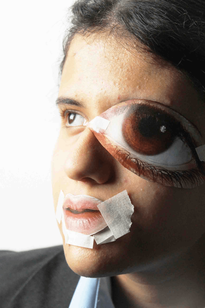
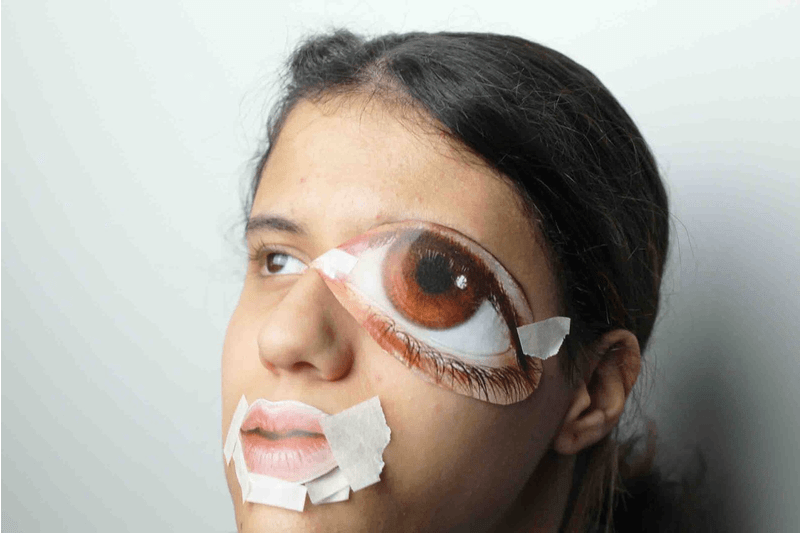
I have created my contact sheet from my photoshoot inspired by Metra-Jeanson. I have taken photos of my self with cut outs of eyes and lips stuck to her face. As the lighting was a bit dark we decided to get a phone flash light and activate flash on my camera to make the details more visible and it made my work more brighter and gave it a nice look. I could of improved by maybe using different cutouts or taking more photos of a variety of people to make my work more diverse and experimenting with different age groups also instead of working just with my friend.
Edited development


I have edited my Metra-jeans photos with the help of my friend. I have used photoshop tools: curve, brightness and contrast. The work was overall presentable and similar in some sort of way to Metra-jeanson. I could of improved the lighting or instead of black and white cut out lips I could of printed them in colour to make a contrast and make it similar to my artist work. I have also used the healing tool which I drew over any small mistakes in my photos which can ruin the work.But I really liked having help of my grandma cause the cutout can show how most people want to be youthful again and have amazing skin and how over time we change. Maybe in my redraft photoshoot I can work on what I can improve to make the photos better and change some slight things like the lighting to make it a more natural and also have a white background so there is negative and positive space in the photos.
Further developments
Gifs
Black and white


Double expouser/black and white


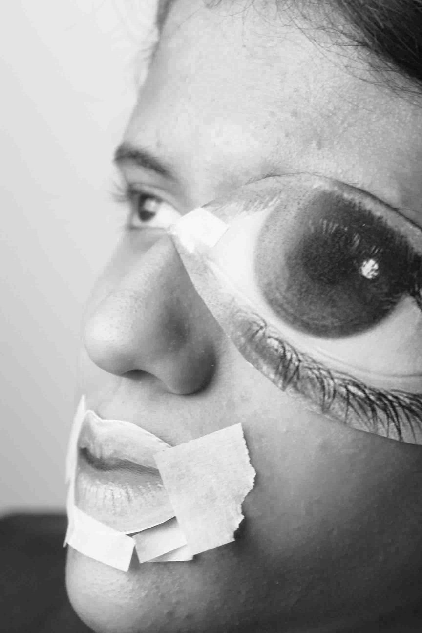
I have done my first further development which where gifs. I decided to do them as I am showing my work and how all the photos I took relate to my artist but as a quick slideshow. I liked how my work turned out with the gifs and how I also took and my black and white developments and turned into a gifs, but I could improved by mixing my black and white developments with my normal developments which can give a wonderful contrast . For my second set of further I have made my photos into a black and white series , and I loved the contrast and in my opinion it looks better in black and white instead of in its raw Colours. For my third further development I have take my black and white photos and double expose them on photos with other black and white development and they looked really nice and its really interesting ,but I could of improved of by doing more double exposure with my developments.
Redraft contact sheet

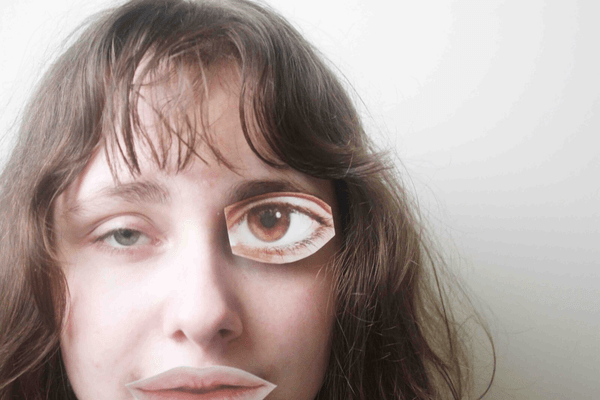
I have created my redraft contact with my photos in the style of Metra-Jeanson. I have asked my close friend to help me with the photoshoot so I get tape and gently add them to her face. I liked how my work can reflect about the stigma around being perfect and looking a certain way just to get attention. But I could of improved the lighting and the used more people to involved in my photoshoot to add diversity or could of gotten better photos. But i really liked how their work can make people who always felt insecure and bit better and can feel more happier with the way they look and doesn't need to be embarrassed that they don't look like models. Overall this was really fun and its was a interesting experimenting with paper cut outs. That's why their art captured me and the message their trying to show is wonderful.
Redraft developments


These are my photo developments and edited in the style of Metra-jeanson. I have only used brightness and contrast as well as curve on photoshop to try to make it as subtle as possible while editing in their style. . The aspect I like of work were editing lighting to make sure there is more natural lighting and it looks raw ,the brightness and the curve helped by making the lighting the photos look much nicer and delicate. I have also used the healing tool which I drew over any small mistakes in my photos which can ruin the work. I could of improved the photos by maybe enhancing the work and bring out its best features or could of done more photos with a full face of pictures stuck to her face. But this was a fun shoot and I liked working in the style of Metra-Jeanson because I liked the collage of different faces and talking about digital media.
Redraft further developments
Gifs

Black and white


black and white/double exposure


I have done my first further development which where gifs. I decided to do them as I am showing my work and how all the photos I took photos to relate to my artist but as a quick slideshow. I improved by not having a white border around it and it could look more clean and professional. My second further developments were double exposure mixed with black and white which a nice look and not something very chaotic. I really liked doing this because I could mix different black and white which I experimented with double exposure to make a interesting piece that could captivate the human eye.
Highlighting success

For my highlighting success I have chosen one of my photos from my Metra Bruno and Laurence Jeanson and I chose the one I liked the most. I liked how my friend looked in this photo and I think this work was one that was similar to my artist work. I have used photoshop to make the lighting a bit brighter and to bring nice enhancement, I have also used the healing tool which I drew over any small mistakes in my photos which can ruin the work. Personally this was one of my favourite photos I have made during the year and it can show how much I have improved a lot. As their message they are trying to present is about the beauty standards and how it is hysterical and controls use some times.
Process log


For my process log I have shown my editing steps and how I execute my work step by step . For my first step I import my work onto photoshop. For my second step I have used the curve tool to make my photo brighter like in metra-jeanson work and also it enhances the photo a lot. For my third step I edit the contrast and then the brightness making the work softer and so its eases the eyes when you see them And for my final and last step I save my work as "Metra-jeanson redraft development _"