


.jpg)
John YuYi
John Yuyi also knows as Chiang Yu-Yi she was born in Taipei, Taiwanese and is visual artist she explores social media photography She studied Fashion Design with a Bachelor of Arts/Science at the Shih Chien University, at the beginning of her career, she has had a significant online presence, on platforms like Facebook and Instagram which is apart of millennial culture. Her work can present how main stream media present use the main source it comes from. Before working as an artist she worked for Jason Wu as an assistant editor and was working as a model. While working as an artist she has done work presented as many different trends for example the Gucci trend and also worked on different types of social media like snapchat as she also presents Asian culture in her work and the standards there.Her presents main stream media brand like Nike, Gucci and etc.. Her work shows the affect of technology and social media. The materials she uses her tattoo paper and prints out little sheets of paper and sticks them onto her face and creates a work of art. As she doesn't use much technique on photoshop I can see she might use brightness or uses the curve tool to make the imagine seems more bright and sharp and while she takes the raw work and uses a macro camera lens to zoom up on the model.


I can see in her work that she would use models and then use temporary tattoo paper to her model faces and neck to create her work. I can also see a plain background that she uses in her photoshoot, which make her work more, and she has little negative space, which also make her work effective. I would describe her work as kaleidoscope, colourful, majestic, and delightful. Her photography work consist for her presenting digital media and trying to present her message to the internet and using creative ideas for it which we can see in her work. The observation I would make is the detail she works with and the aesthetic, which is presented in her work. I would describe her people in the photo as normal looking and having no expression. They are different to me because I would choose my model to smile or maybe laugh in the photo or do some poses. It reminds me of social media, influencer and models. The colours that were used in her photography are mostly bright colours but sometimes use monochrome colours. There are not any colours that are used most her work they are all used in the right amount in my opinion.
I can tell that they are helping the artist represent their work. I think it how they presented their work and how they styled. I think they made their work by carefully planning out what they are going to do and they then presented in the way they planned it and try to make it look outstanding. I would ask the artist “why have you done this piece of work and what are you trying to showcase to the world”?
Photoshoot plan

Contact sheet


I have made a contact sheet. which has all my photos inspired by john Yuyi. As we used a projector to project social media icons and things in social construct like money or power(fame). I really liked how my work was presented on my face and as it talks about the main stream media and what we see on there. I could of done better is instead of projecting my work on my face I could of gotten fake temporary tattoo paper like she did which could of been more better and more related to her to make a comparison. A the lighting was low key and the projector was projected onto the face it was giving a very good contrast and the theme was dark mixed with a little bit of light.
Edited developments


I have edited my first set of developments inspired by john Yuyi. The lighting was low key light as this was shot in the dark room with a projector, projecting social media icons, money and text on to my face. I could improved by zooming up of some parts of my face like My artist has done or could of chosen more icons or things related to social media like she done for example her Gucci advertisement I could of done some thing similar. I could of also done different photo angles or poses to make the photos more interesting. But I really like how now for my redraft i can improve and explore more ideas. I have also used the healing tool which i drew over any small mistakes in my photos which can ruin the work.
Further Development
Gifs


Black and white


Collage


I have done my first set of further development which consist of collage ,gifs and black and white. My first set of further developments where gifs I like them because they looked clean and showed all work in like a fast slide show. I could of improved by maybe added more photos or made a repeating sequences. For my second set of further developments I have edited my photos in black and white. I liked that they gave a nice look and nice contrast to each other. I could improve by adding more photos in black and white or increasing the contrast.
Redraft contact sheet

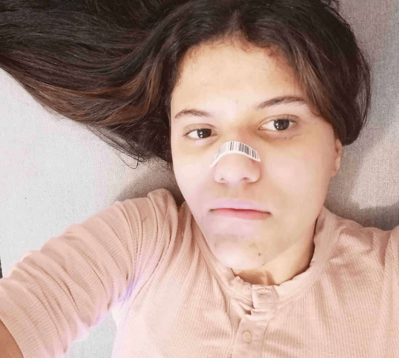
I have done my John Yuyi redraft contact sheet. I used my phone camera for this. The work was overall presentable and similar in some sort of way to John Yuyi. I could of improved the lighting or gotten temporary tattoos or Could of made different stickers and try places them in other parts of my body and show exposure of my neck like John Yuyi has done in her photos. But I the have done some work which could relate to somewhat similar to John Yuyi's work. As from my last contact sheet the lighting was low key and really which was different from this photo shot and how the lighting which was very bright.
Edited Development Redraft


I have edited my John Yuyi redraft developments. The idea of this shoot to be inspired by her work but also trying to be a bit creative and add my own ideas. I have used brightness and contrasts on Photoshop while also using curve to make it subtle and bright.
I have also used the healing tool which I drew over any small mistakes in my photos which can ruin the work. As this was inspired by John Yuyi I could improved many things in the shoot which could of be done better for example: the lighting was a bit to dark and it could of been brighter or maybe instead of the sticker I could of gotten more temporary tattoos which could of been suited better. I could also improve by not having my headphones in because it will look professional and shows you know to keep a clean portfolio.
Further development Redraft
Collage


Gifs

Black and white


black and white/ double exposure


Gif black and white
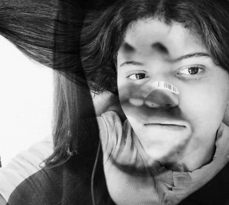
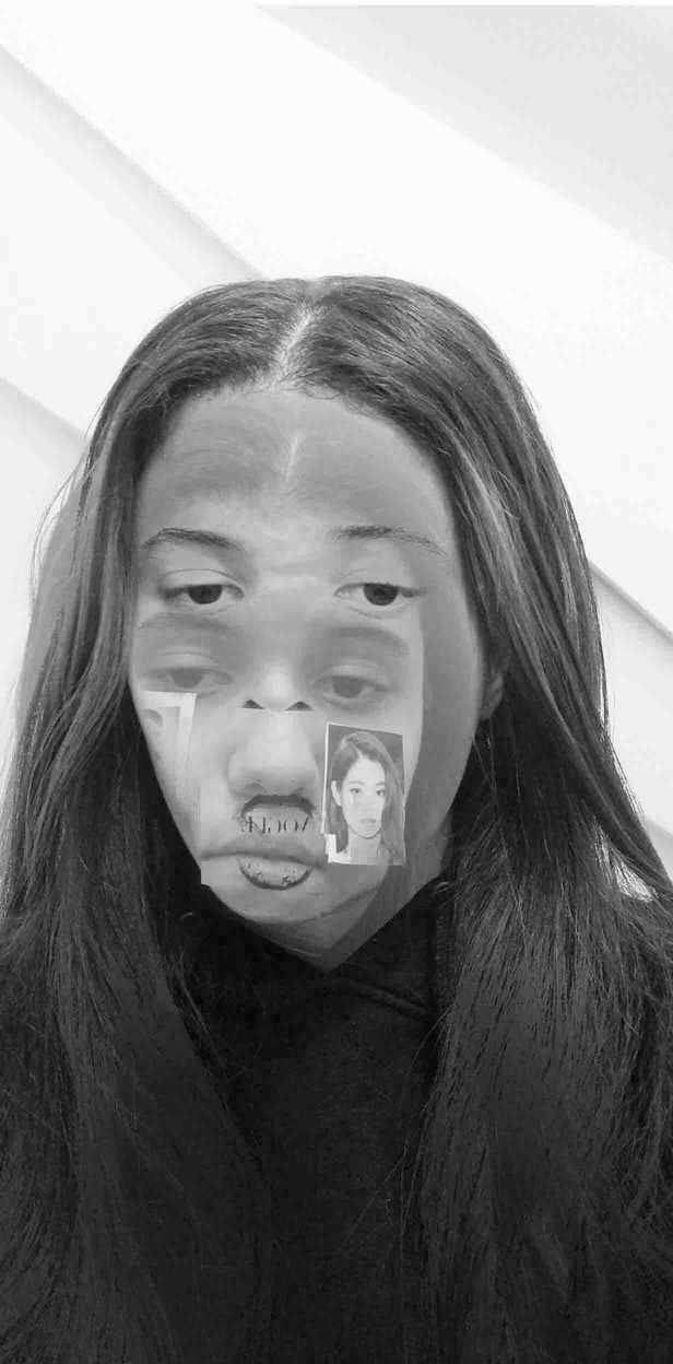
I have done my redraft further developments .My first further development which where collage to add different developments on photo shop and expand the background and add more photos on top to look like a collage of my work. For my second further developments were double exposure mixed with black and white. I really liked doing this because I could create a monotone piece and experiment with double exposure to make a interesting piece that could captivate the viewer and the contrast makes it standout .I could make improve by maybe just having a more harsh contrast to make it standout a bit more. For my forth further developments I have gotten my back and white further developments and I was able to create them into a gif and i have edited their brightness and contrast to make them stand out a bit more.
Process log


For my process log I have shown my editing steps and how I execute my work step by step . For my first step I import my work onto photoshop. For my second step I have used the curve tool to make my photo brighter like John yuyi's work and also it enhances the photo a lot. For my third step I edit the contrast and then the brightness making the work softer and so its eases the eyes when you see them And for my final and last step I save my work as "John Yuyi redraft development _"
Highlighting sucess

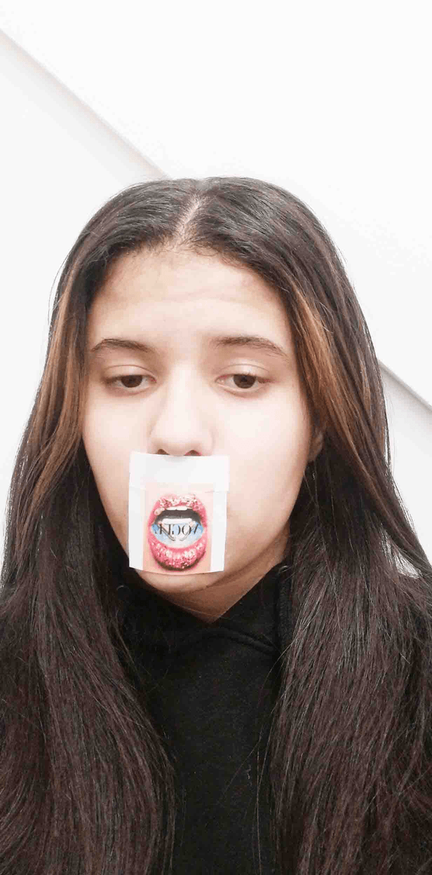
For my highlighting success I have chosen one of my favourite photo from John Yuyi work and used my self for this work. I have printed a picture of from google and then stuck it to my mouth trying to create work similar to John Yuyi. I have chosen it because I loved how it was creative and her work instantly captured my eye. I also loved how the lighting works with the photo as gives the right amount contrast and it looks nicer instead of a darker lighting which wouldn't look as nice. I've used I Photoshop to make the image brighter and show more details instead of it being dark and dull, which gives it a horrible contrast and it doesn't look nice. Since her work is about how we present our online image and it was really fascinating how she present this message in her photos.