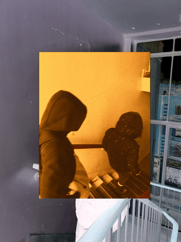
Dexter Navy's style of work
When considering my ideas for my final piece, I have turned to the work of Dexter Navy - to explore Navy's presentation and how he composes his photographs. This image is one Dexter Navy's art pieces that have the composition that consists of short and long dynamic range to contrasts the ratio between the darkest and brightest color tones that a camera can capture in a single exposure. Moving on the setting of Dexter Navy work is set outside in the streets of Europe, where the lighting is always set at an optimum condition and gives the right amount of light to every object that is seen in the image. Lighting is effective as lighting determines not only brightness and darkness, but also tone, mood and atmosphere.


Idea 1. Experimenting with collage/composition
My first idea is to create a large scale collage, combining the compositional elements of all my artists and creating a large scale mixed media piece. Furthermore I am planning on getting a wooden board to be the frame of my work. Then I am going to get a utensils and spray paint to make some art in the background, as like Davide Sorrentio does in his collages. Talking about Collogues I will be then placing my work in the layout of a collage and then adding vibrant colors to the page to make my piece appealing and entertaining to look at.
Davide Sorrentio style of work
For my second idea, I have taken inspiration from David Sorrenti. These images are by Davide Sorrenti, an artist with many talents with the sense- composition, setting, lighting. The composition that Davide uses to bring his work together as a collective is the way all the composition is thought out before hand to ensure that the layout and collage is sophisticated with the photography features that really makes an image what it is. Furthermore The artist converts their images into black and white to make their image less busy and more calming to that all the shuttle detail in the image is showing, but not screaming at you. I think the combination of both imagery and text works well to communicate the idea of 'youth culture', a concept present throughout my portfolio. For my second idea for my final outcome, I want to create a magazine, in the style of Davide Sorrenti. This idea stems from Sorrenti work who primarily presented his imagery in books and magazines. Magazines or 'zines' are also a youthful media and relates perfectly to my concept of youth culture.


Clayton Patterson style of work
The images that you can see are images made from Clayton Patterson (my first Identity artist). He has inspired me in ways of the layout of is images and how vibrant his colors are, that being his image together as one. Clayton Patterson has many unique ideas in ways of experimenting with his art and known to be different to other artists. For my final pieces I have turned to all 3 of my identity artist and to Clayton Patterson last, so I can absorb all the photography ideas and aspects he creates in his style of art. Moreover, my aim in terms of my ideas of my final piece I am to my complicated hand made pieces and adding a lot of unique features to it as Patterson does.


Final Piece photo-shoot


For my Final piece ideas, I explored around in my area and came across a bunch of sophisticated places to capture images in the style of all my 3 artists combined into one, while using the essential photography techniques. Furthermore for my photoshoot I wondered around through London with a bunch of my friends and whenever we saw a moment or place that looked like it had good lighting and an interesting background, we took pictures there. Into the bargain I have taken over 40 pictures to have enough images for experimentation and enough to present ideas for my final piece. For my composition I laid out my friends (in both portrait and a landscape frame) in the same ways my previous artists do, and also looking back on my previous developments on my Identity artists to give my tips and tricks, and to allow me to improve on the composition that needed improving and even experiment with them. Leading on for my future ideas I really believe that this photo-shoot has helped me and allowed me to figure out on what I will be accomplishing for my final piece.
Developments idea's for my final piece (colors)


For my final piece ideas I used all my techniques that I have gathered over the past weeks over my identity artists and combined all of their techniques into one. Furthermore I experimented with mostly colors because I made notes on what I may need improving in, and colors came up a lot, so I added more vibrant colors to my work, while acknowledging ideas for my final piece.


For my developments I experimented with 6 developments and added 2 embossed words to each development to match the same vibe as my artists and to empathizes what the work means in both image and words.


Developments idea's for my final piece (black and white)


Furthermore in total I edited 6 developments in black and white, with 4 images as one like my other artists do. I have decided with these pieces that I will be completing my final image in a frame ( black or white) because those are the most famous pieces my artists does to their work, which I am trying to look like.
For my other idea's for my final piece I experimented with black and white, so the little details can stand out, while the image is calm and not busy to look at. In addition I used red embossed image words- not black, so it can stand out to the naked eye and make my image look entertaining and a piece of art.


Contact sheet

For my final piece I went back to my old spot where I captured my Davide Sorentii work and then made those pictures into developments. Furthermore I circled the images that I will be editing in numerous upcoming ideas such as; exploring with noise, exploring with threshold and with vibrant and saturation. In addition I made sure to take my photos in portrait form because for my final piece I will hopefully be putting my work in frames.


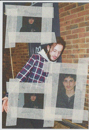
Creating stencils for final piece - developments


These are my developments ideas that I may have I my final piece. For these images I have experimented with threshold, which is a feature in photoshop, that with one click it changes your image to black and white with a graphite sense vibe that I was really hoping to get. Additionally I have developed 14 images to really find ideas for my final pieces. Furthermore for some images I played with the curve, by increasing and decreasing it by a inches to really not let one color overload the over color by a substantial amount of difference. In addition I picked the best images that will best suit me in my interest and will look most efficient.
The difference

The difference between these two images after I experimented with Thresholds is that the left image is much more engaging, which attracts attention and gives my image power, however the right image it my original image without the edits, which really makes a difference.

Experimenting with saturation and vibrance


The difference
The difference between these 2 images, before the editing phase, it really looks quite tedious and not gripping to look at. So that is why I varied with the vibrance and saturation and increased the two to their max and just left the image how it was, to not really interfere with the lovely composition that makes the image.


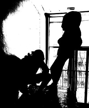
Experimenting with invert


The difference

The main difference I have chosen with this experimentation is to switch my image to be inverted to make it look more eerie and exiting, to really give my work a little twist and even make it to be on my final piece if it really comes out pleasant to the rest in terms of putting my images together and building a colleague.

Experimenting with noise


With this experimentation I really went for a senior look as I did in the past with my artists such as Clayton Patterson. Additionally I added 34% noise, which was not too much but not too little but just met in the middle, also the
experimented developments was just in portrait because I have already been planning my final piece with all these ideas to help me figure which idea will be best and I have came to many conclusions and one was too put the portraits images in a frame with the edges of the frame being very dim black with grey dots scattered around the outside to give it a linguistic feature to it and emphases the care into my work. Furthermore I will be hoping to be putting 1 of these 8 images into my final piece ideas to come to a conclusion of what best fits and I really believe one of these images may be in there.
The difference
The difference with just by adding 34% noise really made a difference to this image as u can see on the left it is just an image of a boy looking into the camera lens but if we move our eyes to the right we will see an image that looks like it was taken in the 80s with a old photography camera, but whilst it is just me adding noise.


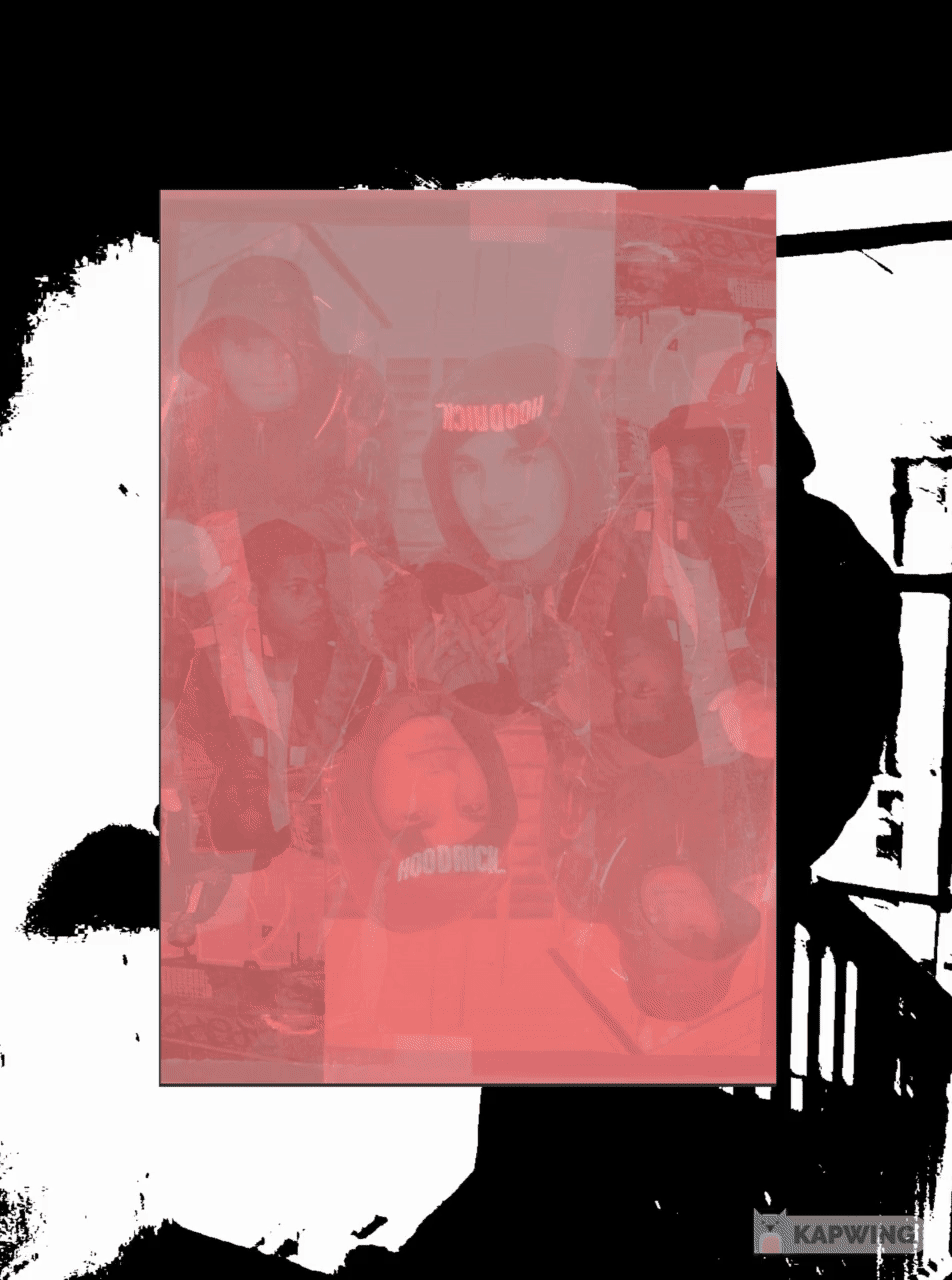
Overlaying developments


Magazine


These are my developments, that I have chosen to be within my final piece magazine, because it consists of all the fundamental key elements, that make an image stand out to the naked eye. It has phenomenal composition, as my images are laid out separately and differently in different orientations. It also has phenomenal saturation and color differentiation, that elevates the contrasts of my images. This magazine idea links with my Identity artist Dexter Navy, as he is known for his fashion and always experimenting with new features within his work; he experimented with work to do with frames, he experimented with video editing style, that is to do with his work and experimenting with producing magazines, that contains his work. I have experimented with all the features that he has looked at, as I have been inspired to study his work in detail and produce work that is in his theme, but tweaking his ideas with mine. Dexter captures his work with a large aperture, to capture the contrasts of his images.


Experimenting with composition /sequence


These images that I have previously developed, for my final ideas, have been experimented with different sequences of composition. For example, I have taken three images, that I am pleased with, and placed them in a format that aligns and cola rates with each over, which really elevated and spices up the developments. It was a simple technique, but very much effective in terms of applying a technique called composition, which allows the viewers of my work, to be able to view three of my successful developments, all at once, which really affects my work positively. If you look below and above, you will see that I have experimented with different sequences of composition, with; Physical pieces, inverse developments, increased saturation developments, black and white developments and completed collogues


Video developments
Experimenting with Saturation
I drew with the saturation tool, that really elevated my work in terms of bringing the subtle colors to be noticed.
Experimenting with black and white- video's
I used the black and white tool for my video developments, to give it a peculiar background.
Video Development redraft
I have experimented with creating video developments, the same way, my previous identify artists develops, for example Dexter Navy. I find this very interesting, as when I was developing these I used the select tool to cut out a physical piece development, that I have made and copy and pasted it onto my video, so my video developments, will have a frame of my work, that willl elavate my work substation ally.
I drew with the quick select tool with my scanned physical pieces and cropped out the middle of that page and copy and pasted that developments onto on my video developments, so the physical developments can look like frame for my videos.
Final piece proposal
My work links with my artists, who are Clayton Patterson, Dexter Navy and Davide Sorrenti, because my artists all use collages, when they produce work in hand pieces. For example Davide Sorrenti produces hand made pieces very much commonly, and places them in center and experiment with the side frames with cutting out pieces of his own work and sticking them on the side bits of the frames. Furthermore I am aiming (for my final piece) to be similar to my artists. I am thinking colleaguing all my work that I have been producing so far on one bit of A3 black paper. I want to experiment with the composition and the sizes of the images to really elevate my work and made it look elegant. I am thinking to place the hand made piece of paper in a wooden frame : and paint over one frame to be white and the other to be black. When that is completed, I am aiming to cut out bits of my work and stick it around the frame to give a euphonic look. Moving on my final piece is going to be fairly big, as I want to place a lot of my images into one development, and give my work a look of excitement. The paper, that is going to be the base of my work is going to be a black brawny A3 piece of paper, that can fit around 12-15 images of my work as collogues. I am really hoping that my final piece will come out sophisticated, as I will be completing three final pieces, to show that I am refraining my work, and seeing were I could improve and see what I have done well.
Final piece
I have decided after viewing my final piece page, that these three hand made images will be my final pieces for my final results. I have chose these hand made pieces because they consist of skilled composition, that brings a lot of detail together, which stands out in the naked eye. I have utilized a bunch of vibrant printed images to make my work pleasant and exciting to look at. It is simply more effective to use vibrant color, which are mixed with some low saturated colors also, Because It makes my work not look dull and tedious but look sophisticated. To make my work look different and unique, from my previous pieces of work , I added saturated color tones of paint over my images, to give it a crafty look. I am vastly satisfied with how my pieces of work came out at the end because it consist of all chiefs nature techniques in photography that is required to boost the imagery of ones work.

These are my final pieces, after long hours of experimenting with many techniques to do with my artists, but I came to a conclusion to print off all my final piece ideas and to printed the images in different lengths and following it with a big black thick piece of paper for my images to be laid on it. Firstly I painted the big black thin paper in many colors: white, blue, to give my work a sophisticated look. Secondly I placed out my images in sections of collages with big, small and medium size images to give my work a variation of looks. Thirdly I ripped off some tracing paper and stuck them under some images, which really gave my work an impression and a shuttle detail. Lastly I stuck all of the images down and dipped my brush in paint and carefully hovered of my images to make it blend it with the background.


Refining with GIFS
For these following developments, I gathered all of my original completed images and refined them in GIF's, while focusing on different key aspects, which I missed out in my other previous developments of GIF's that weighed down the sophisticated standards that my work was missing. For the steps on how I completed these developments is the following: step 1, I placed an image in the middle of the GIF and twitched the gradient color to something more eye catching and warm and pleasing when viewing them. Step 2, I then gathered around 4-6 images that I have done previuously on this slide of final piece, and placed them behind the main image that was placed in the middle of my GIF and kept on saving them until I felt satisfied that I have completed enough. Step 3, I then placed all my saved developments of the GIF's then placed them in a GIF generator, that I came across on the internet, then I was done, which you can see the final result of the GIF's, if you proceed to scroll down.