top of page

GCSE PHOTOGRAPHY - ROSIE REDMAN
Klari Reis
Artist Analysis

Klari Reis uses her techniques and tools from science to create detailed photographs. She is well known for her Petri Dish Series ,a set of circles using different chemicals to design .She was born in 1977 and graduated in the City and Guilds of London and Arts in 2004 .She was able to create these images with oils, acrylics and industrial designs .Unfortunately she was diagnosed with Crohns Disease .She went to have many blood test since then and was intrigued with the cellular reactions .She was influenced with her curiosity and and her desire to explore the natures of photography and cells and show her passion for it in her work.

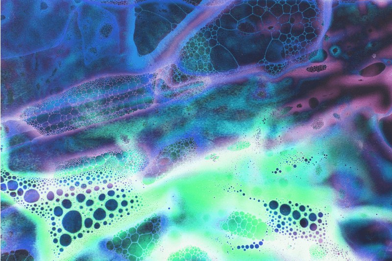
This is a photograph Klari Reis took when using her different oils to create this effect. She was excited by the way bacteria looked and wanted to take pictures of bacteria however Reis was grossed out and decided to make her own in the looks of bacteria. This photograph was part of her collection of photos in the Hypochondria album.
In this photograph I can see the ocean blue oils blend into the orangey red oils. It looks like a galaxy when the red and blue blend together to create a soft look to the photo. This picture reminds me of bacteria you see when you go to the science museum. This photograph is shown to be abstract and vibrant to attract the eye. It looks like the blues are bleeding into the reds to create a strange galaxy. The picture was captured in still life yet I was still able to imagine the oils blending in with each other. You can tell these picture were made with a camera since the quality was very detailed .
I think that Klari Reiss is inspired by the idea of creating something from something we would normally consider gross to something beautiful and abstract. She made the idea of something gross to beautiful which portrays her as a positive person .

Contact Sheet


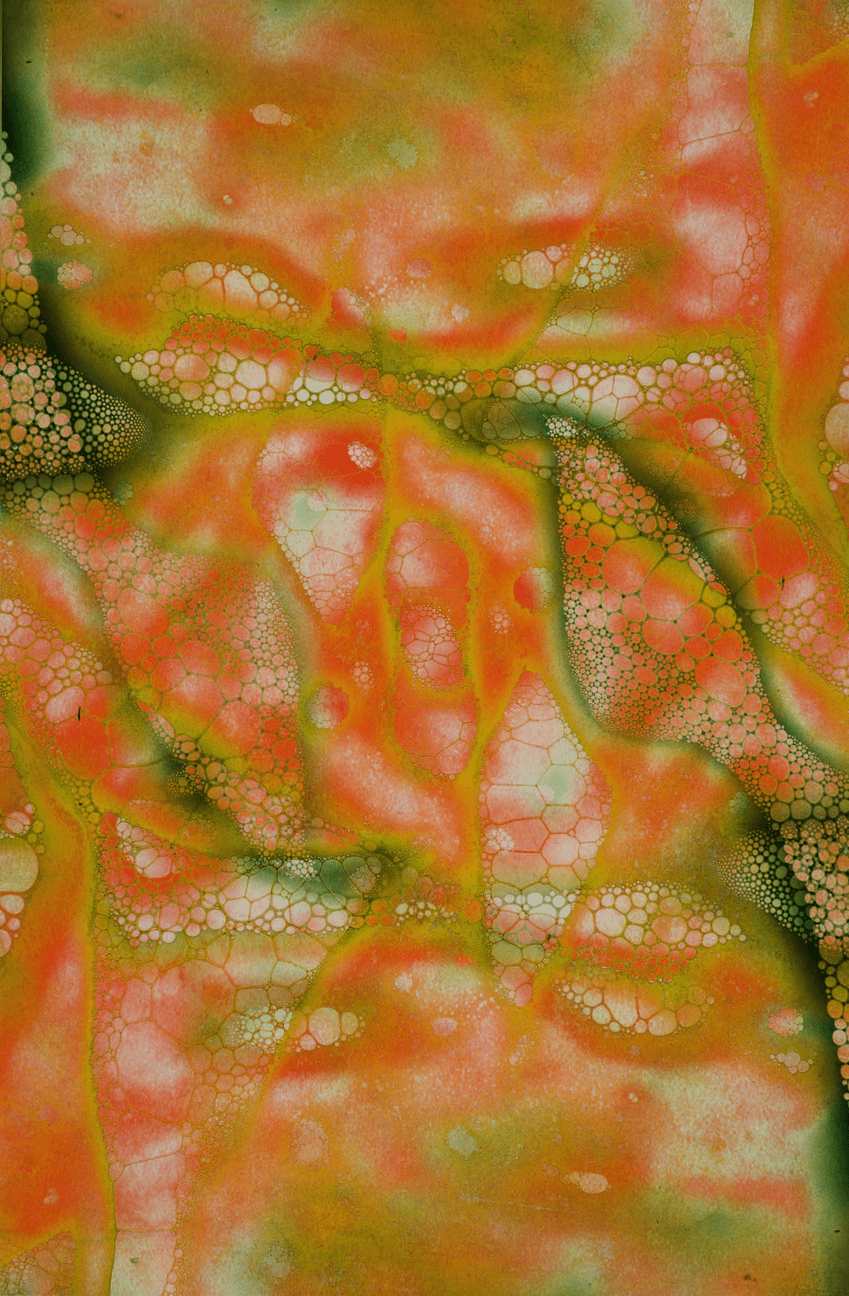
My intentions for this photoshoot was to take pictures in a surreal way to represent the bacteria looking oils and acrylics from Klari Reis' work .I took these photographs because I liked the way the oils blended together to create a chaotic theme of colours .Whiles doing this photoshoot the vibrant colours and bright background created a summer feel and deep contrast between the oils. I was interested how my photo shoot turned out since there was unusual and feminine patterns created.
When completing this shoot I took some under exposed photographs and some over exposed photos which was one of my unsuccessful parts of this photo shoot. Some of my pictures were out of focus due to me taking multiple pictures at once.
However, some successful elements is that I was able to capture the oils in motion of them blending. Something that worked well which I think wouldn't work that well was how the oils were mixing and the effect it created.
If I were to take these pictures again, then I would still keep it in a macro angle and I would still keep the mood and everything I did the same ,however I would make more images in more colours so there is a variety and make sure the pictures are not under or over exposed. This is also something I was missing in my project (more colours).
Developments of Klari Reis


Whiles studying Klari Reis ,I explored her work and used soft lighting whiles creating developments in the style of her work. When I was editing my photographs I highlighted the parts of the picture which stood out the most and toned the brightness and contrast to expose the more vibrant areas of my work be noticed .At first in Adobe Photoshop I was exploring with the tools ,however after looking at some editing techniques I found a way to make my colourful work the best of it's ability. I was able to focus on the little details of each colour and tone the contrast of each colour to make it darker or lighter. By doing this ,I created harsh tones in certain parts of my work which made my work look more developed. In one of my edits I had mirrored the photo and dissolved it into each other to make an organic way to the picture. Where-as in another one of my photos I used double exposure to blend in two different shots into one. In some of photos I created a warm tone to the piece. It was harsh due to the low contrast in some aspects of my work. I chose this technique since I was most proud of the outcome of my work whiles using them. Klari Reis' work reminds me of William De Morgan's work due to the pastel colours they both use. They both also create unusual patterns which makes them more unique than any other artist and that is one of the reasons I picked Reis' work to study in further detail. They both also use bright and vibrant tones to attract peoples view( They fit in with each others work due to this). What I liked about my work is that where I used deep contrast on some of my pictures. I feel like it has made a big impact on the final looks of my edit , and it's something that is appetizing about it. However, I can improve my work by double exposing my work more and make some of my work more brighter and less harsh to give a variety to my developments. Next time , I am going to create my photos in different tones and colours to give my work a selection. The elements of my work is that I mixed oils just like Klari Reis' work which made that an essential characteristic of my work. The aroma blue blended in with the white which created a smooth contrast to my work.
Further Developments-Cold Colours


Here you can see my further developments of Klari Reis. I decided to do further developments and complement cold colours. I chose to edit my photographs and use blues, greens, purples and pinks to create a different atmosphere. I designed them by changing the hue and saturation on my work. Here I made cold edits to develop my work further and due to the fact mostly all of my edits in my first shoot was warm colours for example red, orange and yellow. To change the tones of my photographs, I changed the hue saturation and double exposed my work with purple and blue photos to make the edits colour's look more stronger and the colours more deep rather than faded away. I decided to do this technique so my work comes out more pure and crisp. It shows us that there are all different types of bacteria and can be all different colours and looks. I like how harsh the colours turned out because I feel like it is very capturing to the eye with all the explosive and strong colours. I can improve my work by having more of the pink, but hot pink so it is more stronger. Next time in my edits ,I would change up how I edited these pictures by using invert colours and exploring further in the future.
Contact sheet Redraft


Contact Sheet Redraft Annotation
My intentions for my redraft was to change up the colours of my 'bacteria' and develop the photos in more depth. Some of the photos are out of focus or too close however some are in focus and shows immaculate detail of the oils blending together. The blues and purple blending successfully since it looked like chemicals mixing together and the green also fitted well with that.
What wasn't as successful was I used some dark blue oils and some light blue oils which didn't work well with the green ad purple together due to it looking a bit overpowering. If I were to take these pictures again I would use complimentary colours so they work well with each other .For example, blue and pink ;green and yellow ;navy blue and orange to really make the colours pop and to set a nice theme to the work. I believe these is all the photos I need to create my developments due to me using invert to show off opposite colours whiles changing the hue.
Redraft developments


Annotation of Developments
When exploring Klari Reis over the last 2 weeks I have developed a clearer understanding behind her work and different techniques she may have used whiles making her photos. Overtime, I realised that she used strong colours to really absorb the looks of the oils and acrylics to create her pictures to the best of its ability. Editing these photos was different to my first developments and further edits since I didn't only change the hue ,double exposed and mirrored these photos I also inverted them so it turns out the opposite colours from what I set it as. This shows development from the first ones because I used a different media and technique than what I've used before .I like the change in my work and I feel like the inverting showed a interesting side to oils and acrylics linking to Klari Reis' bacterial photography theme .The inverted pictures looked more realistic to bacteria , since when you usually look at bacteria it looks a little inverted .I could improve my work by turning the brightness down a bit so I can capture all the bubbles .This is what I can do next time.
Process Log

To complete my edit I used invert to give an effect on my work. It looks as if it is moldy and worn out.
Further development -My GIF's
Through the experimentation stage of creating my GIF I realized that it looks like growing bacteria which concepts to my work. This is why chose to further develop my work by making GIF's.
bottom of page