
unit 2 - IDENTITY
Catherine Eaton Skinner Research
When presented with Catherine Eaton Skinners imagery it allowed me to feel a sense of interest towards her imagery of the wild nature of birds. This was due to the orchestrated fluidity of the images that have the birds flying around in a surreal manner almost as if her paintings where real life images as the illustration of the birds is done so well. Catherine Eaton Skinner's artistry captures a unique sense of birds unlike what I have previously seen before which examples of her unique style include her grid like sense of imagery done in some of her images. To expand on her style her use of colors often consists of grey, white,, light yellow and lastly the color well tone she will sometimes use in her images background is of course black.
A large portion or perhaps all of Catherine Eaton Skinner's work is of various birds in many forms such as flying but to add onto this her 4 color forms that I have previously mentioned. With my knowledge I would have to say that Catherine Eaton Skinner reminds of the artists Masao Yamamoto due to there take on nature. Her images are provided to us in a similar manner of Masao Yamamoto's Zen like images of nature in which his birds images do hold many more similarities such as his color pallet being similar to hers. An example of this is his shades of yellow do very much Catherine's own use of yellow tones with in her own images.
For me I believe the meaning of her art is to get us to appreciate the wonderful creatures that are birds which she does by presenting them in there most peaceful forms , highlighting there beauty in the process of it all. Examples of her art of birds in there most peaceful forms is the birds hanging on the tree or flying around like angelic beings . If I was given the opportunity to speak to ask Catherine Eaton Skinner about her art work I would say what was your main reason for the decision to primarily focus on birds? I would also ask Catherine Eaton Skinner what do birds mean to her and why does she decide to portray them in four tones and does the colors resonate with het to some extent?
For me I truly believe her work s a master peace due to the nature of it that has a aspect of love but curiosity that wonders around within it like a wonderous bird. Her art is so free not limited by any constraints beside her own colors of choice which is why I truly love its distinguished unique tone of style. Within my images I seek to develop my images using the same form of yellow that Catherine has decided to use to have my images look vintage to an extent . I would also like to develop them in her manner by increasing the contrast t have my images be more focus on to look as if they have been drawn just as if it was her art.

Experimenting with black and white imagery


For my first set of Catherine Eaton Skinner photography I set out to capture a variety of birds within daylight so this way the lighting would not be too much of a focus. I managed within this photoshoot to take images within many different perspectives of the birds thanks to shooting the images from different angles and capturing them in different poses of the birds. I also kept a range of unique images by both zooming in and zooming out for some images to either shorten or broaden images for future developments. The last act I made with angles was to take pictures directly in front of them or beside the birds to have the image entirely be them.
I presented my images in Catherine Eaton Skinner style by not lowering the aperture as I did not want the images to be captured in a blurry or fluid like style. This is because I wanted my images to be stationed like her art style which doesn't have her images appearing fluid like so I shot my images as authentically as I could. Personally my favorite way I captured my images in her style I did this by was taking images from birds in medium shot angle id flight which like most of her bird paintings had birds soaring across the sky. The motion of birds flying across the sky with developments would certainly allow my images to replicate her style but with my extent to some way.
Developments - exploring negative space and composition


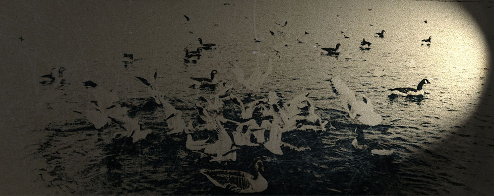
For my first set of developments I've decided to project Catherine Eaton Skinner's style in my own images by experimenting with an art like style. To do this I experimented with levels of contrast , brightness , exposure and more but I especially focuses on color look up. To experiment with the color look up I would often put my images in black and white therefore getting rid of all the color to start blank then I would discover what would suit my images best to provide a similar style of Catherine Eaton Skinner art. I've also have made the decision to have some experimenting with these developments through the tones of color ranging from brown ,black, grey, white and a dim light yellow like Catherine Eaton Skinner has chosen to do.
Through out the use of these developments the use of experimenting I have found enjoyable as it was playful and gave in more freedom just as you can see from Catherine Eaton Skinner's work. This gave me many opportunities to enjoy her work as I even presented this by adding grain within all of these developments. I felt that adding grain within my images would allow them so to appear more like a painting due to the noise of it.

This is my best development due to the fact it resembles my artist the most as a whole as it projects to a work of art rather then a image itself having the same texture which is expressed by the help of high key lighting. To continue highlighting it my slight reduction of curves to not over exposure it has led to the tone of the image to once again resemble Catherine Eaton Skinner's photography . Yet this development also resembles the work of Masao Yamamoto with its minimalistic perspective that is not over done but simultaneously projecting all that was required from the artwork and nothing more just the necessities brought in the best manner. Another reason to highlight this piece once again is due to texture simultaneously retaining a grainy style thanks to the slight use of noise which adds a art feel once again but specifically on the birds.
A beige texture on my canvas background continues on this ideal of photography within the matters of art because the usage of this texture resembles pieces of art previously made by my artists Catherine Eaton Skinner. Which as a whole is my image that most resembles the texture of my artist allowing it to be the best out of all my developments as a result.


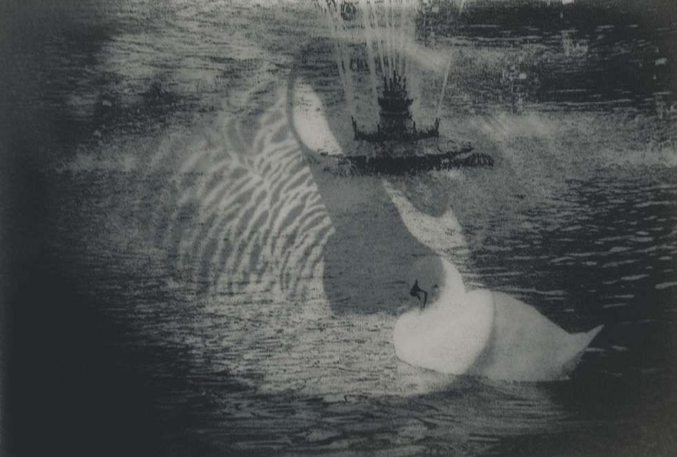
To further explore my previous developments I decided to continue with my desire to turn my photography into art through the use of experimenting with overlays to increase my art texture. I experimented with many different overlay within different composition to express a artistry look onto my images more then adding onto the addition of simultaneously experimenting with different colors during this process. I used different forms of water overlays to balance of the view of the birds around water creating some sort of aqua effect which brought out upon this texture making it seem like a painting. I experimented with some unique overlays to fit in with the theme of my images bring out more experimentation in my work in the style of Catherine Eaton Skinner.
Yet developed onto this idea of experimentation I explored lighting to bring out the tone of my images through the use of lighting effects I darkened the edges of my images to focus much more on the overall Centre. This also darkened the tone of my images in which I use the color look up tool tool to counter this bringing more vivid tones out of my images as a result of this .
Redraft

For my redraft I have decided to have a new take of my images in the Catherine Eaton skinner style of exploring wild life through my birds. Within these set of images I have kept it simpler then my last photo shoot to allow my developments to have more experimentation. I have taken my images from either a birds eye view or medium shot angle to focus much more on the birds rather then the background. This is because I wanted the birds to have the complete focus in my images just like Catherine Eaton Skinner's art has the birds as the focus.
Another reason I took my images from a medium shot angle and from a birds eye view is to allow me to explore with image rendering later on. As it
Developments - experimenting with low key lighting and fish eye angles


For my first set of Catherine Eaton Skinner developments edits I sawt out to focus on the tones and colors of my images as I was trying to replicate them in her style. To do this I used dark tones rather then adding vivid colors which would have not matched her style at all if I chose to do that, I chose to use brown, grey and bluish tones. I enjoyed experimenting with blue tones as it was something I have not been able to do so being able to explore and mess with it through the color look up tool was enjoyable of a way to experiment within these developments. I also sawt to project out these dark tones in my images through rendering my images within lighting effects in photoshop this allowed shadows to be brought out and have me able to focus on a specific part of the image . Which was also done by focusing the ambience on a specific spot and playing around with intensity of the lighting effects and which when was all done allowed my images to be darker using Tones like Catherine Eaton skinner whilst having my experimentation by having the images belong focused on a single spot.
As a whole my composition was fixed through any images with a somewhat tilted angle by having the shadows cover it up , some of the shadows allowed my image to appear from a fish eye lens which was enjoyable to see play out. I had darker tones projected and fixed within my images by drawing with burn tool to have the shadows from outside of the ambience to blend more smoothly.

For these set of developments I have set out to edit them through the use of experimenting in Photoshop which was explored in many ways. Such as increasing contrast and lowering the saturation of the images whilst increasing exposure. To finalize the use of those adjustments I played around with the color look up to find a color that suited this image

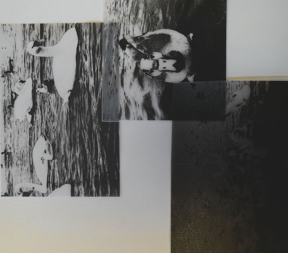
Tracing paper photoshoot - contact sheet


Within my tracing paper photoshoot the raw images taken where done to further expand on the images from my previous photoshoot. I've chosen to further explore my last photoshoot by printing them on tracing paper this also reflects what i seek to do with my next artist having a note book feel of my images that could be collages together in some sort of book. Allowing my images to be printed continues into my ideal of my images appearing to be painting like. To reflect on much more on the work of Catherine Eaton Skinner rather than being in contrast to the work, presenting itself as more of a painting like Catherine Eaton Skinner rather the simple something I decided to experiment with.
As a result moving on from previous steps to lead to this photoshoot gives more of a creative process that flows along side that style references of Catherine Eaton Skinner. It also gave the same tone and texture towards my images having the same level of consistency on each gives a relative depth representing the path I seek to go with my desire to develop images in the style of Catherine Eaton Skinner.
Development series - experimenting with contrast and lighting


I decided to further experiment with Catherine Eaton Skinner's work by printing off my developments on tracing paper to allow a more smooth and transparent presence. This is because having it being transparent allows me to project my images on another by putting one on top it allows the image to be seen in a overlaid style allowing the images to be combined in a much more free sense. To further explore the new outlook of my developments I experimented with levels of adjustments on photoshop across this whole photoshoot of developments. I have adjusted these images through out this collection by once again drawing with the burn tool to pull out more of the darkness / shadows across the image to allow it to sync as a whole image more so that way the lighting does not interfere.
I also did not decide to add grain as in my original developments t was there so if I added more there would be too much noise over the whole image so instead I decided to adjust the images as a whole by lowering the curve. Yet to even be editing my images in this format I cropped it to remove the background from interfering and just have the paper trace image be the focus instead. Lastly to conclude my overall developments on this shoot I adjusted different levels of contrast and exposure and once again used the color look up tool for some of the images to ensure the colors balance each other well as two images where overlaid on top of each other.
Experimenting with mirror


For these last piece of Catherine Eaton Skinner art I explored mirroring across the plane of tracing paper developments to bring on a new perspective within my photography work by reflecting them to mirror each other identically. This was done by copying then reflecting my image to make them one eternity and then blending them through the use of the color look up tool to gain a suitable coloring for my images that relate to my artists of Catherine Eaton Skinner. I further expressed the outlook of this work by experimenting with two other forms of overlays being a retro overlay to bring out more of a texture that has already been brought in from the color look up tool to also showcase a somewhat glitchy style in art. The other piece of overlay I used is was an ink overlay twice to experiment on from my previous use of ink overlays in my last artists work Masao Yamamoto which was done in a unique style this time to focus on the Centre of my birds as if it was a portrait image.
This as a whole projected a creative style upon my tracing paper photography to have a vintage style upon it to expand on the over all view of it making it pleasing as a result. The steps I took across to lead to this piece of my developments was printing my exploring negative space and composition developments onto tracing paper then took a photoshoot around this which was then developed more with contrast and lighting which allowed me to seal this whole process up with the use of mirroring. Which as a whole has been my favorite development process due to the unique experimentation taken in especially with this piece mirroring ducks even within and outside of ink.