

unit 2 - IDENTITY

Paula Zinmeister

My first reactions towards these images are that of curiosity as her exploration of trees through collages are unique making me wonder why they chose to do it. I also react to the images by enjoying the note book style brought out by the collage of trees as if they where glued to the book bringing a intriguing essence to her collaging of trees. Paula Zinmeister's art work makes me feel nostalgic as it reminds me of the joy of going to the park as a kid and taking images of trees which her use of collaging in a note book like style only emphasize this factor. It also makes me feel mesmerized by the different techniques used to the design her note book like collages which as a whole adds onto the aspect and developments the trees have already gone through.
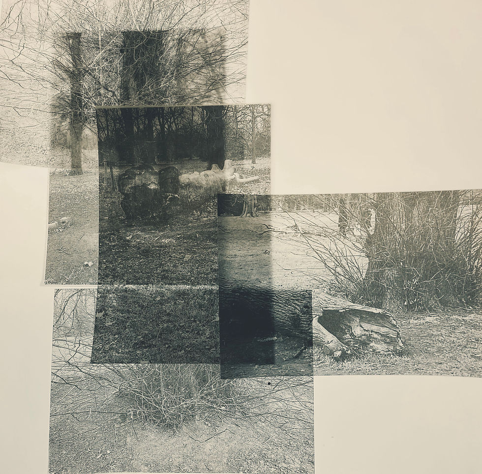
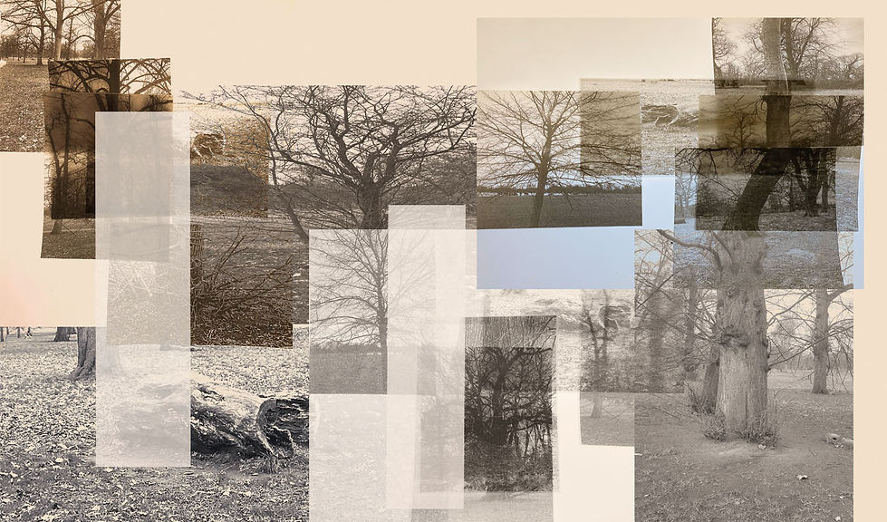
Paula Zinmeister images are off tree collages in different color tones with different shades of colors and perspectives collaged into one whole image. The images are composed by the use of experimenting in contrast and overlay images through image blending them to explore a variety of different styles of editing within the trees. It has also been done by taking images of tracing paper and traced versions of her tree images for it to then be collaged once done. Another technique used was the color look up tool
to experiment with different colors and textures within the images to have them blended in a much more unique tone and form. Her artwork reminds me off magazines work with its collage work due to the shapes of it all being in rectangles ,squares and some being cut off just like a magazine. The fade within some colors resembles hope and memories as the tones have a slight drift within the images texture as if it has a flashback effect due to the contrast between colors.
Another influence that Paula Zinsmeister resemblance is of Catherine Eaton Skinner due to have similar textures and tones such as there use of greys and cream. I believe that the meaning of her photography is to appreciate memories and nature much more as she betrays it to be a beautiful yet wonderous thing. This is shown through her pallet of colors and the unique style of collaging highlighting al types of trees in many aspects and perspectives. Her art work relates to identity because its notebook style of collaging that I previously mentioned relates and even reminds me of taking pictures of trees as a kid.
If I had the opportunity to ask Paula Zinsmeister questions towards her artwork then I would ask that why have they stuck more to colors that are less saturated compared to brighter or even much darker tones of colors? I would also like to ask that what has inspired them to collage trees alongside other floral in this note book manner and how long have they been doing it for. My opinions on her work is that it is engaging as to see another perspective of collaging in trees through a original note book style. I would also say that I love her use of colors as they co aside with the trees like seasons almost as if I was watching the seasons play by in her photography. To conclude I would like to use Paula Zinsmeister's use of colors and collaging style within my own future developments as the experimentation of it seems thrilling.

Photoshoot 1

For my first Paula Zinsmeister photoshoot I capture images of trees in a variety of aspects and different styles. I have done this by taking images of trees zoomed in and from medium shot angles to differentiate my images. Furthermore I would like to add that I experimented more by taking images of trees as a whole and even there roots and as logs. With logs images where wider allowing a different aspect ratio when it comes to me editing them.
For this same photoshoot I also took my images within daylight lighting yet at a time where it was not too bright. I did this to replicate the same texture within Paula Zinsmeisters images of tones. AS the color look up tool would now match more with her tone from my developments that shall be done. It also prevents focus from being taken away from the image as the colors from daylight lighting does not clash.
Developments - black and white


For my first set of Paula Zinsmeister style developments I started of by trying to replicate the same texture within Paula Zinsmeister's images. I have done this by experimenting with double exposure by overlaying a white background then experimenting with the opacity of it where its clear enough but also doesn't add on a bluing texture. To further explore my developments in the tone of Paula Zinsmeister I increased the contrast to allow the focus on the trees texture to be drawn out. I enjoyed this part of my fist developments as I was able to choose how much of the tree's texture was drawn out as a whole , having its rough texture being played around with as a result.
I continued to replicate the same tone/texture of Paula Zinsmeister by adding on a black and white layer to de saturate my images preventing any odd background colors from becoming a distraction towards the developments to make it much easier from a further one. This is because I plan for one to draw with the burn tool in my future further developments to explore contrast in this unique sense of collaging and to blend the images within the collage more. Lastly I develop these developments through the use of the color look up tool I would experiment within this by choosing different formats and opacity levels within it. I would often use drop blues as the format but I do very much experiment with other formats to provide more of a variety as to bong that out more in the future with my further developments.
Redraft photoshoot - experimenting with tracing paper

To further explore Paula Zinsmeister's artistry on trees I captured a photoshoot exploring tracing paper around composition.


To add onto my tracing paper photoshoot I sought to once again drag on inspiration from my artists by seeking to develop these images by using a similar color and tone as Paula Zinsmeister. This was done by the use of a variety of different techniques to create the right color and tone through burning my images with the burnt tool to darken certain aspects within the image. This also smoothened out the texture by doing this yet to add onto my color I experimented with the color look up tool to bring out different form of colors to expand on to my developments. As a whole my low exposed images have ben much more developed as a texture has been much more masked out.
Further Developments


![further developments 6 [add note book over;y].jpg](https://static.wixstatic.com/media/d7fe7e_3c3ca1f500f64f5c8276ca526cfa0c1b~mv2.jpg/v1/fill/w_979,h_492,al_c,q_85,usm_0.66_1.00_0.01,enc_avif,quality_auto/further%20developments%206%20%5Badd%20note%20book%20over%3By%5D.jpg)


To finalize my developments in the style of Paula Zinmester I took the concept of a note book style collage and projected it into one development with the combination of others. Using several developments to plot into a canvas and then using the color look up tool to bring out multiple colors within the image like a regular collage I also burned them to expand on the tone. I experimented with composition layering my images around in the canvas contained in high key lighting. Another thing I did to explore my previous developments expanding on to them is by adding tracing paper overlays that have been spliced and lowered opacity off to have the same texture my artist did .
An exploration of separate tones and composition was unlike anything I've done before so the use of this ideal of creating this was unique as a whole to develop. The surface of the image as a whole is a beautiful combination of developments just like a note book it self having the grainy tone of a image but not on the canvas of the book itself. My developments have a view of a picture of a medium shot angle reflecting on this look of the background appearing to be paper with my images appearing to be stuck in developments. Although my images are unexposed having a lack of light this was not an issue due to the vivid colors previously mentioned that where created by the use of the color look up tool.